feature


21
May 11

Problematic quote of the day

“Ellsberg offered several groups of people a chance to bet on drawing either a red ball or a black ball from two different urns, each holding 100 balls. Urn 1 held 50 balls of each color; the breakdown in Urn 2 was unknown. Probability theory would suggest that Urn 2 was split 50-50, for there was no basis for any other distribution.”

From page 280 of Against the Gods: The Remarkable Story of Risk.


8
Feb 11

Power, p-values, publication bias and statistical evidence

I created this video to show as part of a presentation I’ll be giving next week. Your comments welcome, either here or at Youtube.


12
Jan 11

R: Attack of the hair-trigger bees?

In their book “Complex Adaptive Systems”, authors Miller and Page create a theoretic model for bee attacks, based on the real, flying, honey-making, photogenic stingers. Suppose the hive is threatened by some external creature. Some initial group of guard bees sense the danger and fly off to attack. As they go, they lay down a scent. Other bees join in the attack if their scent sensitivity threshold (SST) is reached. When they join the attack, they send out their own warning scent, perhaps triggering an even bigger attack. The authors make the point that if the colony of bees were homogeneous, and every single one had the same attack threshold, then if that threshold was above the initial attack number, then no one else would join in. If it were below, then everyone goes all at once. Fortunately for the bees, they are a motley lot, which is to say a lot more diverse than you would imagine just from looking at the things. As a result, they exhibit much more complicated behavior. The authors describe a model with 100 bees and call their attack threshold “R”. By assuming a heterogeneous population of 100 with thresholds all equal spaced, they note:

“In the hetrogeneous case, a full-scall attack ensues for [latex]R \geq 1[/latex]. This latter result is easy to see, because once at least one bee attacks, then the bee with threshold equal to one will join the fray, and this will trigger the bee with the next highest threshold to join in, and so on…. It is relatively difficult to get the homogeneous hive to react, while the hetrogeneous one is on a hair trigger. Without explicity incorporating the diversity of thresholds, it is difficult to make any kind of accurate prediction of how a given hive will behave.”

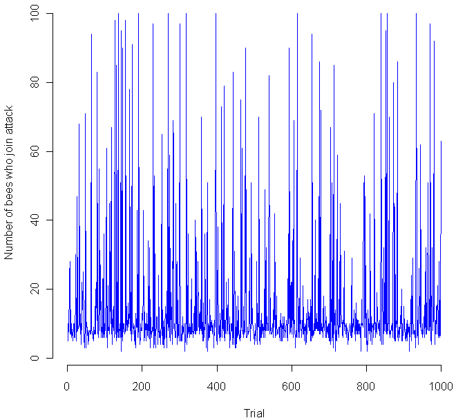
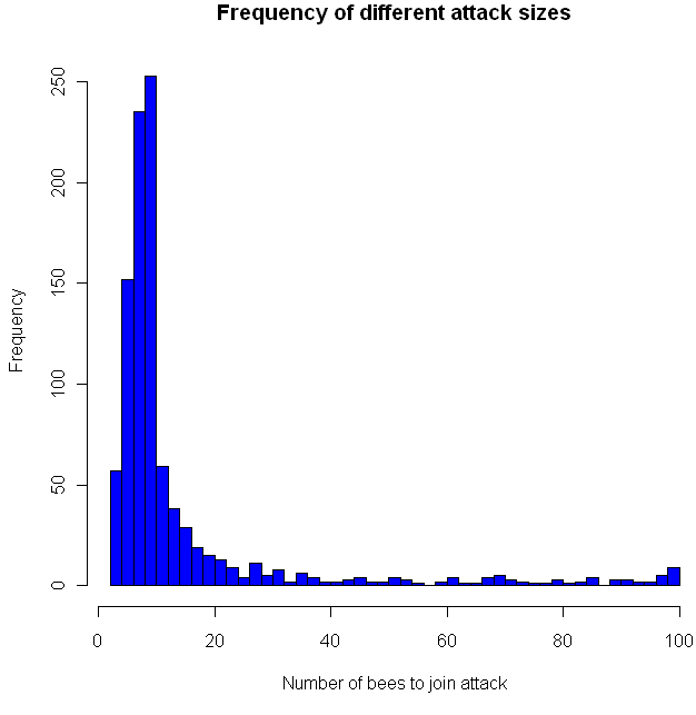
I think this last sentence is their way of noting that the exact distribution of sensitivities makes a huge difference in how the bees behave, which indeed it does. I decided to put the bees to the test, so I coded a simulation in the language R (code at the end of this post). I gave 100 virtual apis mellifera a random sensitivity level, chosen from a Uniform(1,100) distribution, then assumed 10 guards decided to attack. How would the others respond? Would a hair-trigger chain reaction occur? The chart at the top shows the results from 1000 trials. Looks pretty chaotic, so here’s a histogram of the results:

As you can see, most of the time the chain reaction dies out quickly, with no more than 20 new bees joining in the attack. However, occasionally the bees do go nuts, sending the full on attack. This happened about 1 percent of the time. Perhaps most interestingly, all of the other attack levels were clearly possible as well, in the flat zone from about 30 to 95. You might want to try playing with the distribution of the sensitivities and see if you get any other interesting distributions. Meanwhile, if you decide to raid a hive, make sure to dip yourself in mud first, that way the bees will think you are nothing but an innocent black rain cloud.

Code in R:

trials = 1000

go = rep(0,trials)
initial = 10

for(i in 1:trials) {
  bees = sort(runif(100,1,100))
  
  # Everyone who's threshold is less than the inital amount goes.
  going = length(bees[bees initial) {
    more = length(bees[bees going) {
    # Keep doing this until it stops
      going = more
      more = length(bees[bees
				

31
Dec 10

The year of the anti-model

Here’s how it used to work. You have a hypothesis, something you want to test. You go out, collect a mess of data, then start to build a model. The model is your key weapon for understanding the data. Is there a linear relationship? Fit a regression line. Does a particular variable have an impact on the results? Do t-test and find out. The goal is to make your models clear, interpretable, and above all concise. We all know the more parameters you add to a model, the closer you can get it match the data, whatever the data may be, so avoid the temptation to overfit at all costs. Overly complicated models tell you nothing.

Stick to the process above, and you can claim that your results show not just tendencies and correlations, but meaning. The models, properly tested and fit, offer understanding. Through the use of math and inductive logic, we are able to separate the word into signal and noise, “systematic” trends and “random” variation. Once complete, we know what we know (Gremlins are 87% more evil if you feed them after midnight), and we also know what we don’t know (23% of evil behavior in gremlins can’t be explained by violations of the three rules). As an added bonus, we get bounds for how well we know what we know, and how little we know about what we don’t know.

Models can be incredibly powerful tools, but perhaps their least understood property is how well they fool us into believing that fitting a line through points is the same things as understanding an underlying process.

In 2011 I’m going beyond the model. Instead of understanding, I’ll be striving for accuracy of prediction, or to optimize some profit/loss function related to the accuracy of prediction. Instead of trying to part the world into signal and noise — the part that can be understood, and the part that must be dealt with as inevitable “error” — I’m going to design a system that treats signal and noise as all one and the same. Instead of using math and algorithms to extract meaning, I’ll be using these tools to decrease the informational entropy of a stream of data. Data will be treated like a dense, tangled and interconnect forest, an entire ecology of information that cannot be split apart, and can only be “understood” by non-deterministic, evolutionary models which grow in complexity and inscrutability as quickly as their real-world counterparts. In my most well-read (and controversial!) post of 2010, I argued that Occam’s razor was the dumbest argument smart people made. In 2011, I’ll try to demonstrate the power of leaving behind the “simple is better” mentality once and for all.


5
Nov 10

Livin’ la Vida Poisson

Yes, I did just mix English, Spanish and French. And no, I am not living the “fishy” life, popular opinion to the contrary. Here’s the story. As someone who spends the majority of his time working online, with no oversight, I notice that I tend to drift a lot. I don’t play solitaire, or farm for virtual carrots, but I do wander over to Reddit more than I should, or poke around in this or that market in virtual assets to see if anything interesting has shown up. To some extent this can be justified. Many, perhaps all, of my profitable ventures have come from keeping my eyes open, poking around, doing my best to understand the digital world. On the other hand, at times I feel like I’ve been drifting aimlessly, that I’m all drift and no focus. My existing projects are gathering dust while I chase after shiny new things.

That’s the feeling, anyway. What does the evidence say? To keep track of what I was really doing, and perhaps nudge me towards more focus, I set a stopwatch to go off every 15 minutes. When it did, I would stop, write down what I was doing at that moment, and continue on. Perhaps you can see how these set intervals might provide an incentive to, shall we say, cheat? Especially right after the stopwatch chimed, I knew that whatever I did for the next few minutes was “free”, untracked. So I decided that I would have to write down everything I did during those 15 minute intervals, which worked sometimes, othertimes not so well.

My current solution? Setup a bell which chimes at random intervals, with an average time between chimes of 15 minutes. To hear what the bell sounds like, Go ahead and try it out, I think you’ll find it makes a nice sound. Leave that page open while you read the rest of this post, see how many times it rings.

At any rate, in order to randomize how long the wait was between chimes, I used a little something called a Poisson process. Actually, what I used was the Binomial approximation to the Poisson built from multiple Bernoulli trials, which results in wait times that are Exponential. Wait! Did you get all that? If so, then skip ahead until things look interesting. Otherwise, here’s more detail about how this works:

In order to determine the length of time between chimes, my computer generates a random number number between 0 and 1. If this random number is less than 1/15, then the next chime is in just one minute. Otherwise, the computer generates another random number and adds one minute to the time between chimes. On average, it will take 15 tries to get a number below 1/15, so the average time between chimes will be 15 minutes. However, to call 15 minutes the average is somewhat misleading. Here are the frequencies of different wait times (source code in R at the end):
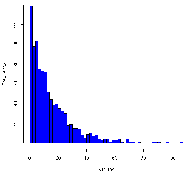

As you can see, the most common time between chimes is just one minute. Strange, no? What’s going on here is that each test to see if the random number is below 1/15 is a Bernoulli trial, which is basically Italian for “maybe it succeeds, maybe it fails”. In this case “success” has probability of 1/15, failure happens the other 14 out of 15 times. In cases where probability is small, and you end of doing a lot of trials, the total number of successes over a given time period will have the Poisson distribution. The “Poisson” here is a Frenchman, who may or may not have smelled like his surname, but who certainly understood The Calculus as well as anyone in the early 1800’s. To get an even better approximation of the Poisson, I could have used trails with probability of success of 1/900, then treated each failure as another second of waiting time. That would have made the graph above smoother.

But wait! I didn’t show you a graph of the Poisson. I showed you a graph of something that approximates the exponential distribution. The number of chimes per hour is (roughly) Poisson distributed, but the waiting time between each chime is exponential, which means shorter wait times are more frequent, but no length of time, no matter how long, can be ruled out. In fact, the exponential distribution is the only (continuous) distribution which is “memoryless”. If you have waited 15 minutes for a chime, your expected wait time is still…. 15 minutes. In fact, your expected wait is independent of how long you have waited so far. The exponential distribution is a “maximal entropy” distribution, entropy in this case is related to how much you know. With the exponential, no matter how long you’ve waited, you still don’t know anything more than when you started waiting.

If you’ve been tuning out and scanning this post, now would be a good time to tune back in. I promise new and interesting things ahead!

It’s one things to understand the memoryless property of the exponential, even down to the mathematical nitty-gritty. It’s quite another to actually live with the exponential. No matter how well I know the formulas, I can’t shake the felling that the longer I have waited in between bell rings, the sooner the next chime must be coming. Certainly, it should be due any time now! While I “know” that any given minute has exactly the same probably as the next to bring with it the bell, the longer I wait, the nearer I feel the the next chime must be. After all, the back of my mind insists, once the page loads the wait time has been set into stone. However it was distributed before, it’s now a constant. Every minute you wait you are getting closer to the next bell, whenever it might have been set to come. I keep wanting to know more than I did a minute ago about about when the next bell will arrive.

This isn’t the only way in which I find my psyche battling with my intellect. I would also swear that over time the distribution of short waits and long waits evens out. Now, by the law of large numbers, it’s true that the more chimes I sit through, the closer the mean wait time will approach 15 minutes. However, even if you’ve just heard three quick bells in a row, that has absolutely no bearing on how long the wait will be between the next three chimes. The expected wait times going forward are completely independent of the wait times in the past. The mean remains 15 minutes, the median remains 10.4 minutes. Yet that’s not what I feel is happening, and over the past two weeks of experimenting with this I would swear that on days when there are a number of unusually quick intervals, these have been followed, later that very the same day, with unusually long intervals. And vice versa. It feels like things are evening out.

It’s possible that when my computer wakes up from a sleep mode, my web browser doesn’t remember where it was in a countdown to refreshing the chime page. So I reload it. Now, in theory, if you “reload” an exponential wait time while in process, this has absolutely no effect on your eventual wait time until the next chime. Yet anytime I reload the page, I have a moment of doubt as to whether I’m “cheating” in some way, to make what would have been a long wait shorter. In this case, the back of my mind says the exact opposite of its previous bias: because I am reloading a page that has been waiting a long time, this means that the wait time would have been really long. By starting the process anew, I’m increasing the chances of a short chime time.

Before you call me a nut, try living for a while with the timer running the background. Keep track of what you are doing if you want (and BTW I’ve found this to be every enlightening and more than a little sad), but mostly keep track of how you feel about the timing. Try reloading the page if you don’t hear a chime for a while. How does that feel? I suspect that in some ways humans were very well hard wired to understand probabilities. Yet I also suspect our wiring hinders how we understand probability, a suspicion backed up by all those gamblers out there waiting for the lucky break that’s well overdue.

CODE:

iters = 1000
results = rep(0,iters)
for (i in 1:iters) {
	minutes = 1
	while(runif(1)>(1/15)){
		minutes = minutes + 1
	}
	
	results[i] = minutes
}

hist(results, breaks=40, col="blue", xlab="Minutes")

4
Sep 10

Weekend art in R (Part 4)

Computer creations are perfect by design. We put in numbers, and if all goes well we get out an exact result. If we want a line, we want it perfectly straight. If we want a circle, it should conform to the platonic ideal of a circle. From a mathematical standpoint, these perfect shapes and precisely computed numbers are ideal.

Someday, perhaps, we will have true fuzzy computation built right into our hardware. For now, it takes considerable effort to achieve just the right level of imperfection needed for simulating mistakes, or any organic processes.

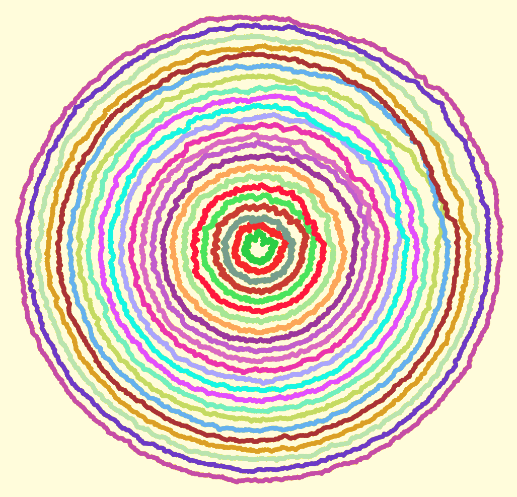
I sent each of the circles shown above on a random walk. That part was easy, getting each circle to end up where it started (and close the loop) took a bit more effort. To vary the “wigglyness” of the lines, adjust the “sd” parameter in “rnorm”. To change how quickly randomness tapers off, change the “4” in “i/4”. Here is my code:

# Circle lengths
j = seq(0.1,1.9,.08)

par(bg = "black")
plot(-2,-2,pch=".",xlim=c(-2,2),ylim=c(-2,2),col="white")

# How many dots around the circle?
dots = 1000

# Create an offkilter circle
rads = seq(0,2*pi,2*pi/dots)

for(aLength in j) {
	# Pick a random color
	myCol = paste("#",paste(sample(c(1:9,"A","B","C","D","E","F"),6,replace=T),collapse=""),collapse="",sep="")
	
	# Start at length = 1, then walk.
	myLength = rep(aLength,dots)
	
	for(i in 2:dots) {
		myLength[i] = myLength[(i-1)] + rnorm(1,0,sd=.005)
		
		# Closer we are to end, faster we return to where started so circle closes
		dist = aLength - myLength[i]
		myLength[i] = aLength - (dist*((dots-(i/4))/(dots)))
	}


	for(i in 1:dots) {
		cat(myLength[i]*cos(rads[i]),myLength[i]*sin(rads[i]),"\n")
		points(myLength[i]*cos(rads[i]),myLength[i]*sin(rads[i]),col=myCol,pch=20,cex=2)
	}
}

What do your circles look like?


30
Aug 10

The Chosen One

Toss one hundred different balls into your basket. Shuffle them up and select one with equal probability amongst the balls. That ball you just selected, it’s special. Before you put it back, increase its weight by 1/100th. Then put it back, mix up the balls and pick again. If you do this enough, at some point there will be a consistent winner which begins to stand out.

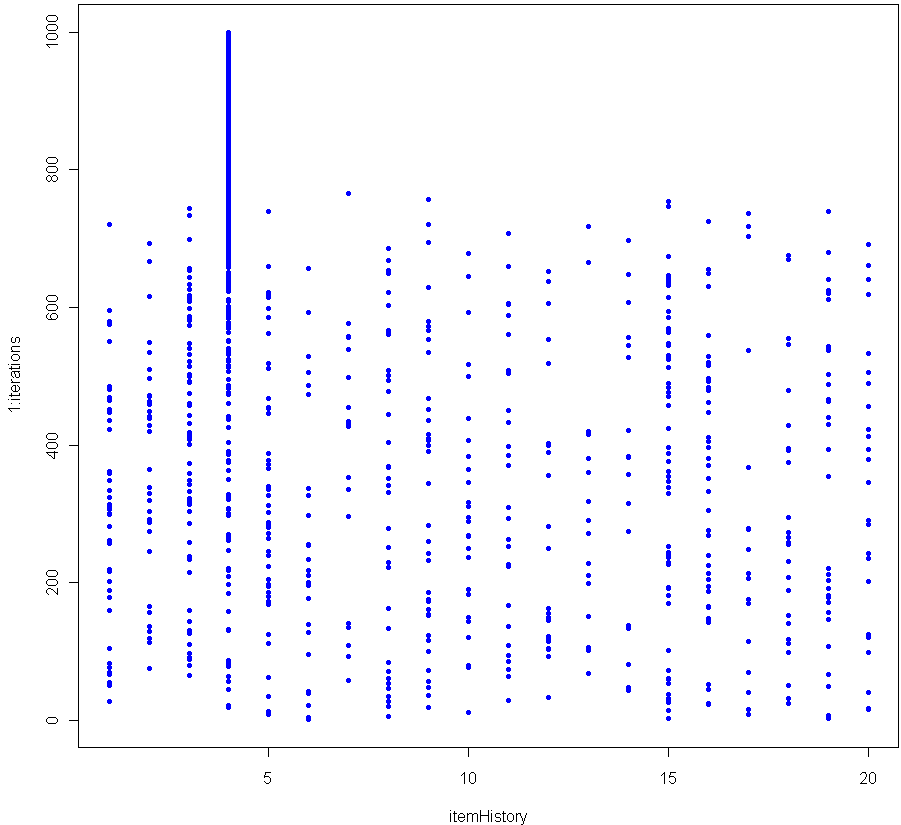
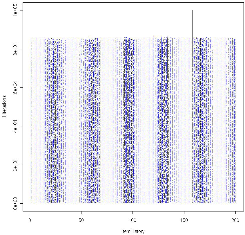
The graph above shows the results of 1000 iterations with 20 balls (each victory increases the weight of the winner by 5%). The more balls you have, the longer it takes before a clear winner appears. Here’s the graph for 200 balls (0.5% weight boost for each victory).

As you can see, in this simulation it took about 85,000 iterations before a clear winner appeared.

I contend that as the number of iterations grows, the probability of seeing a Chosen One approaches unity, no matter how many balls you use. In other words, for any number of balls, a single one of them will eventually see its relative weight, compared to the others, diverge. Can you prove this is true?

BTW this is a good Monte Carlo simulation of the Matthew Effect (no relation).

Here is the code in R to replicate:

numbItems = 200
items = 1:numbItems
itemWeights = rep(1/numbItems,numbItems) # Start out uniform
iterations = 100000
itemHistory = rep(0,iterations)

for(i in 1:iterations) {
	chosen = sample(items, 1, prob=itemWeights)
	itemWeights[chosen] = itemWeights[chosen] + (itemWeights[chosen] * (1/numbItems))
	itemWeights = itemWeights / sum(itemWeights) # re-Normalze
	itemHistory[i] = chosen
}

plot(itemHistory, 1:iterations, pch=".", col="blue")

After many trials using a fixed large number of balls and iterations, I found that the moment of divergence was amazingly consistent. Do you get the same results?


21
Aug 10

Weekend art in R (Part 3)

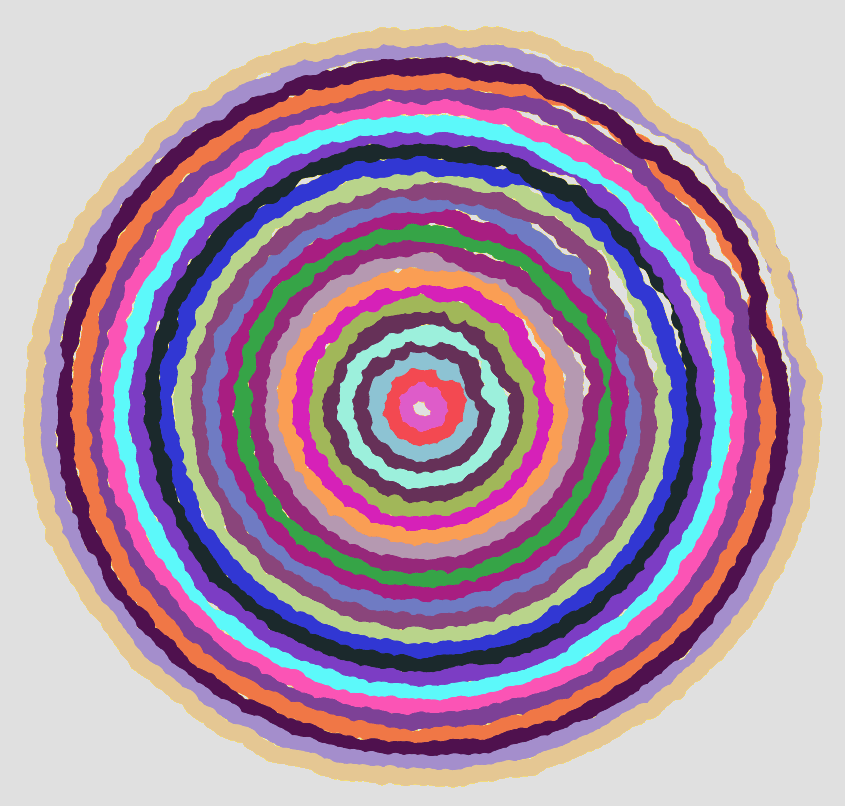
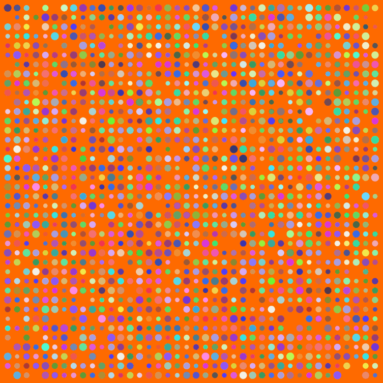
I have a few posts nearing completion, but meanwhile a weekend break for art. Big thanks to Simon Urbanek and Jeffrey Horner, creators of Cairo, a library for the programming language R. Have you noticed how R can’t anti-alias (fancy way for saying smooth out lines and curves when creating a bit-mapped image)? Cairo can.

Make sure to click the image above for the full version. Here’s my code:

# The Cairo library produces nice, smooth graphics
Cairo(1200, 1200, file="D:/Your/Path/Here/Dots.png", type="png", bg="#FF6A00")

# How big should the grid for placing dots be?
myWidth=40
myHeight=40

dotsPlaced = myWidth*myHeight

# Optional default colors and sizes for dots
myColors = rep(c("#0000F0","#00F000"),dotsPlaced)
myCex = rep(3.2,dotsPlaced)

for(i in 1:dotsPlaced) {
	# Change this to allow more of the default color dots to survive
	if(runif(1)<1) {
		myColors[i] = paste("#",paste(sample(c(3:9,"A","B","C","D","E","F"),6,replace=T),collapse=""),collapse="",sep="")
	}
	myCex[i] = runif(1,3,6)
}

# Keeping this is marginal
par(oma=c(0,0,0,0))
par(mar=c(0,0,0,0))

# Start off with a blank plot. The white dot helps with cropping later
plot(0,0,pch=".",xlim=c(0,40),ylim=c(0,40),col="white", xaxt = "n", yaxt = "n")

for(m in 1:myWidth) {
	for(n in 1:myHeight) {
		if(runif(1) < .93) {
			points(n,m,pch=20,col=myColors[((m*n)+n)],cex=myCex[((m*n)+n)])
		}
	}
}

dev.off() # Tell Cairo to burn the plot to disk

8
Aug 10

Seeing angels in the architecture

Sorry for the long delay between posts; I was temporarily sucked in to the infinite. While doing some reading about set theory (foundational stuff for probability and, in fact, all of mathematics), I veered off into the infinite and had a hard time climbing back out. I’m guessing you already know most of the basics about sets: compliments and unions and intersections. You may even know some of the stranger parts, like G. Cantor’s cascading crescendo of cardinalities. But knowing those in a cursory way (and really, that’s all a work-a-day statistician or even probabilist needs) isn’t the same as really exploring them.

Looking up again now after several weeks, I feel like I’ve traveled three levels deep in a dream, lost in a purgatory I could only escape by answering questions like  “Is a line made up of points, or does it have points?”, “Is it possible to count what you cannot fully name”, and “In an unbounded universe, is the compliment of the compliment of an object the same as the original object?”. I know, I know. I should have taken that left back at Albuquerque, I shouldn’t have swallowed the red pill. Still, it’s been an interesting trip to say the least, and I feel like I may now be coming back up the the surface, a little bit wiser and a lot more confused than when I began.

Meanwhile, I’ve added a couple items to the “Manifesto” and, The Architect permitting, will be posting a theory on Types of Randomness soon. Post should take between 1 and 10 days to complete, with 95% confidence. Hum… better make that an 80% confidence interval, I still haven’t wrapped my head around the whole idea of forcing.


19
Jul 10

R: Clash of the cannon cycles

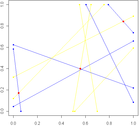
Imagine a unit square. Every side has length 1, perfectly square. Now imagine this square was really a fence, and you picked two spots at random along the fence, with uniform probability over the length of the fence. At each of these two locations, set down a special kind of cannon. Just like the light cycles from Tron, these cannons leave trails of color. To aim each cannon, pick another random point from one of the three other sides of the fence, and aim for that point.

Sometimes there will be a collision within the square, other times no. The image at top shows the results of five trials. The red dots are where the trails from a pair of cannons collided. My burning question: What is the distribution for these dots? Before reading on, try to make a guess. Where will collisions be most likely to happen?

Somewhere in the world, there lives a probabilist who could come up with a formula for the exact distribution in an hour, but that person doesn’t live in my house, so I took the Monte Carlo approach, coded in R:

# Functions to pick two points, not on the same side:
m2pt <- function(m) {
	if(m <1) {
		myPoint = c(5,m,0)
	} else if (m < 2) {
		myPoint = c(6,1,m %% 1) 
	} else if (m < 3) {
		myPoint = c(7,1-(m %% 1),1)
	} else {
		myPoint = c(8,0,1-(m %% 1))
	}
	return(myPoint)
}		

get2pts <- function() {
	pt1 = m2pt(runif(1,0,4))
	pt2 = m2pt(runif(1,0,4))
	
	# Make sure not both on the same sides. If so, keep trying
	while(pt1[1] == pt2[1]) {
		pt2 = m2pt(runif(1,0,4))
	}
	return(c(pt1[2:3],pt2[2:3]))
}

# Optional plot of every cannon fire line. Not a good idea for "iters" more than 100
#windows()
#plot(0,0,xlim=c(0,1),ylim=c(0,1),col="white")		
		
# How many times to run the experiment
iters = 10000

# Track where the intersections occur
interx = c()
intery = c()

for(i in 1:iters) {
	can1 = get2pts()
	can2 = get2pts()
	
	# Optional plot of every cannon fire line. Not a good idea for "iters" more than 100 
	#points(c(can1[1],can1[3]),c(can1[2],can1[4]),pch=20,col="yellow")
	#segments(can1[1],can1[2],can1[3],can1[4],pch=20,col="yellow",lwd=1.5)
	#points(c(can2[1],can2[3]),c(can2[2],can2[4]),pch=20,col="blue")
	#segments(can2[1],can2[2],can2[3],can2[4],pch=20,col="blue",lwd=1.5)

	# See if there is a point of intersection, find it. 
	toSolve = matrix(c( can1[3]-can1[1], can2[3]-can2[1], can1[4]-can1[2], can2[4]-can2[2]),byrow=T,ncol=2)
	paras = solve(toSolve, c( can2[1]-can1[1], can2[2]-can1[2]))
	
	solution = c(can1[1] + paras[1]*(can1[3]-can1[1]), can1[2] + paras[1]*(can1[4]-can1[2]))
	
	# Was the collision in the square
	if(min(solution) > 0 && max(solution) < 1) {
		# Optional plot of red dots
		# points(solution[1],solution[2],pch=20,col="red",cex=1.5)
		
		# if this intersection is in square, plot it, add it to list of intersections
		interx = c(interx, solution[1])
		intery = c(intery, solution[2])
	}
}

windows()
plot(interx, intery, pch=20,col="blue",xlim=c(0,1),ylim=c(0,1))

After carefully writing and debugging much more code than I expected, I ran a trial with several thousand cannon fires and plotted just the collisions. Here is what I saw:

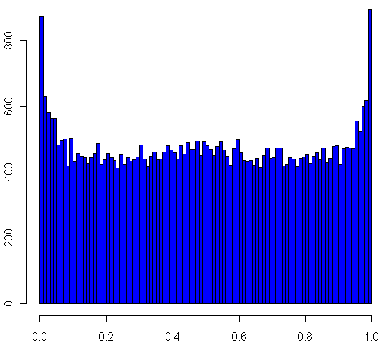
Looks pretty uniform, doesn't it? If it is, I will have gone a very long way just to replicate the bi-variate uniform distribution. My own original guess was that most collisions, if they happened in the square, would be towards the middle. Clearly this wasn't the case. Looks can be deceiving, though, so I checked a histogram of the x's (no need to check the y's, by symmetry they have the same distribution):

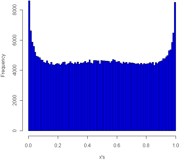
Very interesting, no? The area near the edges appears more likely to have a collision, with an overall rounded bowl shape to the curve. The great thing about Monte Carlo simulations is that if something unexpected happens, you can always run it again with more trials. Here I changed "iters" to 100,000, ran the code again, and plotted the histogram.

hist(interx, breaks=100, col="blue",xlab="x",main="Histogram of the x's")

Now its clear that the distribution spikes way up near the edges, and appears to be essentially flat for most of the middle area. It seems like it may even go up slightly at the very middle. Just to be sure, I ran a trial with one million iterations:

Now it definitely looks like a small upward bulge in the middle, though to be sure I would have to do run some statistical tests or use an even larger Monte Carlo sample, and given how inefficient my code is, that could take the better part of a week to run. So for today I'll leave it at that.

One final statistic of note: During my run of one million iterations, 47.22% of all collisions happened inside the box. What do you think, is the true, theoretical ratio of collisions within the box a rational number?