- Last Monday (Feb. 17th) was R.A. Fisher’s birthday. To honor him, Deborah G. Mayo, Professor of Philosophy at Virginia Tech, publishes Fisher and Neyman after anger management, and R.A. Fisher: ‘Two New Properties of Mathematical Likelihood’.
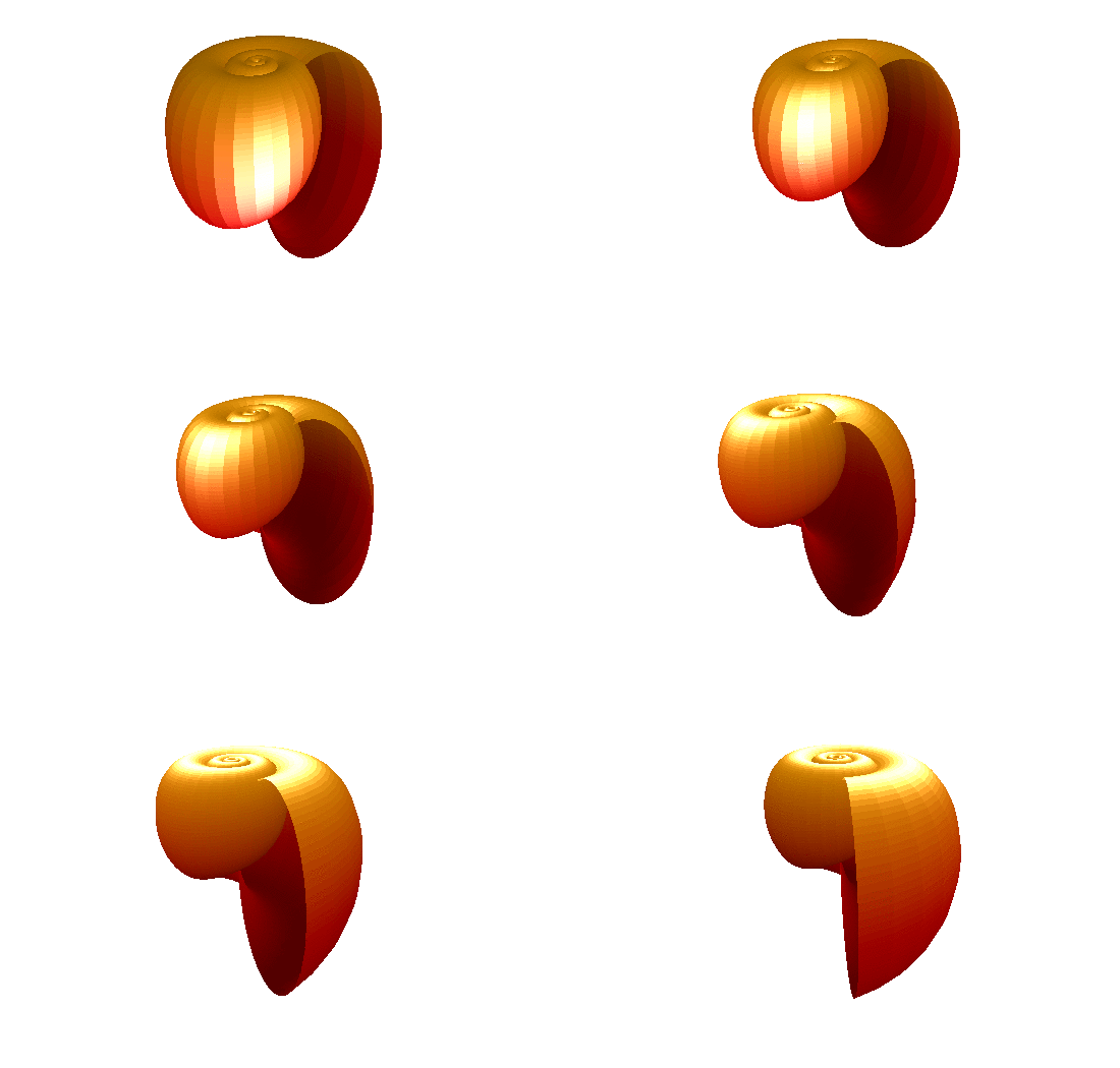
- A few articles related to visualization and graphics received lots of attention: ggplot2: Cheatsheet for Visualizing Distributions, Automatically coloring your R output in the terminal using colorout, A visual explanation of conditional probability, R: Fun with surf3D function and No need for SPSS – beautiful output in R.
- Given that you have a five-card hand with ♠K and ♡K, what is the probability that you have all four Kings?
- Coursera offers a new MOOC course called Data Analysis for Genomics. The course starts on April 7, 2014.
- And finally, Arthur Charpentier (aka Freakonometrics) publishes a technical article called Identification of ARMA processes.
News
24
Feb 14
The week in stats (Feb. 24th edition)
2
Dec 13
The week in stats (Dec. 2nd edition)
- Mixed effect models are useful tools in statistics because they can capture both fixed effects and random effects. Jared Knowles, a PhD student at University of Wisconsin Madison, created a tutorial with real world examples that explains how to run mixed models in R.
- Revolution Analytics compiles a list of industry news on R and statistics, including coverage on Domino, a San Francisco startup on collaborative Data Science, an R visualization tutorial, and some news on Quandl.
- Andrew Gelman discusses the concept of randomization and how it is misused in an interesting blogpost titled Three unblinded mice.
- For the finance and forecasting folks, a simple tutorial on how to create dygraphs using rCharts (don’t know what dygraphs is? It’s a fast, flexible, open source JavaScript charting library).
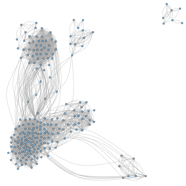
- How to analyze your Facebook friends network with R? A new package called Rfacebook can help you.
- And lastly, Derek Jones explains why he believes OLS is dead and software engineers like himself should use other tools.
23
Sep 13
The week in stats (Sept. 23th edition)
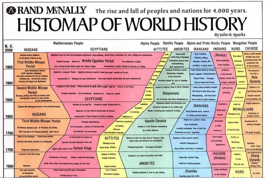
- The Histomap of World History illustrates the rise and fall of various empires and civilizations through an increasing time series up to present day (because the original image is too large, we include a truncated version here in post). Did you know that you can create these visuals in R? Here is how to do them.
- When we deal with time series modelling and forecasting, many people start with sophisticated models like the ARIMA or the GARCH. Rob Hyndman of Monash University suggests that when forecasting daily data, unless the the time series is very long, the easiest approach is to simply set the frequency attribute to 7. Then any of the usual time series forecasting methods should produce reasonable forecasts.
- Kaiser Fung, the owner of the popular statistics blog Junkcharts, interviews Andrew Gelman.
- OpenStreetMap is crowdsourced map project. Thousands of users log in each day, and help to improve the map by updating their neighborhood. Here is a visualization of this amazing social fabric of individuals working together. Every user is assigned different color, and their updates are represented on this map. Take a look at how many people have been mapping near you.
- A series of four articles by Charlie Kufs of statswithcats on How to Write Data Analysis Reports.
- What is the limiting distribution of a sum of weighted Gaussian?