31
Jul 13

A probability cookbook

Randomness – Probability = Chance

Chance – Randomness = Fate

Fate + God = Predestination

Probability + Epistemology = Types of Randomness

Subjective Probability = Betting + Coherence

Propensity theory = Probability + Animism

Kolmogorov Axioms = Probability – randomness – chance

Probability + Complexity = Cryptography

Chaos + Ignorance = Randomness

Regression: Data = Signal + Noise

Bayesian:
Posterior = Prior [latex] \times [/latex] Likelihood
Prior + Data [latex] \rightarrow [/latex] Probability

Probabilitst:
Probability [latex] \rightarrow [/latex] Frequency

Statistical:
Frequency [latex] \rightarrow [/latex] Probability

Big Data:
Predictive value [latex] \gg [/latex] Model simplicity
High dimensions + Fast computers = De chao ordo


10
Jul 13

Updates to types of randomness

Just a quick note that I’ve gone through and made some revisions to A classification scheme for types of randomness. If you haven’t yet read this post, I’d highly recommend it. If you have, go read it again!


03
Jul 13

The hat trick

In his book Quantum Computing Since Democritus, Scott Aaronson poses the following question:

Suppose that you’re at a party where every guest is given a hat as they walk in. Each hat has either a pineapple or a watermelon on top, picked at random with equal probability. The guests don’t get to see the fruit on their own hats, but they can see all of the other hats. At no point in the evening can they communicate about what’s on their heads. At midnight, each person predicts the fruit on their own hat, simultaneously. If more than 50% of the guests get the correct answer, they’re given new Tesla cars. If less than 50% of the guests get it right, they’re given anxious goats to take care of. What strategy (if any) can they use to maximize their chances of winning the cars?

Answer: there is no strategy that works.

Kidding! Of course there’s a strategy, as you can tell by the length of this post. Did you come up with any ideas? At first glance, it seems like the problem has no solution. If you can’t communicate with the other party goers, how can you find out any information about the fruit on your own head? Since each person was independently given a pineapple or a watermelon with equal probability, what they have on their heads tells you nothing about what you have on your head, right?

My own initial strategy, after considerable (but not enough!) thought, was to bet on regression to the mean. Suppose you see 7 pineapples and 2 watermelons. The process of handing out hats is more likely to generate a pineapple/watermelon ratio of 7 to 3 than 8 to 2 (it’s most likely to generate an equal number of each type, with every step away from a 5/5 ratio less and less likely). Thus, I figured it would be best to vote that my own hat moved the group closer towards the mean. Following my strategy, we all ended up with goats. What did I do wrong?

The key to solving this problem is to realize that the initial process for handing out hats is irrelevant. All that matters is that, from the perspective of a given person, they are a random sampling of 1 from a distribution that is known to have either 7 pineapples and 3 watermelons, or 8 pineapples and 2 watermelons. Thus, each person knows that the probability a randomly sampled guest will have a pineapple on their head is somewhere between 70% and 80%. More precisely, it’s either 70% or 80%. In any case, so long as every person votes for themselves being in the majority, then the majority of guests will be voting that they are in the majority.

I simulated this strategy using parties of different sizes, all of them odd (to avoid the issue of having and equal number of each hat type). Here’s the plot, with each point representing the mean winning percentage with 500 trials for each group size. As always, you can find my code at the end of the post.

As you can tell from the chart, once we have 11 or more guests, it’s highly likely that we all win Teslas.

One way to look at this problem is through the lens of the anthropic principle. That is, we need to take into account how what we observe gives us information about ourselves, irrespective of the original process that made each of our hats what they are. What matters is that from the perspective of each party goer, their view comprises a random sampling from the particular, finite distribution of pineapples and watermelons that was set in stone once everyone had entered the room. In other words, even if the original probably of getting a pineapple was 99%, if you see more watermelons than pineapples, that’s what you should vote for.

This problem, by the way, is related to Condorcet’s Jury Theory (featured on the most recent episode of Erik Seligman’s Math Mutation podcast). Condorcet showed, using the properties of the binomial distribution, that if each juror has a better than 50% chance of voting in accordance with the true nature of the defendant, then the more jurors you add, the more likely the majority vote will be correct. And vice versa. Condorcet assumed independence, which we don’t have because our strategy ensures that every person will vote the same way, so long as the difference between types of hats is more than 2.

# Code by Matt Asher for StatisticsBlog.com
# Feel free to modify and redistribute, but please keep this header
set.seed(101)
iters = 500
numbPeople = seq(1, 41, 2)
wins = rep(0, length(numbPeople))

cntr = 1
for(n in numbPeople) {
	for(i in 1:iters) {
		goodGuesses = 0
		hats = sample(c(-1,1), n, replace = T)
		disc = sum(hats)
		for(h in 1:n) {
		
			personHas = hats[h]
			# Cast a vote based on what this person sees
			personSees = disc - personHas
			
			# In case of a tie, the person chooses randomly.
			if(personSees == 0) {
				personSees = sample(c(-1,1),1)
			}
			
			personBelievesHeHas = sign(personSees)
			
			if(personBelievesHeHas == personHas) {
				goodGuesses = goodGuesses + 1
				break
			}
			
		}
		
		if(goodGuesses > .5) {
		
			# We win the cars, wooo-hooo!
			wins[cntr] = wins[cntr] + 1
		}
	}
	
	cntr = cntr + 1
}

winningPercents = wins/iters

plot(numbPeople, winningPercents, col="blue", pch=20, xlab="Number of people", ylab="Probability that the majority votes correctly")

01
Jul 13

Morality needs probability, manifesto addendum

Just added to my Big Bright Green Manifesto Machine. You might need to read this through a couple times; it’s a difficult concept since it lives in a collective blind spot for us:

Doing ethics without probability is like performing surgery with a wooden spoon — it’s a blunt instrument capable of only the most basic operations, and more likely to kill the patient than heal them. Implicitly, we understand this need for probability in making ethical judgements, yet most people recoil when the calculus of probabilities is made explicit, because it seems cold, because the math frightens and confuses them, or because letting odds remain unestimated and unacknowledged allows people to confuse positive outcomes with moral behavior, sweeping hidden risks under the rug when things go well, or claiming ignorance when they don’t. It’s time to acknowledge — directly, explicitly, mathematically — that morality needs probability. For ethics to move forward it must be integrated with our knowledge of randomness and partial entailment.

Here’s an example of how we already take probability into account implicitly. If we retrieve our lost ball from someone’s yard without asking first, we justify this based on our belief that the owner is more likely to be bothered by us interrupting their dinner, than by our temporary trespass on their lawn. The greater the probability of great harm, the higher the level of certainty we demand. Our most heated debates involve situations where the probability of harm from both action and inaction is high. If someone’s dog is stuck in a hot car on a sunny day, should you break in and try to save it? Does the chance of a dog dying of heatstroke justify a forced entry that will probably result in expensive damage and an irate owner (though it’s possible they would be grateful instead). If you decide to break in, how long should you wait first? What prior distribution should you put on the owner’s return time, and how do you update your prior as time goes by? If the waiting time is chi-square on low degrees of freedom, your concern for the dog might be unjustified. If it follows the unreliable friend distribution, you may be that dog’s only hope.

As I hope is becoming clear, questions of morality cannot be resolved without asking questions about probability. If the example above seems trivial (perhaps the owner’s property rights trump your concern for a dog), then substitute the animal for a toddler who looks uncomfortably warm. Now how long do you wait, and how do you deal with the risk that smashing a window might harm the child?


30
May 13

Uncovering the Unreliable Friend Distribution

Head down to your local hardware store and pick up a smoke detector. Pop off the cover and look inside. You’ll see a label that mentions Americium 241, a radioactive isotope. Put on your HEV suit, grab a pair of tweezers and a fine-tipped pen, and remove the 0.3 millionths of a gram of Americium. If you need reading glasses, now might be a good time to put them on. Pick out one of atoms and label it with an X. Now watch closely. Sooner or later, it will spit out an Alpha particle.

Just how long will you have to wait? Decay rates are measured in half-lives, which is the amount of time needed for half of the particles to decay (any particular atom has a 1/2 chance of decaying in this time as well). The stated half-life for this isotope is 432 years, and your waiting time will follow an exponential distribution. The strange, oddly beguiling quality about this distribution is that the conditional probabilities remains constant. In other words, no matter how long you’ve waited, there’s still a 1 in 2 chance that your Americium isotope will decay in the next 432 years. Waiting for an exponentially distributed event to happen leads to an odd feeling, at least for me. The longer you wait, the more you “expect” the event to happen soon, even knowing that your expected wait time never changes. I wrote about that feeling previously, and created an exponential timer you can try out for yourself. I would suggest setting it to less than 432 years.

Cranking uncertainty up to 11
Recently, as I waited patiently for my own particle of Americium to give up its Alpha, I got to thinking about conditional uncertainty. No matter how long we wait for our event, we never get any smarter about when it will happen. But we don’t get any dumber, either. Would it be possible, I wondered, to build a kind of “super-exponential” distribution, where the longer we wait, the less we know. In other words, can we take our level of uncertainty up to 11?

Imagine the following scenario: first we sample from a standard uniform distribution, which gives us a number somewhere between 0 and 1. Call this number [latex]U[/latex]. Then we take [latex]U[/latex] (without looking at it!), and plug it into the exponential distribution as the parameter [latex]\lambda[/latex]. This gives us a random variable with a mean waiting time of [latex]\frac{1}{U}[/latex] for the first occurrence. (Note that this mean isn’t the same as the half-life, which is actually the median. To convert from mean to half-life, multiply by the natural log of 2).

My prediction was that this method would increase the overall level of uncertainty about our waiting time, and, even worse, make our uncertainty grow over time. Why? The longer we’ve waited, I figured, the more likely our (presumed) [latex]\lambda[/latex] will be small, which in turn means the expectation and variance of our exponential waiting time grow, widening our confidence intervals.

At this point, I had the vague feeling that this probability distribution should already exist as a known thing, that it may even be a version of something I’ve encountered before. Another way to look at the exponential is in terms of the failure rate, or, conversely, the survival rate. When Ed Norton, the un-named narrator of Fight Club (I know, I know), says that “on a long enough timeline, the survival rate for everyone drops to zero,” this is what he means. Only Norton is referring to the cumulative survival rate, whereas it’s usually most interesting to look at the instantaneous (or marginal, for my economist friends) rate. For the exponential this rate is constant, ie flat. There is a distribution specifically crafted to let you simulate failure rates when the rate itself is variable, it’s called the Weibull. It can be used to model products whose expected durability increases with time (note that we are not saying the product becomes more durable over time, but that the fact that it has survived tells us that it is highly durable). Did I just rediscover the Weibull, or one it’s friends in the same family of extreme distributions?

Before breaking out my great big Compendium of Probability Distributions, I dove right in with a quick Monte Carlo simulation. As with all my posts using R, you’ll find the code at the end of this post.

A wave of plots
Here’s the histogram for our sample, with the rightmost tail chopped off (because your screen, unlike mine, is just too damn small):
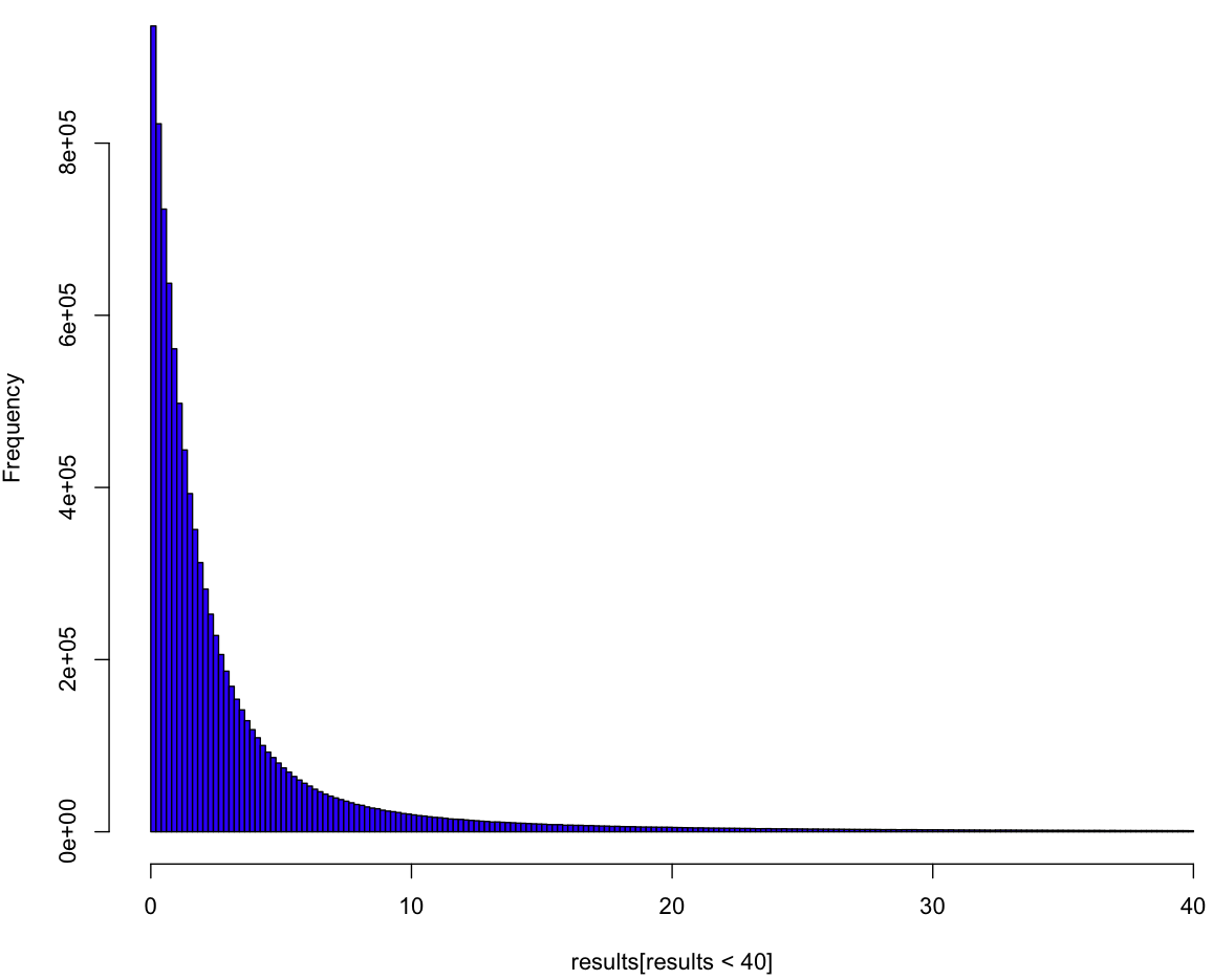
So it looks like a variant of the exponential, but this plot doesn’t tell us much. To really understand the distribution we have to see it as if we were inside the distribution, waiting for the event to happen. All we know is the process, and we have to come up with a guess about our distribution curve conditional on how long we’ve waited so far. In order to understand this curve, we first need to make a guess about [latex]\lambda[/latex], which is to say [latex]U[/latex]. Can we put a probability distribution on [latex]U[/latex] given how long we’ve been waiting so far? Yes, we most certainly can! And, because our prior distribution on [latex]U[/latex] is uniform (of course), our posterior is our likelihood. Here’s what our (posterior) curves look like:
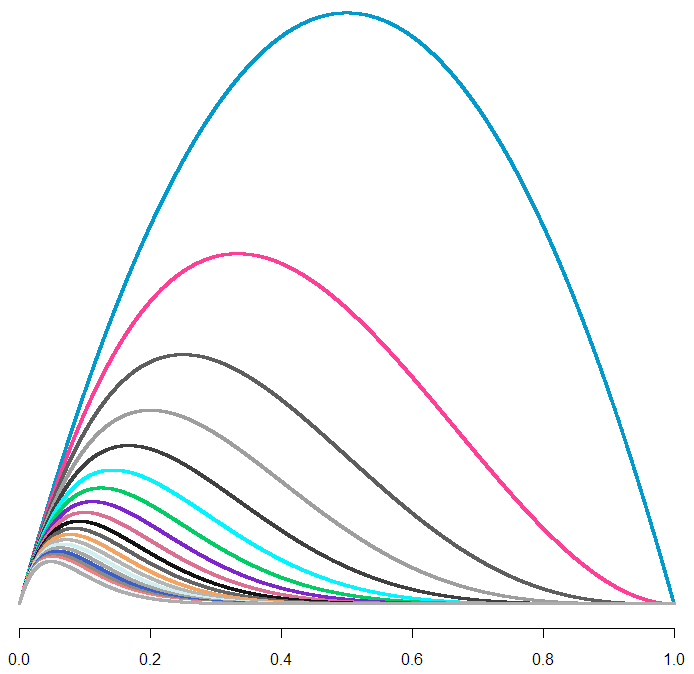
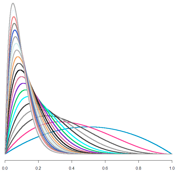
Each curve is a probability distribution on our belief about [latex]U[/latex]. In other words, the peaks represent what we believe to be the most likely value for [latex]U[/latex], given how long we’ve waited so far. The biggest curve is our distribution for [latex]U[/latex] after waiting for one unit of time (let’s just call them “minutes”). As you can tell, if we continue to wait, our maximum likelihood estimate (MLE) for [latex]U[/latex] shifts left, and it looks like our curve flattens out. But wait! Each of these curves has a different area. To treat them like a true probability distribution, we should normalize each of the areas to one. Here’s what those same curves look like after normalization:

From this handsome chart (the same one from the beginning of the post), we can tell that expected range of values for [latex]U[/latex] is narrowing, not broadening. So could our uncertainty be decreasing along with our wait, as we hone in on the true value of [latex]U[/latex]? Let’s take a look at what happens to our additional wait time as time passes.
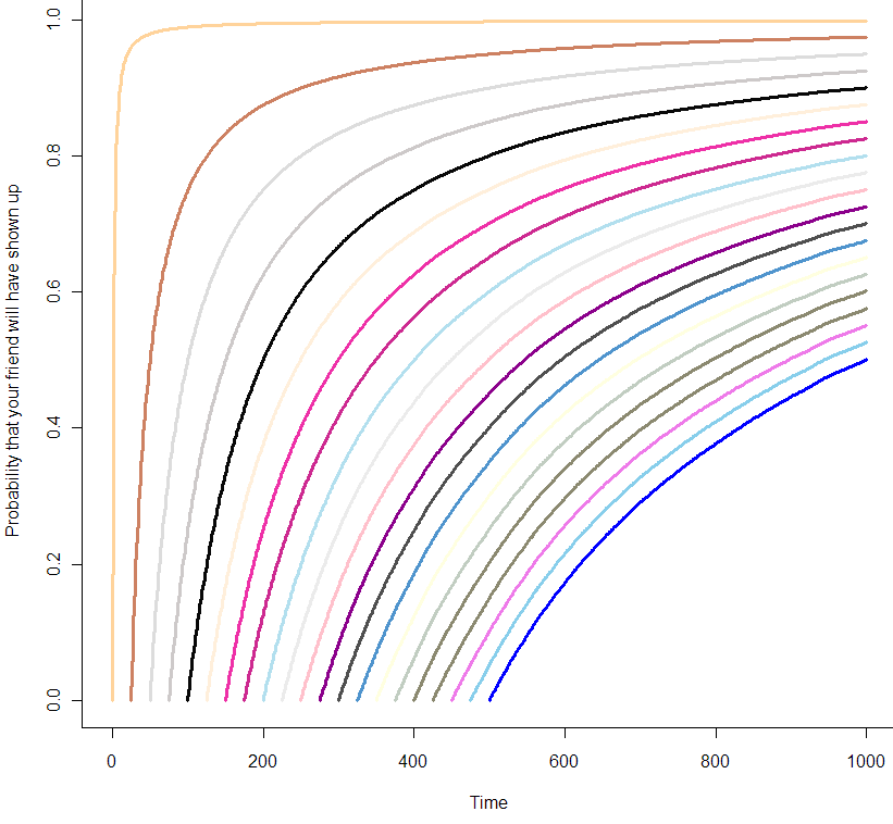
You can think of these curves as the chance that your friend will show up in the coming minutes, given how long you’ve already been waiting. At the very beginning of your wait, modeled by the orange curve at the far left, you can be almost certain that your friend will show up in the next 10 minutes. But by the time you’ve been waiting for 500 minutes, as seen in the blue curve at the far right, you are only 50% sure that she will show up in the next 500 minutes. Are those probabilities exact? It seems like it, but let’s zoom in on the first 25 minutes:
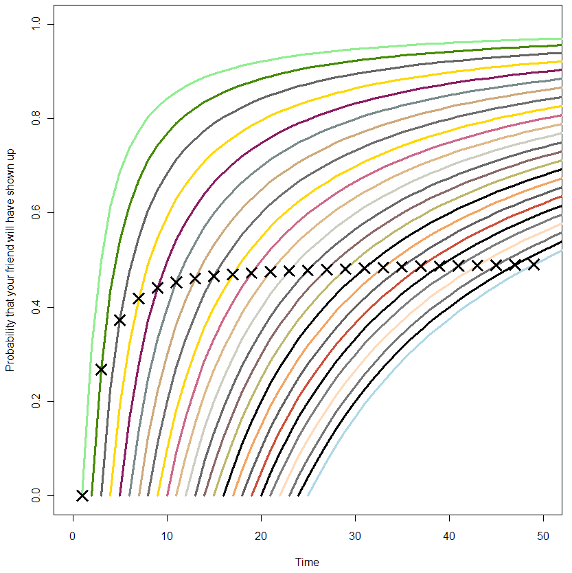
The X’s represent the median time for your friend’s arrival. If this was always equal to your wait time so far, all of the X’s would be in a straight line at 0.5. From this plot, it’s clear that this is not the case from the beginning, but only becomes so as you wait longer. So what have we got here? At this point I’m at the limit of what I can get out of Monte Carlo. It’s time to do math! (or not, feel free to skip this next section).

The formula
To get the pdf for this distribtion, I start by noting that if we had two possible choices for [latex]\lambda[/latex] with a one-half chance each of being picked, then the probability our waiting time would be less than [latex]x[/latex] would be:

[latex] P(t < x) = \frac{1}{2}(1 - e^{-x \lambda_1}) + \frac{1}{2} (1 - e^{-x \lambda_2})[/latex]

where [latex](1 – e^{-x \lambda_i})[/latex] is the cumulative distribution function (CDF) of the exponential distribution with parameter [latex]\lambda_i[/latex]. If you really know your exponential, you may have noticed some similarities with the hyperexponential distribution, but we’re gonna take it to the limit, and create a kind of hyper-hyperexponential. More generally, for a sample of [latex]\lambda_i[/latex]:

[latex]P(t < x) = \frac{1}{n} \sum_{i=1}^n (1 - e^{-\lambda_i x}) [/latex] Since the [latex]\lambda_i[/latex] are uniformly distributed, the more of them we sample, the more our order statistics are going to look like [latex](\frac{1}{n}, \frac{2}{n}, \frac{3}{n}... \frac{n}{n})[/latex] where our sample size is n (proof is left as an exercise for you, my dear reader). [latex]P(t < x) = \frac{1}{n}\sum_{i=1}^n (1 - e^{-xi/n})[/latex]

Ready to take it to the limit?

[latex] \lim_{n \rightarrow \infty} \frac{1}{n}\sum_{i=1}^n (1 – e^{-xi/n}) = \int_0^1 1 – e^{xt} dt[/latex]


Solving this integral, we get:

[latex] F(t) = \frac{e^{-t} + t – 1}{t}[/latex]


Did we get it right?
Maybe you trust my math, maybe you don’t and skimmed over the last section. Either way, let’s see how well the math matches the data. Here I’ve plotted the log of the observed (Monte Carlo) density versus what the math says it should be:
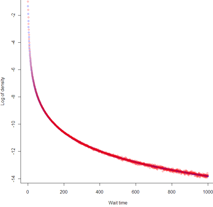
Looks like we nailed it, no? But wait, why are the blue points at the beginning of the curve in between the red points? That’s because we took the differences between points on the empirical CDF, so each density reading is really in-between the true pdf values. So far as Monte Carlo confirmation goes, it doesn’t get much better than this.

Introducing, the Unreliable Friend Distribution!
So far as I can tell, other than the hyperexponential, which is merely similar and more limited, this is a brand new distribution. Have you ever been waiting for someone, and the more they make you wait, the more you suspect they’ve forgotten about you completely? In that person’s honor, I’m calling this the Unreliable Friend Distribution (UFD).

As seems appropriate for such a distribution, the expected wait time for the UFD is infinite. Which means that no matter how late your unreliable friend shows up, you should be grateful that he came early.

The code:

# Code by Matt Asher for StatisticsBlog.com
# Feel free to modify and redistribute, but please keep this header

set.seed(943) #I remembered this time!

# Initial MC sampling
trials = 10^7
results = rexp(trials, runif(trials))

# Plot of liklihood curves for U based on waiting time
# colr = sample(colours(), 1000, replace=T)

lik = function(p, t){
	return((1 - p)^(t-1)*p)
}

# x-values to plot
p = seq(0,1,0.0001)

# Waiting times
t = 1:20

dataMatrix = matrix(nrow=length(t), ncol=length(p))

for(i in t) {
	dataMatrix[i,]=lik(p,rep(i+1,length(p)))
}

plot(p, dataMatrix[1,], col=colr[1], pch=".", cex=3, bty="n" )

for(i in 2:max(t)) {
	points(p, dataMatrix[i,], col=colr[i], pch=".", cex=3)
}

# Let's standardize the area of each curve
standardMatrix = dataMatrix/rowSums(dataMatrix)

plot(p, standardMatrix[1,], col=colr[1], pch=".", cex=3, bty="n", ylim=c(0,max(standardMatrix)))

for(i in 2:max(t)) {
	points(p, standardMatrix[i,], col=colr[i], pch=".", cex=3)
}

# Find wait time curves conditional on having waited t minutes

# We need tail probabilities, let's find them!
t = 0:1000
tailP = rep(0,max(t))
for(i in t) {
	tailP[(1+i)] = length(results[results>i])/trials
}

show = seq(1,25,1) 

# Blank Plot
plot(0,0,col="white", xlim = c(0,2*max(show)), ylim = c(0, 1), ylab="Probability that your friend will have shown up", xlab="Time")

for(i in show) {
	# Normalizing the probabilies so that tailP[i] = 1
	tmp = tailP[(i+1):(max(t)+1)]
	tmp = tmp * 1/tmp[1]
	tmp = 1-tmp
	
	print(length(tmp[tmp<.5]))
	
	# par(new = TRUE)
	lines(i:(max(t)), tmp, col=sample(colours(), 1), lwd=3)
	
	
	# Find the index of the closest tmp to tmp[i]
	xloc = which.min(abs(tmp[i] - tmp))
	
	# Put a point where we cross time 2t on the curve
	points(i+xloc-1, tmp[i], pch=4, col="black", cex=2, lwd=3)

}


plot(0,0,col="white", xlim = c(0,100), ylim = c(0, 0.25))

t = 1:20

tmp = results[resultsi]), xlim = c(0,100), ylim = c(0, 0.25), col=colr[i], cex=3)
}

tpdf = function(x) {
	toReturn = (-x*exp(-x)+1-exp(-x))/x^2
    return(toReturn)
}

tF = function(x) {
	toReturn = (exp(-x) + x - 1)/x
	return(toReturn)
}

lengths = rep(0,1000)
for(i in 0:1000) {
    lengths[(i+1)] = length(results[results>i])
}

empericalF = 1 - (lengths/trials)
empericalf = diff(empericalF)

# Because this the the perfect size for the dots!
plot(log(tpdf(1:1000)), col=rgb(0,0,1,.2), pch=20, cex=1.3728, xlab="Wait time", ylab="Log of density")
points(log(empericalf), col=rgb(1,0,0,.2), pch=20, cex=1.3728)

21
May 13

What are the chances this headline will still be true in 10 years?

In this post I’ll be discussing the ideas presented in The Half-Life of Facts, by Samuel Arbesman. The book argues that facts, which we often take to be iron-clad, unchanging laws of the universe, are regularly discovered to be false or replaced by updated versions. He argues that while it’s impossible to predict in advance how long a particular fact will endure, in aggregate truth values decay at stable rates. In effect, Arbesman is proposing a kind of Law of Large Numbers for belief.

Arebesman’s thesis, I should say right up front, is highly appealing to me. It fits my belief that all facts are, to some extent, fuzzy, uncertain, contingent, and most importantly prone to revision over time as new information comes in. Of course, some facts, or categories of facts, are more likely to be revised than others. What I hoped to get from Arbesman’s book was a deep analysis of why some facts (or fictions) last longer than others, and how you might quantify different categories of facts from the viewpoint of survival analysis.

What are facts?
Arbesman defines facts as “individual states of knowledge awareness.” His main way of subdividing facts is on the basis of how quickly they change, from those constantly in flux (the current weather) to the very stable (the number of continents). In between are what Arbesman calls “mesofacts,” those which change at an intermediate timescale. Most of our scientific knowledge fits in this category.

When I mentioned the continents, you may have wondered whether I was referring to the number of huge landmasses on earth (a slow-changing fact, by any measure), or what we consider to be a continent. For example, if scientists decide that Madagascar or Baffin Island should be called a continent, the quantity of large land-masses on earth hasn’t changed.

Brawndo, the thirst mutilator!
This may seem like an obvious distinction, but it’s one that Arbesman fails to make. He conflates facts about the earth with nomenclature, confusing words with objects. The worst example of this confusion occurs in the chapter on how facts spread. Arbesman explains how we came to use the word “brontosaurous” for what, by scientific convention, should be called “apatosaurus”, as this name came first. Here the “fact” that changed doesn’t really have anything to do with the nature of dinosaurs, it has to do with the name we’ve decided to give it (which is, of course, a matter of convention, and arbitrary). To Arbesman, though, this issue of nomenclature becomes an “erroneous” fact which has “sadly” persisted for way to long.

The conflation of semantics and understanding allows Arbesman to hide a normative decree in a linguistic assessment. If my explanation of the confusion between the descriptive and prescriptive is, itself, confusing, consider Mike Judge’s wonderful illustration from the film Idiocracy. The main character tries to explain to the people of the future that their plants are dying because they are being irrigated with Brawndo, a sport drink. Here’s how their conversation goes:

Arbesman’s failure to draw a line around what are facts, and what aren’t, leads to even deeper confusions. Making this distinction clear would be, no doubt, a very difficult task. But instead of attempting it, and risking falling into “an epistemological rabbit hole,” Arbesman’s shrugs and paraphrases the supremely weasely Supreme Court Justice Potter, who said that no precise, legal definition of pornography was needed, because “I know it when I see it.”

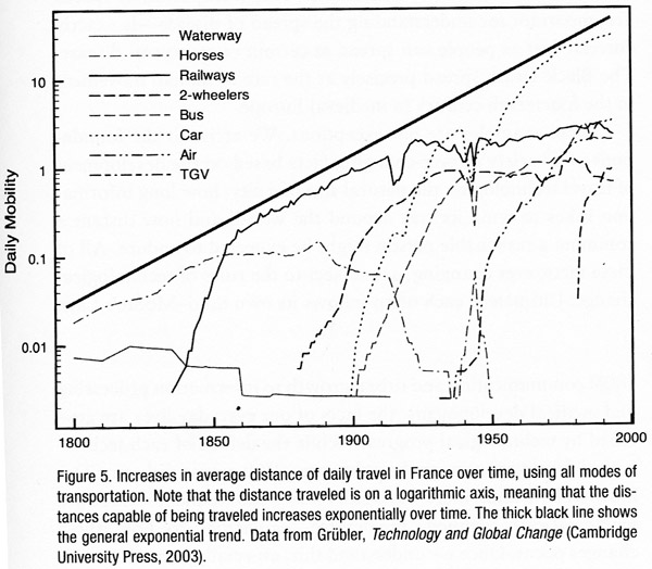
Without a line (however fuzzy) drawn around his subject, Arbesman quickly wanders off from an insightful discussion of the decay rate of information in physics, medicine and scientific models in general, to a broad discussion of the things in our world that change. This transition is completed in the chapter titled “Moore’s law of everything,” in which Arbesman compares exponential growth in computing power to other technologies with accelerating levels of change, like transportation. At this point it’s no longer clear which are the facts under consideration. Is it the maximum number of transistors per chip? Is it our model of how technology changes? Or is it the rate of change of change itself?

Is change a constant?
This last question might be the most interesting one of all. More clearly stated, what is the derivative of the half-life of facts, for a given category? And even one more step beyond, are these derivatives themselves stable? I want to know what the evidence says. Are medical facts becoming obsolete faster than ever? Has our knowledge about basic physical concepts like inertia begun to solidify? Arbesman hints at these questions, but just barely. I was very disappointed by his lack of rigor and quantification. Perhaps this field of study still needs it’s Darwin or John Graunt, someone willing to spend years or decades compiling and analyzing the minutia how facts change, before coming up with a well-informed model of truth decay.

My own suspicion? The stability of a fact is proportional to how well the related field of study is established, and to how long that particular fact has been considered valid. Thus the lifespan of facts would be Weibull distributed, or have some variant of the Unreliable Friend distribution (more about that in a future post). Arbesman hints at this possibility when discussing the history of mathematical proof. He notes that the waiting time for a conjecture to be settled follows a heavy-tailed distribution, which makes it difficult to predict how much longer it will take for mathematicians to come to a conclusion about long-standing problems.

But even this attempt at a more nuanced view of half-lives hints at another problem with Arbesman’s incomplete taxonomy of facts, and his unwillingness to specify which facts we are discussing. In this case of mathematics, it seems at first that he might be referring to the underlying proposition itself. This leads me to wonder if Arbesman is positing (at least implicitly) a Schrödinger’s cat view of the mathematics, where Fermat’s Last Theorem (FLT) exists in a state of superposition, both true and false and indeterminate all at once, waiting for Andrew Weil to come along to open the lid, peer into the box, and declare it “true.” Another interpretation is that the fact being discussed is the social phenomenon; mathematicians went from believing that FLT was probably true but definitely unproven, to believing that FLT was indisputably true. Based on his initial definition in terms of awareness, I assume it’s the later. Unfortunately, no clarification is forthcoming, and Arbesman misses out on an opportunity to comment on the two most interesting twists in the FLT saga, especially from the point of view of evaluating “facts”. For one, Weil made a crucial mistake in his first official version of the proof, and for the other, Weil’s proof depends on a newer, and somewhat controversial, mathematical assumption (the Axiom of Choice).

Chart from The Half-Life of Facts showing the increase in transportation speeds over time.

The depths of shallowness
I suppose there’s a limit to how much depth we can expect from a general interest book. Still, I’m disappointed that the author seems to explicitly avoids discussing the basic, hard puzzles of knowledge: How close to the (real?) truth are the “facts” we are learning today? What is the probability that these will be later found out to be untrue? Does that probability go to one on a long enough timeline, and to what extent can we quantify that timeline.

Instead of rigorous analysis, Arbesman fills out his short book by rehashing famous stories from well-known research papers (if I have to read about the gorilla on the basketball court one more time, I just might go apeshit). We do get occasional bits of insight, usually in the form of quotes, like Lord Kelvin’s insistence that anything that can be measured, can be measured incorrectly, or John M. Smith’s quip that “Statistics is the science that lets you do twenty experiments a year and publish one false result in Nature.”

This last quote refers to the p-value, which Arbesman does a decent job of explaining, though I’m not sure he fully understands it. He quotes John Ioannidis saying that, “If a study is small, it can yield a positive result more easily due to random chance.” However, the use of a fixed p-vale cutoff generally ensures that the exact oppose is true (see this delightfully humorous video about “The power of the test”). The structure of hypothesis testing can be tricky, but since Arbesman is described on the book jacket as an applied mathematician, I’m not willing to grade him on a curve.

There’s one other confusion in Arbesman’s book that I feel compelled to point out, since it may just be the most insidious (and common) epistemological mistake of all: the conflation of facts, predictions, and models. Arbesman mixes them all together in a short passage. In describing computer simulation of a social network, he says:

“When [the researchers] ran this experiment, they discovered that weak ties aren’t that important to spreading knowledge. While weak ties do in fact hold the network together, much as Granovetter suspected, they aren’t integral for spreading facts.”

Did you catch that? Arbesman went from describing a model (in this case a computer simulation) that generated a prediction (about the spread of information), to asserting a fact about our world (weak ties “aren’t integral for spreading facts”).

Am I just being annoying, noxious, always lingering?
Am I’m being overly fussy (to use the nicer word)? Am I too focused on precise definitions and picky distinctions, at the cost of missing the bigger picture? I don’t think so. The history of scientific progress, and in particular statistics, shows a strong correlation between linguistic and taxonomic advances. We can look back and see how progress is stifled by a lack of common, well-defined terms. For example, some of the early attempts to understand probability disintegrated into confused debates that could have been avoided with a clear stating of terms. More recently, E.T. Jaynes resolved Bertrand Russell’s paradox of the random chord by explicitly defining the characteristics a “random” chord would need to have.

If Arbesman is sloppy with the details, can he at least get credit for presenting the broader story in context? To some extent, I think so. As a general tour of how facts change, there’s no mistaking the basic message: facts do change, and we can be particularly blind (or caught off guard) when it comes to changes which happen at a medium pace. I wish, though, that Arbesman had explicitly connected this broader story with what is, to me, the central lesson: all of our beliefs should come with a measure of doubt!

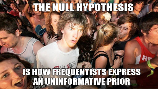
To understand this doubt mathematically, we use probability theory. To understand it in practice, we use a framework for statistical inference. There are a number of these frameworks available, each with its own strengths and weaknesses. Hume said we could never infer anything from anything, giving us a kind of historical “null hypothesis” of inference, one that’s been soundly rejected by the evidence of scientific and technological progress. Fisher and von Mises maintained that probability should be restricted to long term frequencies. Keynes and Jefferies spoke of subjective probabilities and degrees of rational belief. Jaynes viewed probability theory as an extension of logical deduction.

All modern approaches to inference share the assumption that knowledge is not static, and that empirical evidence provides partial information. Full certainty, to the extent that it exists at all, is to be found only in the very long run (mathematically speaking, at the infinite limit). As such, we need to recognize the provisional nature of all facts.


26
Apr 13

Manifesto addition: “N is always finite”

Added one more point to my manifesto:

“N” is always finite. Probability theory gives us many powerful limit theorems. These tell us what to expect, mathematically, as the number of trials goes to infinity. That fine, but we don’t live our lives at the limit. In the real world, asymptotics are much more important, as are non-parametric inference and tools like bootstrap to maximize the information extracted from small sample sizes. Even in those real life situations when N could increase without limit, the growth of the sample size itself can change the problem. Toss a die enough times and the edges will start to wear off, changing the frequency that each side comes up.

Had to add it after reading the phrase “if we let N go to infinity” one to many times.


18
Apr 13

Sudden clarity about the null hypothesis

Can’t take credit for this realization (I studied at an “Orthodox” shop), and the “Clarance” wishes to be anonymous, so send all karma points to your favorite (virtual) charity.


11
Apr 13

High Obesity levels found among fat-tailed distributions

In my never ending quest to find the perfect measure of tail fatness, I ran across this recent paper by Cooke, Nieboer, and Misiewicz. They created a measure called the “Obesity index.” Here’s how it works:

  • Step 1: Sample four times from a distribution. The sample points should be independent and identically distributed (did your mind just say “IID”?)
  • Step 2: Sort the points from lowest to highest (that’s right, order statistics)
  • Step 3: Test whether the sum of the smallest and greatest number is larger than the sum of the two middle.

The Obesity index is the probability that the sum of these end points is larger than the sum of the middle numbers. In mathy symbols:

[latex]Ob(X) = P (X_1 + X_4 > X_2 + X_3 | X_1 \leq X_2 \leq X_3 \leq X_4), X_i~IID[/latex]


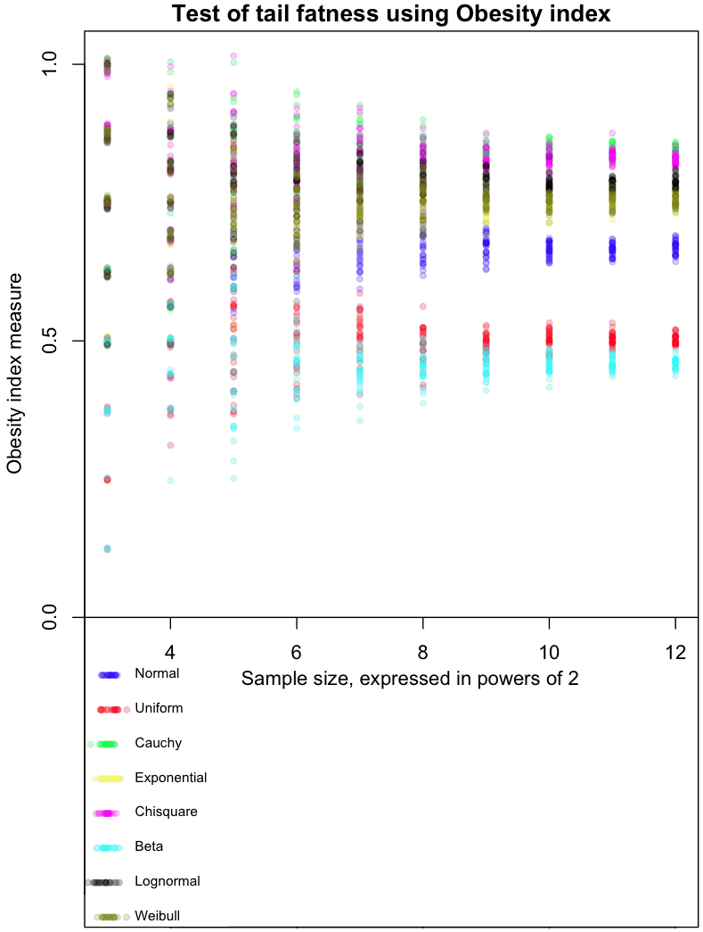
The graph at the top of this post shows how the Obesity index converges for different distributions. As always, I’ve included my R code at the end of this article, so you can run this simulation for yourself (though, as usual, I forgot to set a random seed so that you can run it exactly like I did).

The dots in the graph represent the mean results from 8, 16, 32, and so on, up to 4096 trials from each of the distributions I tested. Note that each trial involves taking 4 sample points. Confused? Think of it this way: each sample of 4 points gives us one Bernoulli trial from a single distribution, which returns a 0 or 1. Find the average result after doing 4096 of these trials, and you get one of the colored dots at the far right of the graph. For example, the red dots are averages from a Uniform distribution. The more trials you do, the closer results from the Uniform will cluster around 0.5, which is the “true” Obesity value for this distribution. The Uniform distribution is, not coincidentally, symmetric. For symmetric distributions like the Normal, we only consider positive values.

The graph gives a feel for how many trials would be needed to distinguish between different distributions based on their Obesity index. I’ve done it this way as part of my Grand Master Plan to map every possible distribution based on how it performs in a variety of tail indices. Apparently the Obesity index can be used to estimate quantiles; I haven’t done this yet.

My initial impressions of this measure (and these are very initial!) are mixed. With a large enough number of trials, it does a good job of ordering distributions in a way that seems intuitively correct. On the other hand, I’d like to see a greater distance between the Uniform and Beta(0.01, 0.01) distribution, as the latter is an extreme case of small tails.

Note that Obesity is invariant to scaling:

[latex]Ob(x) = Ob(k*X)[/latex]


but not to translations:

[latex]Ob(X) \neq Ob(X+c)[/latex]


This could be a bug or a feature, depending on what you want to use the index for.

Extra special karma points to the first person who comes up with a distribution whose Obesity index is between the Uniform and Normal, and that isn’t a variant of one I already tested.

Here’s the code:

# Code by Matt Asher for StatisticsBlog.com
# Feel free to redistribute, but please keep this notice

# Create random varaibles from the function named in the string
generateFromList = function(n, dist, ...) {
	match.fun(paste('r', dist, sep=''))(n, ...)
}

# Powers of 2 for testAt
testAt = 3:12
testAtSeq = 2^testAt
testsPerLevel = 30


distros = c()

distros[1] = 'generateFromList(4,"norm")'
distros[2] = 'generateFromList(4,"unif")'
distros[3] = 'generateFromList(4,"cauchy")'
distros[4] = 'generateFromList(4,"exp")'
distros[5] = 'generateFromList(4,"chisq",1)'
distros[6] = 'generateFromList(4,"beta",.01,.01)'
distros[7] = 'generateFromList(4,"lnorm")'
distros[8] = 'generateFromList(4,"weibull",1,1)'

# Gotta be a better way to do this.
dWords = c("Normal", "Uniform", "Cauchy", "Exponential", "Chisquare", "Beta", "Lognormal", "Weibull")

par(mar=c(4,5,1.5,.5))
plot(0,0,col="white",xlim=c(min(testAt),max(testAt)), ylim=c(-.5,1), xlab="Sample size, expressed in powers of 2", ylab="Obesity index measure", main="Test of tail fatness using Obesity index")

abline(h=0)

colorList = list()
colorList[[1]]=rgb(0,0,1,.2)
colorList[[2]]=rgb(1,0,0,.2)
colorList[[3]]=rgb(0,1,0,.2)
colorList[[4]]=rgb(1,1,0,.2)
colorList[[5]]=rgb(1,0,1,.2)
colorList[[6]]=rgb(0,1,1,.2)
colorList[[7]]=rgb(0,0,0,.2)
colorList[[8]]=rgb(.5,.5,0,.2)

# Create the legend
for(d in 1:length(distros)) {
	x = abs(rnorm(20,min(testAt),.1))
	y = rep(-d/16,20)
	points(x, y, col=colorList[[d]], pch=20)
	text(min(testAt)+.25, y[1], dWords[d], cex=.7, pos=4)

}


dCounter = 1
for(d in 1:length(distros)) {
	for(l in testAtSeq) {
		for(i in 1:testsPerLevel) {
			count = 0
			for(m in 1:l) {
		
				# Get the estimate at that level, plot it testsPerLevel times	
				x = sort(abs(eval(parse( text=distros[dCounter] ))))
				if ( (x[4]+x[1])>(x[2]+x[3]) ) {
					count = count + 1
				}
			}
			
			# Tiny bit of scatter added
			ratio = count/l
			points(log(l, base=2), ( ratio+rnorm(1,0,ratio/100)), col=colorList[[dCounter]], pch=20)
		}
	}
	
	dCounter = dCounter + 1
}


27
Mar 13

Minding the reality gap

Officially, unemployment in the US is declining. It’s fallen from a high of 9.1% a couple years ago, to 7.8% in recent months. This would be good news, if the official unemployment rate measured unemployment, in the everyday sense of the word. It doesn’t. The technical definition of “U3” unemployment, the most commonly reported figure, excludes people who’ve given up looking for work, those who’ve retired early due to market conditions, and workers so part time they clock in just one hour per week.

Most critically, unemployment excludes the 14 million American on disability benefits, a number which has quadrupled over the last 30 years. If you include just this one segment of the population in the official numbers, the unemployment rate would double. On Saturday, This American Life devoted their entire hour to an exploration of this statistic. Russ Robert’s, who’s podcast I’ve recommend in the past, discussed the same topic last year. Despite the magnitude of the program and the scale of the change, these are the only outlets I know of to report on the disability number, and on the implications it has for how we interpret the decline in U3 unemployment.

Targeting the number, not the reality
Statistics, in the sense of numerical estimates, are measures which attempt to condense the complex world of millions of people into a single data point. Honest statistics come with margins of error (the most honest indicate, at least qualitatively, a margin of error for their margin of error). But even the best statistical measures are merely symptoms of some underlying reality; they reflect some aspect of the reality as accurately as possible. The danger with repeated presentations of any statistic (as in the quarterly, monthly, and even hourly reporting of GDP, unemployment, and Dow Jones averages), is that we start to focus on this number by itself, regardless of the reality it was created to represent. It’s as if the patient has a high fever and all anyone talks about is what the thermometer says. Eventually the focus becomes, “How do we get the thermometer reading down?” All manner of effort goes into reducing the reading, irrespective of the short, and certainly long-term, health of the patient. When politicians speak about targeting unemployment figures, this is what they mean, quite literally. Their goal is to bring down the rate that gets reported by the Bureau of Labor Statistics, the number discussed on television and in every mainstream source of media.

Politicians focus on high profile metrics, and not the underlying realities, because the bigger and more complicated the system, the easier it is to tweak the method of measurement or its numeric output, relative to the difficulty of fixing the system itself. Instead of creating conditions which allow for growth in employment (which would likely require a reduction in politicians’ legislative and financial powers), the US has quietly moved a huge segment of its population off welfare, which counts against unemployment, and into disability and prisons — the incarcerated also don’t count in U3, whether they are slaving away behind bars or not.

How metrics go bad
Over time, all social metrics diverge from the reality they were created to reflect. Sometimes this is the result of a natural drift in the underlying conditions; the metric no longer captures the same information it had in the past, or no longer represents the broad segment of society it once did. For example, the number of physical letters delivered by the postal service no longer tracks the level of communication between citizens.

Statistics and the reality they were designed to represent are also forced apart through deliberate manipulation. Official unemployment figures are just one example of an aggressively targeted/manipulated metric. Another widely abused figure is the official inflation rate, or core Consumer Price Index. This measure excludes food and energy prices, for the stated reason that they are highly volatile. Of course, these commodities represent a significant fraction of nearly everyone’s budget, and their prices can be a leading indicator of inflation. The CPI also uses a complex formula to calculate “hedonics,” which mark down reported prices based on how much better the new version of a product is compared to the old one (do a search for “let them eat iPads”).

I don’t see it as a coincidence that unemployment and inflation figures are among the most widely reported and the most actively manipulated. In fact, I take the following to be an empirical trend so strong I’m willing to call it a law: the greater the visibility of a metric, the more money and careers riding on it, the higher the likelihood it will be “targeted.” In this light, the great scandal related to manipulation of LIBOR, a number which serves as pivot point for trillions of dollars in contracts, is that the figure was assumed to be accurate to begin with.

Often the very credibility of the metric, built up over time by its integrity and ability to reflect an essential feature of the underlying reality, is cashed in by those who manipulate it. Such was the case with the credit ratings agencies: after a long run of prudent assessments, they relaxed their standards for evaluating mortgage bundles, cashing in on the windfall profits generated by the housing bubble.

Why we don’t see the gaps
It might seem like the disconnect between a statistic and reality would cause a dissonance that, once large enough to be clearly visible, would lead to reformulation of the statistic, bringing it back in line with the underlying fundamentals. Clearly there are natural pressures in that direction. For example, people laid off at the beginning of a recession are unlikely to believe that the recovery has begun until they themselves go back to work. Their skepticism of the unemployment figure erodes its credibility. Unfortunately, two powerful forces work against the re-alignment of metric and reality: the first related to momentum and our blindness to small changes, the second having to do with the effects of reflexivity and willful ignorance.

In terms of inertia, humans have a built-in tendency to believe that what has been will continue to be. More sharply, the longer a trend has continued, the longer we presume it will continue — if it hasn’t happened yet, how could it happen now? Laplace’s rule of succession is our best tool for estimating probabilities under the assumption of a constant generating process, one that spits out a stream of conditionally independent (exchangeable) data points. But the rule of succession fails utterly, at times spectacularly, when the underlying conditions change. And underlying conditions always change!

These changes, when they come slowly, pass under our radar. Humans are great at noticing large differences from one day to the next, but poor at detecting slow changes over long periods of time. Ever walked by an old store with an awning or sign that’s filthy and falling apart? You wonder how the store owner could fail to notice the problem, but there was never any one moment when it passed from shiny and new to old and decrepit. If you think you’d never be as blind as that shop keeper, look down at your keyboard right now. As with our environment, if the gap between statistic and reality changes slowly, over time, we may not see the changes. Meanwhile, historical use of the statistic lends weight to it’s credibility, reducing the chance that we’d notice or question the change — it has to be right, it’s what we’ve always used!

The perceived stability of slowly changing systems encourages participants to depend on or exploit it. This, in turn, can create long term instabilities as minor fluctuations trigger extreme reactions on the part of participants. Throughout the late 20th century and the first years of the 21st, a large number of investors participated in the “Carry Trade,” a scheme which depended on the long term stability of the Yen, and of the differential between borrowing rates in Japan and interest rates abroad. When conditions changed in 2008, investors “unwound” these trades at full speed, spiking volatility and encouraging even more traders to exit their positions as fast as they could.

These feedback loops are an example of reflexivity, the tendency in some complex systems for perception (everyone will panic and sell) to affect reality (everyone panics and sells). Reflexivity can turn statistical pronouncements into self-fulfilling prophecies, at least for a time. The belief that inflation is low, if widespread, can suppress inflation in and of itself! If I believe that the cash in my wallet and the deposits in my bank account will still be worth essentially the same amount tomorrow or in a year, then I’m less likely to rush out to exchange my currency for hard goods. Conversely, once it’s clear that my Bank of Zimbabwe Bearer Cheques have a steeply declining half-life of purchasing power, then I’m going to trade these paper notes for tangible goods as quickly as possible, nominal price be damned!

Don’t look down

If perception can shape reality, then does the gap between reality and statistic matter? Clearly, the people who benefit most from the status quo do their best to avoid looking down, lest they encourage others to do the same. More generally, though, can we keep going forward so long as we don’t look down, like Wile E. Coyote chasing the road runner off a cliff?

The clear empirical answer to that questions is: “Yes, at least for a while.” The key is that no one knows how long this while can last, nor is it clear what happens when the reckoning comes. Despite what ignorant commentators might have said ex post facto, by 2006 there was wide understanding that housing prices were becoming un-sustainably inflated. In 2008, US prices crashed back down to earth. North of the border, in Canada, the seemingly equally inflated housing market stumbled, shrugged, then continued along at more level, but still gravity-defying trajectory.

The high cost of maintaining the facade
Even as the pressures to close the gap grow along with its size, the larger the divergence between official numbers and reality, the greater the pressures to keep up the facade. If the fictional single entity we call “the economy” appears to be doing better, politicians get re-elected and consumers spend more money. When the music finally stops, so too will the gravy-train for a number of vested interests. So the day of reckoning just keeps getting worse and worse as more and more resources go into maintaining the illusion, into reassuring the public that nothing’s wrong, into extending, pretending, and even, if need be, shooting the messenger.

It’s not just politicians and corporations who become invested in hiding and ignoring the gap. We believe official statistics because we want to believe them, and we act as if we believe them because we believe that others believe them. We buy houses or stocks at inflated prices on the hope that someone else will buy them from us at an even more inflated price.

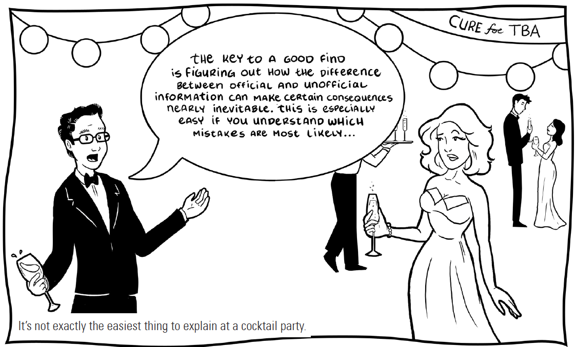
My (strong) belief is that most economic and political Black Swans are the result of mass delusion, based on our faith in the quality and meaning of prominently reported, endlessly repeated, officially sanctioned statistics. The illustration at the beginning of this post comes from a comic I authored about a character who makes his living off just this gap between official data and the reality on the ground, a gap that always closes, sooner or later, making some rich and toppling others.