feature


16
Jun 10

Five dumb arguments smart people make

When smart people make dumb arguments they tend to fall into one of a few categories. I’ve documented five of the most common bad arguments I see at websites where otherwise intelligent geeks, math nerds and skeptics hang out and discuss things. Chances are you’ve encountered at least one of these arguments, maybe you’ve even used one of them yourself.

#1: Occam’s razor

In simple terms, the idea of Occam’s razor is that, whenever possible, simple models are to be preferred. Note that Occam’s razor tells you absolutely nothing about whether a model or a theory is good or bad, useful or worthless. It’s is a rule of thumb. And while not necessarily a bad one, in practice it tends to act like intellect retardant to put out active minds who question existing (often simplistic), beliefs and scientific constructs.

Let me make this very clear: Occam’s razon doesn’t prove anything. In particular, and despite how it is commonly used, it doesn’t show that the more likely, or “simple”, explanation is the correct one. Unlikely, complicated things happen all the time. If you don’t believe this, go flip a coin a thousand times. I guarantee you that the exact result you get will only happen once in a godzillion tries. In terms of (absolute) likelihood, explaining what you just observed with probability theory and stochastic processes is way more complicated than the assertion “that’s what God wanted”, a theory which, if true, explains your effectively impossible result with 100% likelihood. I’m guessing that’s not the can of worms you hoped to open up with Occam’s razor?

#2: You’re a hypocrite.

Yes, and so are you. So what? Do I really need to explain why this agumentum-ad-hypocrisum (note, made-up Latin) is so bad? Given that accusations of hypocrisy are almost as popular as kittens in the blogosphere, I suspect I do. So here goes: showing that your opponent is a hypocrite proves nothing except that they are human. It doesn’t make their arguments wrong, and only weakens them under very limited circumstances, like when you catch a sworn bretharian sneaking a pint of Häagen Dazs to keep from starving to death. Beyond that, calling your opponent a hypocrite has less nutritional value than a peep.

#3: That’s just an anecdote. It doesn’t prove anything.


Repeat after me: Anecdotes are evidence. Nothing more, but certainly nothing less. In the context of a common event followed by another common event (I got a headache after stopping at three red lights in a row), anecdotal evidence is nearly useless. In terms of more rare events (I got kuru after eating my sister), anecdotal evidence can be extraordinarily powerful. Taken to its extreme, discounting anecdotal evidence led (presumably intelligent) academics to hold firm to fallacies like the idea that fireflies can’t flash all in unison, long after anecdotal evidence had come in from reliable observers.

#4: No known mechanism


There are lots of intelligent ways to argue that homeopathy doesn’t work. You can cite studies (although you may find that not all of them confirm your beliefs), or you can say that believers are the random subset of the people who have tried it and then afterwords felt an improvement. I’m not going to weigh in on the subject, except to note that one argument I see used fairly often is that homeopathy doesn’t work because it can’t work, and it can’t work because we don’t understand how it possibly could.

To see how bad this argument is you need to look at the assumptions behind it and view it in historical context. What people are really saying with this argument is: Our current scientific model is comprehensive and infallible. It accounts for all observations, and it has no holes or leaks. I’m going to assume that you are able to see the problem with this mindset yourself. I’ll just note that one particularly unfortunate use of this argument led doctors to reject hand washing before performing operations or delivering babies. After all, evidence that fastidious midwives had lower infection rates was purely anecdotal (see above), and there was no reason to believe cleanliness could make a difference in the pre-germ era. There was no known mechanism.

#5: Three guys with boards


I’m calling this the “three guys with boards” argument in honor of those skeptics who, whenever someone mentions crop circles, declare “it’s a hoax. Three guys with boards admitted they did it.” In fact, some guys with boards did indeed admit to creating a crop circle, and they showed us how they did it. So what’s wrong with this argument?

The problems is that you can’t discount all anomalous observations as “fakes” just because some are known to be fakes, nor does the possibility of faking an event mean that all such events must have been faked. Obviously, scientists don’t like playing games of intellectual wack-a-mole. If you research enough supposed “unexplained mysteries”, and come away convinced each time that the mystery is bogus, the tendency to dismiss other, similar claims outright is understandable. That said, “three guys with boards” is still a dumb argument, especially when you are going against claims of specific evidence that can’t be easily explained away as a hoax. For example, we have large, complicated, precisely implemented crop circles done in a short span of time and exhibiting strangely bent stalks. This evidence may fall far short of irrefutable proof of alien intervention, but it does require much more than dismissively stating that we know they are all fakes. We don’t.

More broadly, any attempt to automatically sort new observations into known categories (often categories that make us comfortable) is a bad idea. Unfortunately there are no shortcuts when it comes to evaluating data or evidence. It has to be done the hard way, one piece at a time.


14
Jun 10

Repulsive dots pattern, the difference of distance

What if you wanted to randomly place objects into a field, and the more objects you had, the more they rejected newcomers placed nearby? To find out, I setup a simulation. The code, shown at the end, isn’t all that interesting, and the plots shown below aren’t all that special. I think there is one interesting part of this, and that’s how the clustering changes depending on how distance is measured. One of the plots uses the traditional “L2″ distance, the other uses L1” (Manhattan taxi cab) measure . Each plot shown below has almost exactly the same number of dots (277 vs 279). Can you tell which uses L1 and which uses L2 just by looking?

Plot A:

Plot B:

Here’s the code. Run it and see for yourself. Make sure to change adjust the values which have comments next to them. Uncommenting “print(force)” can help you pack a maxRepulse value.

calcRepulse <- function(x,y,dots,use="L2") {
	force = 0
	i = 1
	while(i <= dim(dots)[1] && dots[i,1] != 0) {
		if(use == "L2") {
			force = force + 1/( (x-dots[i,1])^2 + (y-dots[i,2])^2 )
		} else if(use == "L1") {
			force = force + 1/( abs(x-dots[i,1]) + abs(y-dots[i,2]) )
		}
		i = i+1
	}
	# print(force)
	return(force)
}

par(bg="black")
par(mar=c(0,0,0,0))
plot(c(0,1),c(0,1),col="white",pch=".",xlim=c(0,1),ylim=c(0,1))

place = 1 #Maximum number of dots to place, change this to something bigger
dots = matrix(rep(0,place*2),ncol=2)
maxTries = place * 10
maxRepulse = 1 # Anything above this will be rejected as too repulsive a location
dist2use = "" # Pick L1 or L2

placed = 0
tries = 0


while(placed < place && tries < maxTries) {
	x = runif(1)
	y = runif(1)
	
	if(calcRepulse(x,y,dots,dist2use) < maxRepulse) {
		dots[(placed + 1),1] = x
		dots[(placed + 1),2] = y
		placed = placed + 1
		points(x,y,col="blue",pch=20)
	}

	tries = tries + 1
}

12
Jun 10

A different way to view probability densities

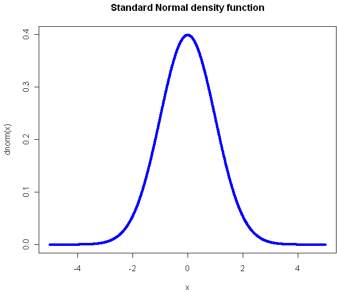
The standard, textbook way to represent a density function looks like this:

Perhaps you have seen this before? (Plot created in R, all source code from this post is included at the end). Not only will you find this plot in statistics books, you’ll also see it in medical texts, sociology, and even economics books. It gives you a clear view of how likely an observation is to fall in a particular range of [latex]x[/latex]. So what’s the problem?

The problem is that what usually concerns us isn’t probability in isolation. What matters is the impact that observations have on some other metric of importance, like the total or average. The key thing we want to know about a distribution is: What range of observations will contribute the most to our expected value, and in what way? We want a measure of influence.

Here’s the plot of the Cauchy density:

From this view, it doesn’t look all that different from the Normal. Sure it’s a little more narrow, with “fatter tails”, but no radical difference, right? Of course, the Cauchy is radically different from the normal distribution. Those slightly fatter tails give very little visual indication that the Cauchy is so extreme-valued that it has no expected value. Integrating to find the exception gives you infinity in both directions. If your distribution is like this, you’ve got problems and your plot should tell you that right away.

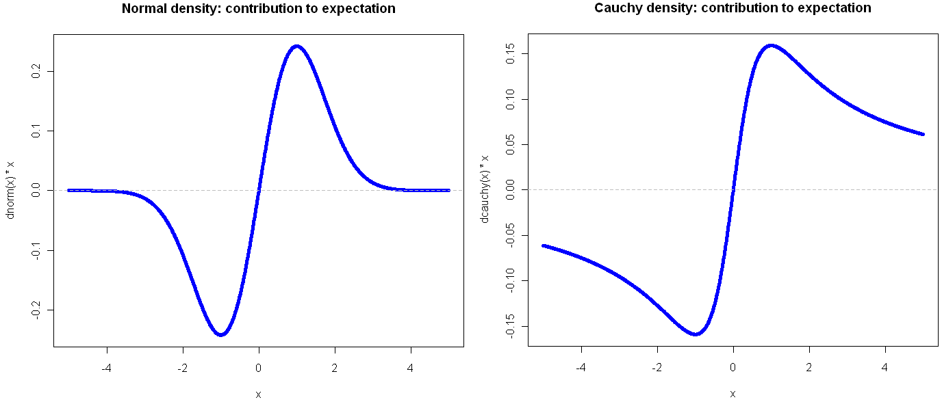
Here’s another way to visualize these two probability distributions:

Go ahead and click on the image above to see the full view. I’ll wait for you…

See? By plotting the density multiplied by the observation value on the y-axis, you get a very clear view of how the different ranges of the function effect the expectation. Looking at these, it should be obvious that the Cauchy is an entirely different beast. In the normal distribution, extreme values are so rare as to be irrelevant. This is why researchers like to find ways to treat their sample as normally distributed: a small sample gives enough information to tell the whole story. But if your life (or livelihood) depends on a sum or total amount, you’re probably best off plotting your (empirical) density in the way shown above.

Another bit of insight from this view is that the greatest contribution to the expectation comes at 1 and -1, which in the case of the Normal isn’t the mean, but rather the second central moment (plus or minus). That’s not a coincidence, but it’s also not always the case, as we shall see. But first, what do things look like when a distribution gets completely out of hand?

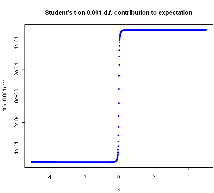
The Student’s t distribution, on 1 Degree of Freedom , is identical to the Cauchy. But why stop at a single DF? You can go all the way down to the smallest (positive) fraction.

The closer you get to zero, the flatter the curve gets. Can we ever flatten it out completely? Not for a continuous distribution with support over an infinite range. Why not? Because in order for the slope of [latex]value * density[/latex] to continue to flatline it indefinitely, the density function would have to be some multiple of [latex]\frac{1}{x}[/latex], and of course the area under this function diverges as we go to infinity, and densities are supposed to integrate to 1, not infinity, right?

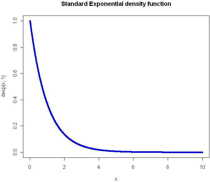
What would the plot look like for a continuous function that extends to infinity in just one direction? Here’s the regular Exponential(1) density function plot:

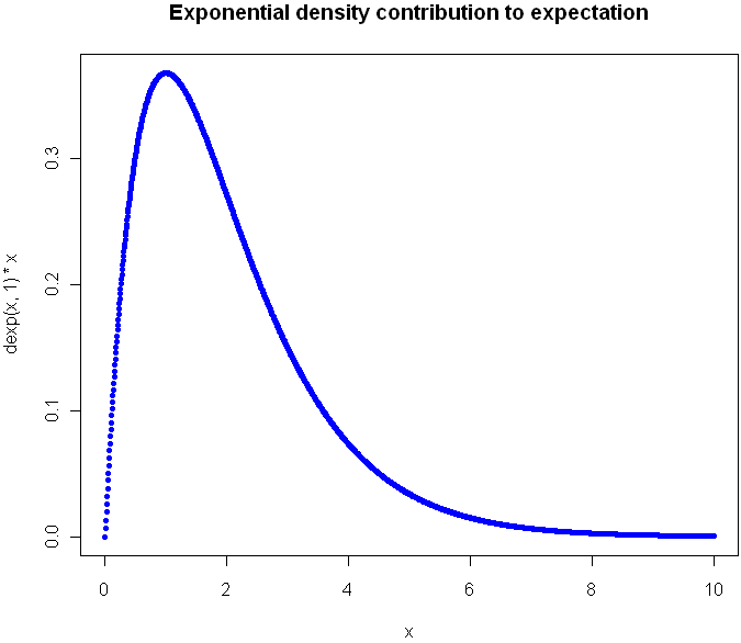
Now look at the plot showing contribution to expectation:

Were you guessing it would peak at 1?  Again, the expectation plot provides insight into which ranges of the distribution will have the greatest impact on our aggregate values.

Before I go look at an a discrete distribution, try to picture what the expectation curve would look like for the standard [latex]Uniform(0,1)[/latex] distribution. Did you picture a diagonal line?

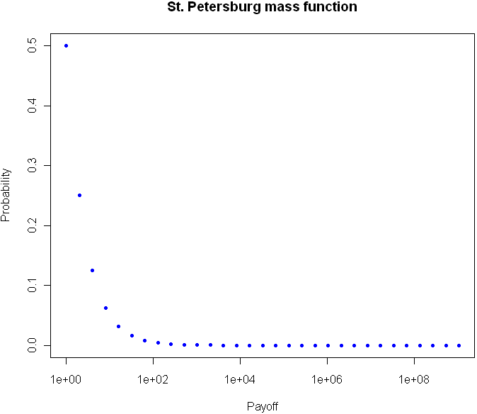
Can we flatten things out completely with an infinitely-supported discrete distribution? Perhaps you’ve heard of the St. Petersburg Paradox. It’s a gambling game that works like this: you flip a coin until tails comes up. If you see one head before a tails, you get $1. For 2 heads you get $2, for 3 heads $4, and so on. The payoff doubles each time, and the chances of reaching the next payoff are halved. The paradox is that even though the vast majority of your winnings will be quite modest, your expectation is infinite.  The regular view of the probability mass function for provides almost no insight:

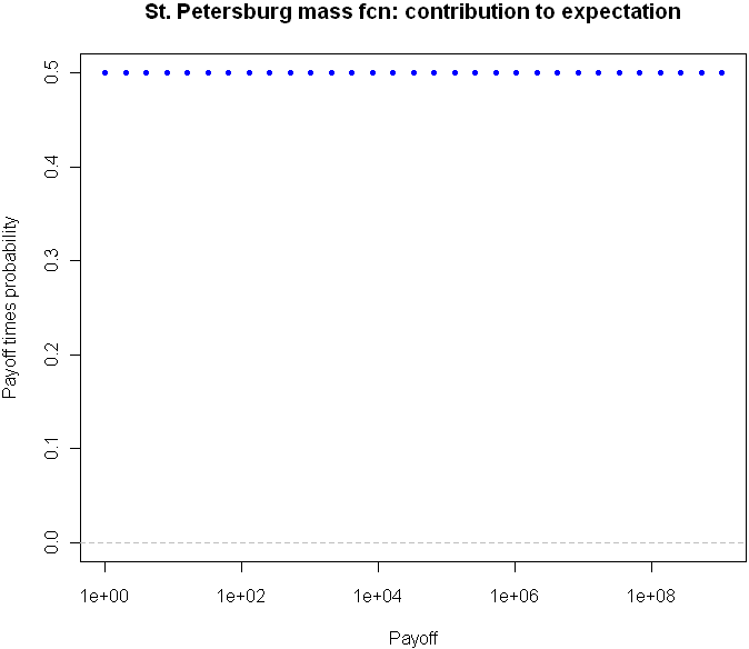
But take a look at the expectation plot:

Flat as a Nebraska wheat field. You can tell right away that something unusual is happening here.

I could go on with more examples, but hopefully you are beginning to see the value in this type of plot. Here is the code, feel free to experiment with other distributions as well.

# Useful way to make dots look like a line
x = seq(-5,5,length=1500)

# You've seen this before. Our good friend the Normal
plot(x,dnorm(x),pch=20,col="blue", main="Standard Normal density function")

# Cauchy looks a little different, but it's not obvious how different it is 
plot(x,dcauchy(x),pch=20,col="blue", main="Cauchy density function")

# New way of plotting the same
plot(x,dnorm(x)*x,pch=20,col="blue", main="Normal density: contribution to expectation")
abline(h=0,lty="dashed",col="gray")

plot(x,dcauchy(x)*x,pch=20,col="blue", main="Cauchy density: contribution to expectation")
abline(h=0,lty="dashed",col="gray")

# Extreme student-t action:
plot(x,dt(x,0.001)*x,pch=20,col="blue", main="Student's t on 0.001 d.f. contribution to expectation")
abline(h=0,lty="dashed",col="gray")


# The Exponential
x = seq(0,10,length=1500)
plot(x,dexp(x,1),pch=20,col="blue", main="Standard Exponential density function")

# The expectation view:
plot(x,dexp(x,1)*x,pch=20,col="blue", main="Exponential mass contribution to expectation")

# What do we see with the St. Petersburg Paradox
x = 2^(0:30)
dStPete <- function(x) {
	return (1/(2*x))
}

# Note the log
plot(x,dStPete(x),pch=20,col="blue", main="St. Petersburg mass function", log="x", xlab="Payoff", ylab="Probability",ylim=c(0,.5))

# Now we see the light
plot(x,dStPete(x)*x,pch=20,col="blue", main="St. Petersburg mass fcn: contribution to expectation", xlab="Payoff", log="x", ylab="Payoff times probability",ylim=c(0,.5))
abline(h=0,lty="dashed",col="gray")

2
Jun 10

It’s your move

I’m thinking of two numbers between 0 and 1. Your goal is to guess a number which falls in between my two numbers. Each guess costs you $1, and if you guess correctly you win the reciprocal of the length of my range (ie if I am thinking of 0.2 and 0.4, a correct guess wins you $5). At any time you may request that I choose of a new pair of numbers, and of course I will pick a new pair of numbers whenever you win.

What’s your strategy? Under certain conditions, this game is fair. How might you be able to have a positive expectation?


31
May 10

Betting on Pi

I was reading over at math-blog.com about a concept called numeri ritardatari. This sounds a lot like “retarded numbers” in Italian, but apparently “retarded” here is used in the sense of “late” or “behind” and not in the short bus sense. I barely scanned the page, but I think I got the gist of it: You can make money by betting on numbers which are late, ie numbers that haven’t shown up in a while. After all, if the numbers in a lottery or casino are really random, that means it’s highly unlikely that any one number would go a long time without appearing. The “later” the number, the more likely it is to appear. Makes sense, right?

Before plunking down my hard(ly) earned cash at a casino, I decided to test out the theory first with the prototypical random number: Pi. Legend has it that casinos once used digits from Pi to generate their winning numbers. Legend also has it that the digits of Pi are so random that they each appear with almost exactly 1 in 10 frequency. So, given this prior knowledge that people believe Pi to be random, with uniform distribution of digits and no discernible pattern, I can conclude that no one digit should go too long without appearing.

I pulled down the first 10 million digits from here (warning, if you really want this data, right click the link and “save as”). Then I coded up a program in the computer language R to scan through the digits of Pi, one by one, making a series of “fair” bets (1:9 odds) that the next number to appear in the sequence would be the one that had gone longest without appearing. My code is shown below. I had to truncate the data to 1 million digits, and even then this code will take your Cray a good while to process, most likely because I have yet to master the use of R’s faster “apply” functions with complicated loops.

myPi = readLines("pi-10million.txt")[1]

# I think this is how I managed to get Pi into a vector, it wasn't easy.
piVector = unlist(strsplit(myPi,""))
piVector = unlist(lapply(piVector,as.numeric))

# In honor of Goofy Programming Day, I will
# track how long since the last time each digit appeared
# by how many repetitions of that digit are in a vector
ages = c()

# Start us off with nothing in the bank
potHistory = c()

# R just loves long loops like this. Hope you have a fast computer
for(i in 1:1000000) {
	# How did our bet do last round?
	# Skip the first 100 just to build up some data
	if(i > 100) {
		if(betOn == piVector[i]) {
			potHistory = c(potHistory, 9)
		} else {
			potHistory = c(potHistory, -1)
		}
	}

	# Increase all ages by 1 by adding to vector, then set the one we found to 0
	ages = c(ages, 0:9)
	ages = ages[!ages == piVector[i]]

	# Count occurences of each digit, find the top digits by occurence to bet on
	# And you thought Perl was beautiful?
	betOn = as.numeric(names(sort(-table(ages)))[1])
}

# Plot the cumulative sum at 1000 point intervals.
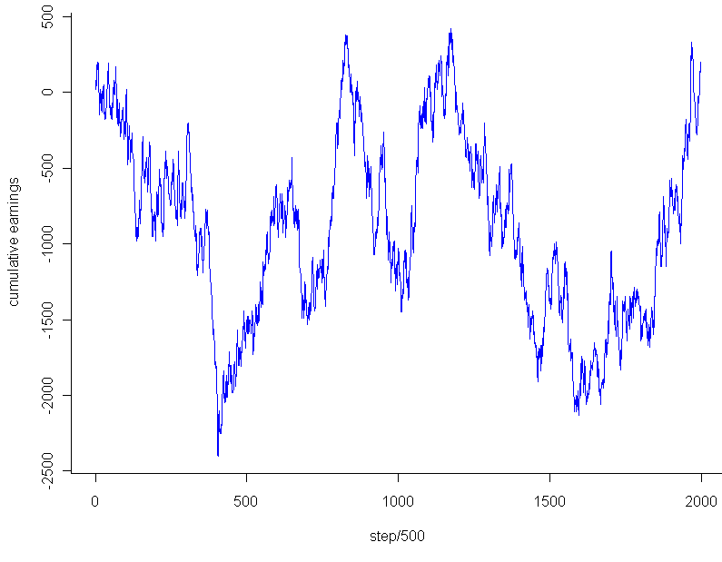
plot.ts(cumsum(potHistory)[seq(0,1000000,500)],pch=20,col="blue",xlab="step/500",ylab="cumulative earnings")

So what was the result? How good was my strategy? After an initial 100 digits to build up data about which digits were latest, I placed a total of 999,900 bets at $1 each. Final earnings: $180. That’s so close to breaking even that it’s almost inconceivable. I had 100,008 wins and 899,892 losses. My winning percentage was 10.0018% percent.

On the face of it, this result seemed almost a little too good, dare I say even suspiciously good, if you know what I mean. How rare is it to get this close (or closer) to the exact perfect proportions after so many trials? Assuming that the number of wins followed a binomial distribution with [latex]p=0.1[/latex], my total wins should follow a Normal distribution with mean 99,990 and variance [latex]n*p*(1-p) = 89,991[/latex] (for an “n” of almost a million and non-minuscule “p”, the Normal approximation to the Binomial should be essentially perfect). Taking the square root of the result, and we get almost exactly 300 as our standard deviation. That’s much larger than the 18 extra wins I had. In fact, the chances that you will land within [latex]18/300 = 0.06[/latex] standard deviations on either side of the Normal’s mean are less than 5%. Before getting too worked up over this result, I decided to take a look at the graph. Using the code:

plot.ts(cumsum(potHistory)[seq(0,1000000,500)],pch=20,col="blue",xlab="step/500",ylab="cumulative earnings")

I got this:

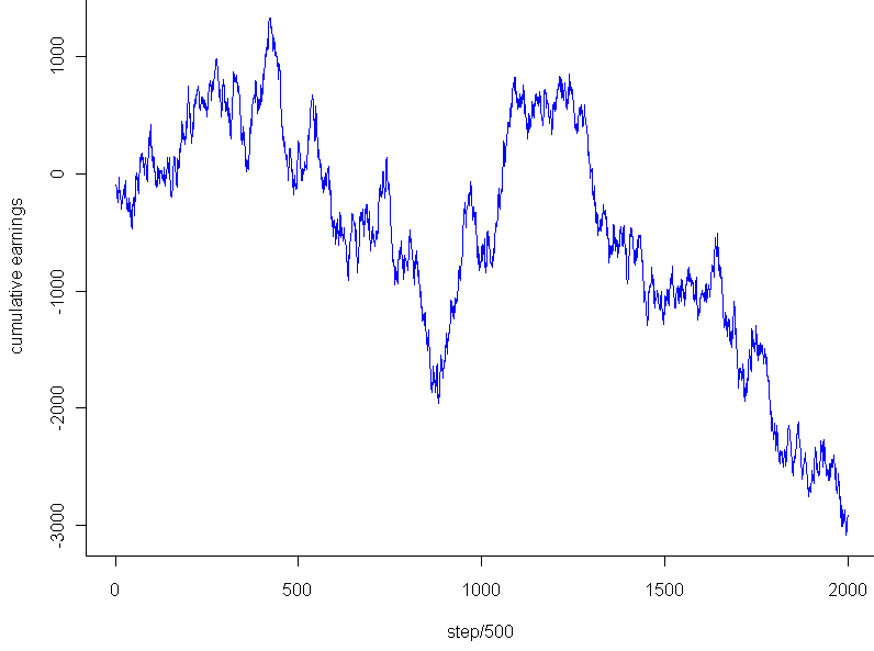
The graph looks pretty much like any random walk, doesn’t it? So the fact that I ended up breaking almost exactly even had to do with the stopping point, not any “unusual” regularity. Just to see if I might salvage any mystery, I tested the very lowest point, -$2,453, which occurred after 202,133 trails. Even that falls within 2 standard deviations of the expected mean for that number of trials, and of course cherry picking the most extreme point to stop at isn’t a fair way to go about this. Any last hope that the graph might be unusual? I plotted a couple random walks using numbers generated in R. Most of them looked like this:

This looks to have the same level of “jaggedness” as  the results of my bet on Pi. Unfortunately, I am forced to conclude that the promising strategy of “late number” gambling turned out to be fairly retarded after all, at least so far as it applies to the digits of Pi.


29
May 10

Weekend art in R (part 1?)


As usual click on the image for a full-size version. Code:

par(bg="black")
par(mar=c(0,0,0,0))
plot(c(0,1),c(0,1),col="white",pch=".",xlim=c(0,1),ylim=c(0,1))
iters = 500
for(i in 1:iters) {
	center = runif(2)
	size = rbeta(2,1,50)

	# Let's create random HTML-style colors
	color = sample(c(0:9,"A","B","C","D","E","F"),12,replace=T)
	fill = paste("#", paste(color[1:6],collapse=""),sep="")
	brdr = paste("#", paste(color[7:12],collapse=""),sep="")

	rect(center[1]-size[1], center[2]-size[2], center[1]+size[1], center[2]+size[2], col=fill, border=brdr, density=NA, lwd=1.5)
}

28
May 10

R: More plotting fun with Poission

Coded as follows:

x = seq(.001,50,.001)
par(bg="black")
par(mar=c(0,0,0,0)) 
plot(x,sin(1/x)*rpois(length(x),x),pch=20,col="blue")

28
May 10

The guessing game in R (with a twist, of course)

Maybe you remember playing this one as a kid. If you are about my age, you may have even created a version of this game as one of your first computer programs. You guess a number, the computer tells you if you if you are too low or high. I’ve limited the number of maximum guesses, and randomized the computer’s choice based on the Poisson distribution (more on that later).

Here’s the code. This was part of my attempt to understand how R reads input from the command line. One of the things I learned: you may need to save this to a file and run it with “source()”, instead of running it directly from the console, line by line.

# Classic guessing game with twist
x = 0
gotRight = 0
failed = 0

# Initial lambda for our random var
correct = 2000
initial = correct

# How many guesses should we allow per number
maxGuesses = 7
	
while(x != Inf) {
	# The +1 part makes sure we never get zero, which would trigger 0's forever
	correct = rpois(1,correct) + 1
	
	# The advantage of using "cat" instead of "print" is that you remove those pesky quotation marks
	cat("I am thinking of a number between 1 and infinity. What is it? (Type Inf to quit)\n")
	
	# Solicit input from the user
	x = scan(n=1) # Just one item in this vector
	
	# Be nice and let the user quit. 
	if(x == Inf) {
		cat("The correct answer was", correct, "\n")
		cat("You got", gotRight, "right and failed", failed, "times. Maximum allowed guesses was", maxGuesses, "and initial lambda was", initial, ". Goodbye.\n")
		cat("Post your score to http://www.statisticsblog.com/2010/05/the-guessing-game-in-r-with-a-twist-of-course/#comments \n")
		break
	}
	
	for(i in 1:maxGuesses) {
		if(x == correct) {
			print("You rock!")
			gotRight = gotRight + 1
			break
		} else {		
			if(i == maxGuesses) {
				cat("You ran out of guesses. I will pick a new random number based on the last one.\n")
				failed = failed + 1
			} else {
				if(x < correct) {
					cat("You are too low. Guess again.\n")
				} else {
					cat("You are too high. Guess again.\n")
				}
				
				x = scan(n=1)
			}			
		}
	}
}

Note 1: My code makes a couple uses of the aparently controversial "break" function. I can still recall a heated debate I had with a CS professor who believed that calling "break" (in Python) was as bad as crossing the streams of your Proton Pack. That said, I have sucessfully used it on several occasions now without any appearance by Stay Puft Marshmallow Man or changing the natural order between dogs and cats. In R, the biggest problem with using constructs like "break" and "while" is that, for reasons clear only to readers of this blog but not myself, if you ask R for help about either of these tokens using

?term

you get an sent an error or to purgatory, respectively.

Hint: Because the random guesses are Poisson based, using a "half the distance" strategy for guessing may not be the best way to go. The hardcore amongst yourselves might want to calculate the median of the expected value conditional on having guessed too low or high.

Note 2: The Poisson isn't a very good distribution for for this. Maybe you can find a better one, or at least jack up the dispersion like an overzealous offroader tweaking the suspension of his 4Runner.


26
May 10

Zone of instability

I woke up from my afternoon nap feeling a bit off-kilter, so I decided to go for another random walk. In particular, I wanted a journey that avoided the center, but didn’t just run for an exit either. After playing around for a while I came up with this:

# Take a wacky walk, return the final "track" steps
wackyWalk <- function(iters, track=iters) {
	locations = c()
	mean2use = 0
	sd2use = 1

	for (i in 1:iters) {
		mean2use = rnorm(1,mean2use,sd2use) 

		# The farther from the center, the smaller the variance
		sd2use = abs(1/mean2use)
		if(track > (iters - i) ) {
	 		locations = c(locations, mean2use)
	 	}
	}
	return(locations)
}

# How many steps to take
iters = 300
track = 300
locations = wackyWalk(iters,track)

# Start us off with a plot
plot(0,0,xlim=c(min(locations),max(locations)),ylim=c(0,iters),pch=20,col="white")

for (i in 1:track) {
	points(locations[i],i,pch=20,col="blue")

	# To create a pseudo animation, take a break between plotting points
	Sys.sleep(.10)
}

Basically, during each iteration the program samples from a normal distribution centered at the same location as the previous iteration, with standard deviation equal to the inverse of the previous location. So if the sequence is at 5, the next number will be sampled from the [latex]Normal(5, (\frac{1}5)^2)[/latex] distribution.

Run it a few times and you’ll see how the blue dot bounces around for a bit near 0, then shoots off to one side or the other, where it will most likely hang out for the rest of its life. There are a number of interesting questions about this sequence which, sadly, will remain unanswered. Among these are: For a given number of iterations, how many times is this sequence expected to cross zero? What is the maximum (or minimum) value the sequence is expected to obtain over a fixed number of iterations? Will the sequence ever diverge to some flavor of infinity?

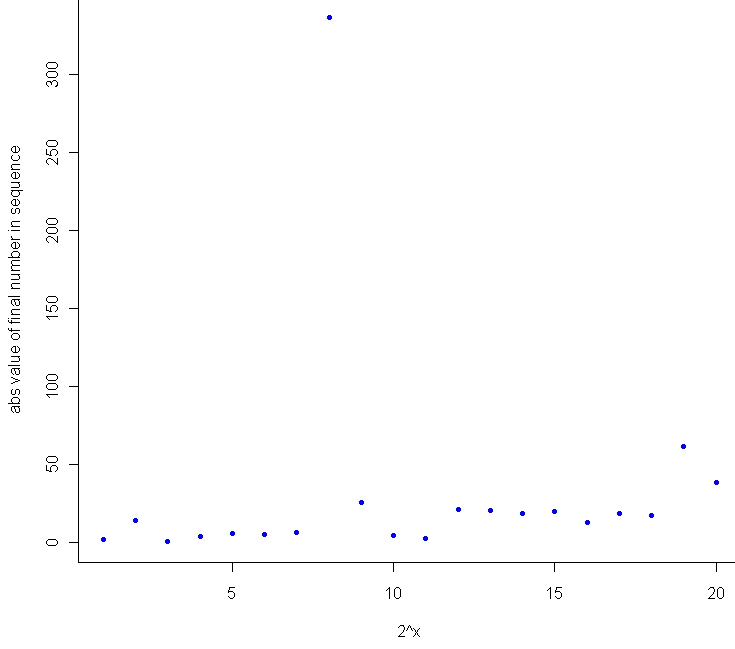
My hunch for this last question is to say no, since the normal distribution is thin-tailed, and the standard deviation is set to converge to 0 (slowly) as the value of the sequence gets larger and larger. At the same time, I suspect that the higher the number of iterations, the larger (in absolute terms) the final number in the sequence. This makes general sense, as the farther you get from 0, the harder it is to return to 0. During testing, I saw a lot of plots that wiggled back and forth, getting closer to the edges of the plot with each wiggle. Since I’m never content to just have a thought without actually testing it out, I plotted the final value in the sequence after [latex]2^x[/latex] iterations, where x went from 1 to 20. Here’s the result:

Sure enough, as a general trend, the more iterations you run, the farther you are from zero. It would have been interesting to see how the 8th trial ended up north of 300, but I only tracked the final result for these. I suspect that it made up most of the ground in a single leap while sampling from a Normal with extremely high variance (ie when the previous number was very close to 0).

Here’s the extra bit of code for comparing final location to number of iterations:

# How does the number of steps compare with distance from center
meta = c()
for (j in 1:20) {
	iters = 2^j
	track = 1
	meta = c(meta, wackyWalk(iters,track))
}

plot(1:20, abs(meta), pch=20, col="blue",xlab="2^x",ylab="abs value of final number in sequence")

These results, I should note, provide very little evidence that the sequence, if extended out to infinite length, will have to converge or diverge. Weird things happen when you start to consider random walks of infinite length, and the one sure limitation of Monte Carlo testing is that no matter how long let a computer simulation run, your PC will crash well before it performs an infinite number of calculations, and most likely before you finish your coffee.