- The R is my friend blog publishes a series of four articles on neural networks. This is probably one of the most comprehensive introductions to neural networks in R. If you are in love with neural nets and want to learn even more, here is another tutorial by Saptarsi Goswami.
- State-by-state media preferences as revealed by bit.ly.
- Andrew Gelman, Professor of Statistics and Political Sciences at Columbia University, discusses why Bing is preferred to Google by people who aren’t like him.
- Have you heard of Simpson’s Paradox? Here is an interactive visual (using the 1973 Berkeley sex discrimination lawsuit as an example) that explains the paradox in 60 seconds.
- Dan Delany does a visual breakdown of furloughed employees due to the U.S. government shutdown. The main view shows furloughed proportions by department, and there are real time tickers for duration, estimated unpaid salary, and estimated food vouchers unpaid.
- If there is an 82% chance an an event will occur within your life time (and assuming that you live for 70 years), what is the probability that this event will occur on any given day?
- Tableau, the popular interactive data visualization tool, is coming out with a new 8.1 update, and it will include integration with the R language. Learn how to integrate the two in just 30 seconds.
- A short (but not trivial) lesson on data smoothing using R.
14
Oct 13
The week in stats (Oct. 14th edition)
07
Oct 13
The week in stats (Oct. 7th edition)
- The picture above is a very well-known mathematical construction called the fractal cat. Brian Lee Yung Rowe shows how to construct fractal artworks using R.
- Arthur Charpentier of Freakonometrics explains how to construct ROC (
rate of changeReceiver Operating Characteristic) curves in R, as well as how to interpret and plot them. This is a useful for those in fields that frequently encounter longitudinal data, such as finance, engineering or biostatistics. - There are many kinds of intervals in statistics. To name a few of the common ones: confidence intervals, prediction intervals, credible intervals, and tolerance intervals. Each are useful and serve their own purpose. You should not only know their names, but also when to use them and why.
- A map of the most visited website for every country in the world (source: Alexa.com), as well as the internet population of each country.
- Suppose that you drop 5 blue marbles and 5 red marbles randomly (and uniformly) on the interval [0,1]. What is the probability that the marbles will interleave each other?
30
Sep 13
The week in stats (Sept. 30th edition)
- Given P(X = E(X)) = 1, does that mean Var(X) = 0?
- An interesting analysis of US high school graduation rates, conducted using R and googleVis.
- Do you have a unisex name? The following series of visuals tells us the most common unisex names in US history, and how the ratio of boys to girls changes over time.
- Most of us know what instrumental variables are (if not, here’s the Wikipedia page), but do you know what weak instruments are? The diffuseprior blog has a tutorial and tells you how to find them using R.
23
Sep 13
The week in stats (Sept. 23th edition)
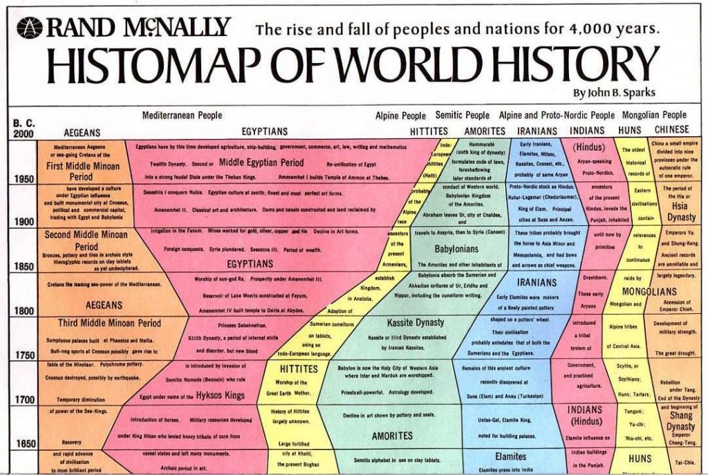
- The Histomap of World History illustrates the rise and fall of various empires and civilizations through an increasing time series up to present day (because the original image is too large, we include a truncated version here in post). Did you know that you can create these visuals in R? Here is how to do them.
- When we deal with time series modelling and forecasting, many people start with sophisticated models like the ARIMA or the GARCH. Rob Hyndman of Monash University suggests that when forecasting daily data, unless the the time series is very long, the easiest approach is to simply set the frequency attribute to 7. Then any of the usual time series forecasting methods should produce reasonable forecasts.
- Kaiser Fung, the owner of the popular statistics blog Junkcharts, interviews Andrew Gelman.
- OpenStreetMap is crowdsourced map project. Thousands of users log in each day, and help to improve the map by updating their neighborhood. Here is a visualization of this amazing social fabric of individuals working together. Every user is assigned different color, and their updates are represented on this map. Take a look at how many people have been mapping near you.
- A series of four articles by Charlie Kufs of statswithcats on How to Write Data Analysis Reports.
- What is the limiting distribution of a sum of weighted Gaussian?
16
Sep 13
The week in stats (Sept. 16th edition)
- This week, we found a number of useful webinars and presentations for statisticians and data scientists on R. Feel free to check out the following opportunities: Online course on forecasting using R by Prof. Hyndman of Monash University, Coursera’s free R courses, Why use R for Data Analysis by Vivek H. Patil of Gonzaga University, and two workshops on R by Bob Muenchen.
- If I roll five dice, what’s the chance that exactly two of the die show the same number?
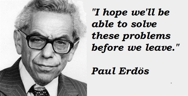
- Did you know that even famous mathematicians like Paul Erdős had a hard time believing the result of the Monty Hall Problem? It was a computer simulation that eventually convinced him. Here’s a simulation of the Monty Hall Problem, and my own take on the how the problem is often poorly presented.
- During the 2013 JSM (Joint Statistics Meetings) Conference in Montreal, Revolution Analytics conducted a survey of attendees from August 5 to August 8. The 865 respondents gave their opinions on the privacy and ethics related to data collection, and on their familiarity with statistical software used for the analysis of such data. Out of the 865 statisticians surveyed…

09
Sep 13
The week in stats (Sept. 9th edition)
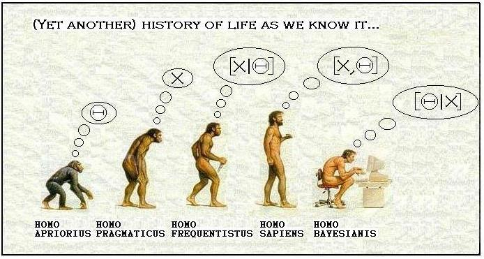
- Larry Wasserman, Professor at Carnegie Mellon University, is a graduate of University of Toronto, a COPSS Award winner, and a leading statistician in Bayesian analysis and inference. In this post, he discusses his views on the question Is Bayesian Inference a Religion?
- Two people will each spend 15 consecutive minutes in a bar between 12:00pm – 1:00pm. Assuming uniform and independent arrival times, what is the probability that they will have a chance to clink glasses?
- Have you ever wondered which statistical package gives the fastest computational speeds? This quick comparison of Julia, Python, R and pqR provides some guidence.
- An interesting analysis of the most popular porn searches in the US.
- A quiz for everyone in the data visualization industry: Identify at least three problems with this chart and explain what you can do to make it better.
- R user groups continue to thrive worldwide. Joseph Rickert from Revolution Analytics prepares the following compilation of the locations of 127 R user groups around the world.
02
Sep 13
The week in stats (Sept. 2nd edition)
- Do you have a Master’s degrees in Statistics? Is it worth your time to get one? Jerzy Wieczorek, mathematical statistician at the U.S. Census Bureau. discusses his thoughts on postgraduate educations for statistician.
- The Karpov vs. Kasparov rivalry holds a special place in the chess world. The duo, (arguably) the two best players ever in the history of this game, played 201 matches over almost 35 years. The following analysis (with R visualizations) show which one of the two Russians deserves to be the best of all chess players.
- One piece of advice for all of you who are in the data visualization industry: hate the default.
- In July of each year, Forbes, in partnership with the Center for College Affordability and Productivity (CCAP), produces a ranking of 650 universities in the US. Vivek H. Patil, Associate Professor of Marketing at Gonzaga University, provides some neat visuals on the Forbes University Ranking. I reviewed a book that had a wonderful chapter about all the ways that law schools cheat to improve their public rankings.
- A stick randomly breaks into 3 pieces, what is the probability that the 3 pieces can form a triangle?
- How do people die? A display of ranked causes of death, and how they’ve changed since 1990.
- If you work with time series data frequently, you should learn how to convert daily observations into weekly/monthly data in R.
26
Aug 13
The week in stats (Aug. 26th edition)
- Computing speed is often an important factor in assessing a programing language. In this post, Nathan Lemoine uses R and Python to calculate the bootstrapped confidence intervals for simulated linear regressions, and compares the computation times.
- We all know, from elementary calculus, that π is the ratio of the circumference of a circle to its diameter, and e is the base of the natural logarithm. But do you know why both of these constants appear in the density function of a normal distribution?
- Everyone (hopefully) knows how to import Excel spreadsheets into R, but do you know how you can save your R results directly as an Excel spreadsheet, with column names?
- If your chance of getting a parking ticket in one hour is 80%, what is the probability you’ll get a ticket in half an hour?
- One of the problems with Big Data is that large datasets are often proprietary and not accessible to the public. Joseph Rickert put togther a collection of some really nice big datasets that you can use to practice your R skills. They are all yours to experiment with.
- I have two children. One is a boy born on a Tuesday. What is the probability I have two boys?
- The Man Who Invented Modern Probability – the life story of Andrei Kolmogorov, by Slava Gerovitch of MIT.
19
Aug 13
The week in stats (Aug. 19th edition)
- Data science is emerging as a new, hot field, but is it really different from statistics? Wesley from statistical-research.com discusses why data science is more than just a title.
- Are you in the market research industry? If you ever run into incomplete data, here is how machine learning can help to fill in the gaps.
- This year, more than 6,000 people attended the Joint Statistical Meetings, the largest statistical meeting in the world. If you missed the 2013 JSM, this summary will bring you up to speed.
- Why an infinite number of monkeys (or even just one monkey!) will eventually crank out a complete play every bit as melodramatic as The Bard’s famous Hamlet.
- Egon Pearson (11 August 1895 – 12 June 1980) is one of the most prominent figures in the history of statistics. His most important contributions include the Neyman-Pearson (1933) theory of hypothesis testing, and promoting statistical methods in industry. However, most people fail to realize that Pearson’s contributions go well beyond hypothesis testing. Here are some early pioneering works of Pearson that have been neglected.
12
Aug 13
The week in stats (Aug. 12th edition)
- Thinking of starting a new business? Rodolfo Vanzini guides R users through the process of integrating Google maps with your own demographic data.
- Suppose you have n students each holding some number of eggs. There are two large baskets at the front of the room, one red and one blue. With some probability that varies by student, they will each put all of their eggs into one of the two baskets. What is the probability that the blue basket will have more eggs?
- Good news if you know R and you want a job.
- Follow the bouncing balls as they plot the ebbs and flows of coverage in Patrick Burns’ What I Learned From A Year Of Watching SportsCenter.
- Ever wanted to sit in on Google’s (no so) secret R training sessions? Here’s your chance with the online series Google Developers R Programming Video Lectures.
- Assume that the probability of getting a baby boy is 1/2 (and to be very clear and precise, the probability of getting a girl is also 1/2). If a family has 3 children, what is the probability that they have a) exactly one boy, and b) at most two girls?
- At this year’s JSM in Montreal, Nate Silver addresses the links between journalism and statistics by presenting 11 principles for journalists.
- Are you an iOS user? Do you love R? Here is a quick tutorial that shows you how to run R on your iPhone.


