stats


12
Jan 11

R: Attack of the hair-trigger bees?

In their book “Complex Adaptive Systems”, authors Miller and Page create a theoretic model for bee attacks, based on the real, flying, honey-making, photogenic stingers. Suppose the hive is threatened by some external creature. Some initial group of guard bees sense the danger and fly off to attack. As they go, they lay down a scent. Other bees join in the attack if their scent sensitivity threshold (SST) is reached. When they join the attack, they send out their own warning scent, perhaps triggering an even bigger attack. The authors make the point that if the colony of bees were homogeneous, and every single one had the same attack threshold, then if that threshold was above the initial attack number, then no one else would join in. If it were below, then everyone goes all at once. Fortunately for the bees, they are a motley lot, which is to say a lot more diverse than you would imagine just from looking at the things. As a result, they exhibit much more complicated behavior. The authors describe a model with 100 bees and call their attack threshold “R”. By assuming a heterogeneous population of 100 with thresholds all equal spaced, they note:

“In the hetrogeneous case, a full-scall attack ensues for [latex]R \geq 1[/latex]. This latter result is easy to see, because once at least one bee attacks, then the bee with threshold equal to one will join the fray, and this will trigger the bee with the next highest threshold to join in, and so on…. It is relatively difficult to get the homogeneous hive to react, while the hetrogeneous one is on a hair trigger. Without explicity incorporating the diversity of thresholds, it is difficult to make any kind of accurate prediction of how a given hive will behave.”

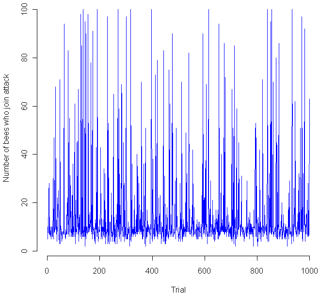
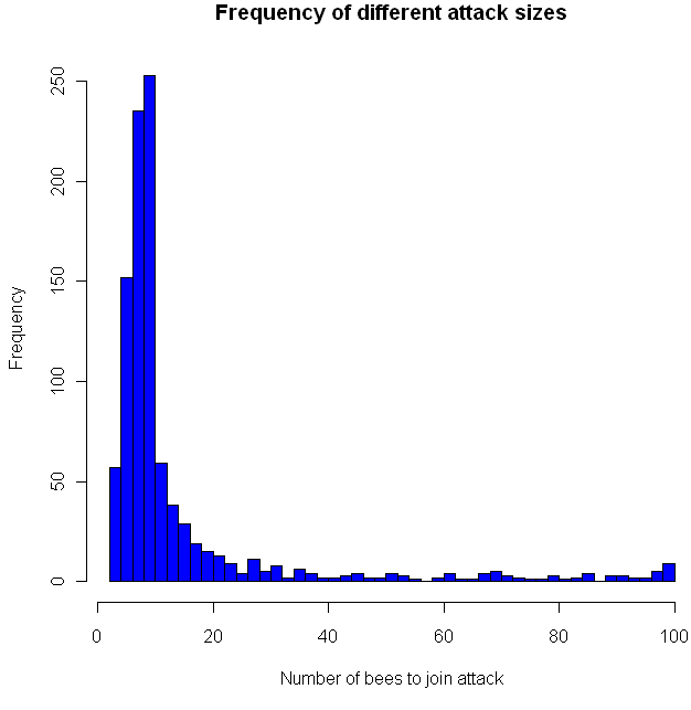
I think this last sentence is their way of noting that the exact distribution of sensitivities makes a huge difference in how the bees behave, which indeed it does. I decided to put the bees to the test, so I coded a simulation in the language R (code at the end of this post). I gave 100 virtual apis mellifera a random sensitivity level, chosen from a Uniform(1,100) distribution, then assumed 10 guards decided to attack. How would the others respond? Would a hair-trigger chain reaction occur? The chart at the top shows the results from 1000 trials. Looks pretty chaotic, so here’s a histogram of the results:

As you can see, most of the time the chain reaction dies out quickly, with no more than 20 new bees joining in the attack. However, occasionally the bees do go nuts, sending the full on attack. This happened about 1 percent of the time. Perhaps most interestingly, all of the other attack levels were clearly possible as well, in the flat zone from about 30 to 95. You might want to try playing with the distribution of the sensitivities and see if you get any other interesting distributions. Meanwhile, if you decide to raid a hive, make sure to dip yourself in mud first, that way the bees will think you are nothing but an innocent black rain cloud.

Code in R:

trials = 1000

go = rep(0,trials)
initial = 10

for(i in 1:trials) {
  bees = sort(runif(100,1,100))
  
  # Everyone who's threshold is less than the inital amount goes.
  going = length(bees[bees initial) {
    more = length(bees[bees going) {
    # Keep doing this until it stops
      going = more
      more = length(bees[bees
				

31
Dec 10

The year of the anti-model

Here’s how it used to work. You have a hypothesis, something you want to test. You go out, collect a mess of data, then start to build a model. The model is your key weapon for understanding the data. Is there a linear relationship? Fit a regression line. Does a particular variable have an impact on the results? Do t-test and find out. The goal is to make your models clear, interpretable, and above all concise. We all know the more parameters you add to a model, the closer you can get it match the data, whatever the data may be, so avoid the temptation to overfit at all costs. Overly complicated models tell you nothing.

Stick to the process above, and you can claim that your results show not just tendencies and correlations, but meaning. The models, properly tested and fit, offer understanding. Through the use of math and inductive logic, we are able to separate the word into signal and noise, “systematic” trends and “random” variation. Once complete, we know what we know (Gremlins are 87% more evil if you feed them after midnight), and we also know what we don’t know (23% of evil behavior in gremlins can’t be explained by violations of the three rules). As an added bonus, we get bounds for how well we know what we know, and how little we know about what we don’t know.

Models can be incredibly powerful tools, but perhaps their least understood property is how well they fool us into believing that fitting a line through points is the same things as understanding an underlying process.

In 2011 I’m going beyond the model. Instead of understanding, I’ll be striving for accuracy of prediction, or to optimize some profit/loss function related to the accuracy of prediction. Instead of trying to part the world into signal and noise — the part that can be understood, and the part that must be dealt with as inevitable “error” — I’m going to design a system that treats signal and noise as all one and the same. Instead of using math and algorithms to extract meaning, I’ll be using these tools to decrease the informational entropy of a stream of data. Data will be treated like a dense, tangled and interconnect forest, an entire ecology of information that cannot be split apart, and can only be “understood” by non-deterministic, evolutionary models which grow in complexity and inscrutability as quickly as their real-world counterparts. In my most well-read (and controversial!) post of 2010, I argued that Occam’s razor was the dumbest argument smart people made. In 2011, I’ll try to demonstrate the power of leaving behind the “simple is better” mentality once and for all.


29
Jun 10

Entropy augmentation the modulo way

Long before I had heard about the connection between entropy and probability theory, I knew about it from the physical sciences. This is most likely how you met it, too. You heard that entropy in the universe is always increasing, and, if you’re like me, that made very little sense. Then you may have heard that entropy is a measure of disorder: over times things fell apart. This makes a little more sense, especially to those teenagers tasked with cleaning their own rooms. Later on, perhaps you got a more precise, mathematical definition of entropy that still didn’t fully mesh with the world as we observe it. Here on earth, we see structures getting built up over time: plants convert raw energy to sunflowers, bees build honeycombs, humans build roads. Things do sometimes fall apart. More precisely, levels of complexity tend to grow incrementally over long periods of time, then collapse very quickly. This particular asymmetry seems to be an ironclad rule for our word, which I assume everyone understands, at least implicitly, though I can’t remember anywhere this rule is written down as such.

In the world of probability, entropy is a measure of unpredictability. Claude Shannon, who created the field of Information Theory, gave us an equation to measure how much, or little, is known about an incoming message a prori. If we know for sure exactly what the message will be, our entropy is 0. There is no uncertainty. If we don’t know anything about the outcome except that it will be one of a finite number of possibilities, we should assume uniform probability for any one of the outcomes. Uncertainty, and entropy, is maximized. The more you look into the intersection of entropy and statistics, the more you find surprising, yet somehow obvious in retrospect, connections. For example, among continuous distributions with fixed mean and standard deviation, the Normal distribution has maximal entropy. Surprised? Think about how quickly a sum of uniformly distributed random variables converges to the Normal distribution. Better yet, check it out for yourself:

n = 4
tally = rep(0,10000)
for(i in 1:n) {
	tally = tally + runif(10000)
}

hist(tally, breaks=50, col="blue")

Try increasing and decreasing “n” and see how quickly the bell curve begins to appear.

Lately I’ve been thinking about how to take any general distribution and increase the entropy. The method I like best involves chopping off the tails and “wrapping” these extreme values back around to the middle. Here’s the function I created:

smartMod <- function(x, mod) {
	sgn = sign(x)
	x = abs(x)
	x = x %% mod
	return(sgn * x)
}

Now is a perfect time to use a version of our “perfect sample” function:

perfect.sample <- function(dist, n, ...) {
	match.fun(paste('q', dist, sep=''))((1:n) / (n+1), ...)
}

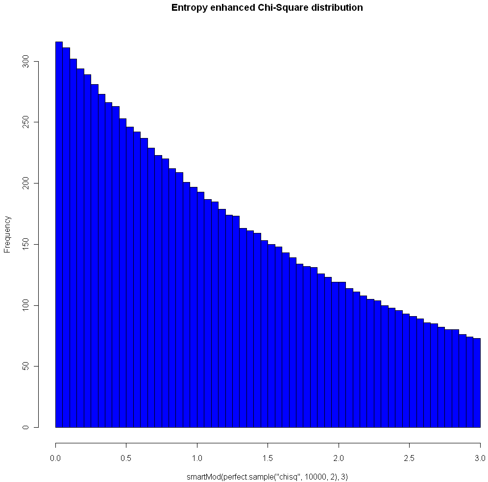
The image at the top of this post shows the Chi Square distribution on 2 degrees of freedom, with Modulo 3 Entropy Enhancement (see how nice that sounds?). Here’s the code to replicate the image:

hist(smartMod(perfect.sample("chisq",10000,2),3),breaks=70,col="blue",main="Entropy enhanced Chi-Square distribution")

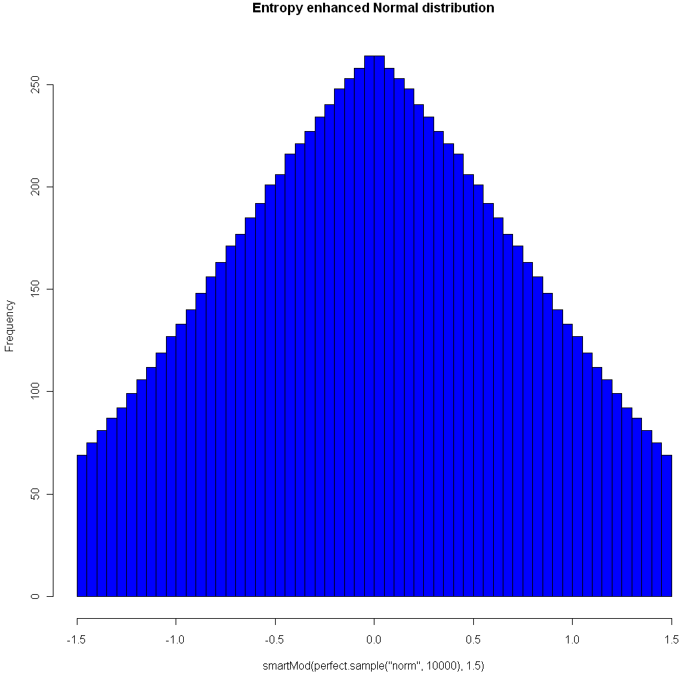
Here’s another plot, using the Normal distribution and Modulo 1.5:

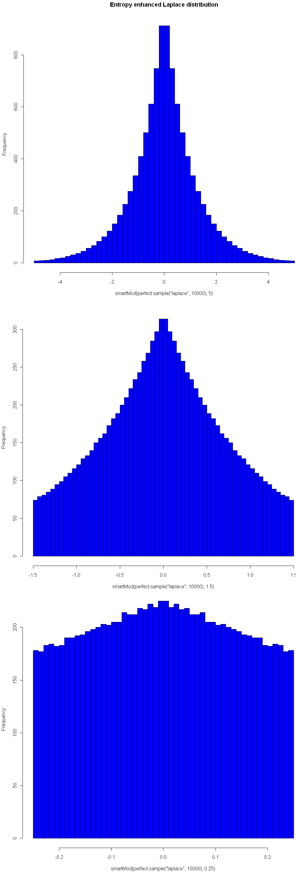
One nice property of this method of increasing entropy is that you get a smooth transition with logical extremes: As your choice of Mod goes to infinity, the distribution remains unchanged. As your Mod number converges to 0, entropy (for that given width) is maximized. Here are three views of the Laplace, with Mods 5, 1.5, and 0.25, respectively. See how nicely it flattens out? (Note you will need the library “VGAM” to sample from the Laplace).

It’s not clear to me yet how entropy enhancement could be of practical use. But everyone loves enhancements, right? And who among us doesn’t long for a  little extra entropy for time to time, no?


25
Jun 10

A rare event in tennis

70-68

That was the final score in the final set, won by John Isner over Nicolas Mahut at Wimbledon. In the final set of a match the winner has to beat the other by at least 2 games, so as in baseball matches can (theoretically) go on indefinitely. In practice even final sets that go into “extra innings” tend to end quickly. The previous record for number of games in a final set was 1/3 as many. For some commentary on the odds related to this extraordinary match check out:

A mathematician watches tennis II

Wikipedia has a list of Longest tennis match records.


23
Jun 10

Data is dumb, try to be smart

I blurred out my personal information, but otherwise the check shown above is exactly as I received it. Yahoo! really did send me a check for ZERO DOLLARS 00 CENTS. Obviously, mailing out checks for nothing is wasteful and pointless (shall I try cashing it? Will the bank “credit” me for nothing?). It could be that this check isn’t even “legal”, if I’m to believe the Best Answer by Yahoo!’s crack team of expert volunteers. But instead of making this a “Ha! Ha! Big Company Does Something Stupid” post, I thought I’d dig a little deeper into the story behind the check.

Until recently, Yahoo! had an advertising program similar to Google’s Adsense. Webmasters could show ads from Yahoo!’s network and share in the profits when people clicked on the links. Although basically similar, Yahoo!’s version was much more restrictive: fewer websites were accepted into their network and webmasters could only display ads to visitors from the United States. I can understand why Yahoo! would want to limit payment to clicks coming from a single (huge and wealthy) country, but the way they implemented this requirement struck me as odd. It was the webmaster’s responsibility to make sure no one from outside the US saw their ads. This meant that I had to install Geo-IP software on my server, which maps the unique numerical identifiers of visitors to their country of origin. Installing this software is a pain, and you have to update it regularly with the latest free or paid versions of the database, or else the information becomes inaccurate. Yahoo!, with all its infrastructure and CPU power and economies of scale, was making thousands of individual webmasters perform a task best handled by a giant IT company, like, say, Yahoo!

The other strange, and occasionally frustrating, thing about Yahoo!’s program was the high volatility in payment amounts. On average, the earnings from their ad network were good, but I would see days when a website made $50 and others when it made $2.11, sometimes from the same number of visitors or even the same number of clicks. Variability is built in to programs like this, but I found Yahoo!’s results to be way more inconsistent that Google’s or even some of the much smaller companies with their own advertising networks. You might think that only the average matters, but high volatility leads to poorer decision making. Imagine the following two scenarios: in one, you see the revenue from a advertising program slowly and steadily decline over the course of months. Time to find a different program. In the other scenario, payouts vary widely from month to month. Some are fantastic, some very poor. How can you tell when to leave the program, and when to expand your use of it? There are ways to measure non-obvious trends with time series analysis. But no matter which tool you use, the more “noise” in your data stream, the worse your predictions will be.

High volatility in Yahoo!’s payouts was so prolonged that it couldn’t have been just a matter of growing pains. Either no-one at Yahoo! was looking into payment variability at the level of individual users (it’s possible that the total revenue generated by their program, summed across all users, was much more stable), or they didn’t see why this was a problem.

Finally, we have the issue of the worthless check. When Yahoo! closed their program, they had to send out final checks, even to those users with balances below the regular minimum threshold (most programs require $50 or so in earnings before they send you a check). One possibility is that Yahoo!’s algorithm never looked to see if the amount owed was positive before cutting a check. That would be really dumb. Another, slightly-more-favorable explanation is that they really owed me 0.5 cents, so their algorithm saw this as a positive balance. It looked like I should be getting a check, but then Yahoo!’s check-printing software rounded down to the nearest penny and I end up with $0.00. Either way, I see this as a final indicator that Yahoo! just isn’t thinking very hard about their data. By contrast, Google and other companies seem to understand that their business depends on managing data with a huge amount of human intelligence and understanding. Data is dumb, Yahoo! needs to be smarter.


22
Jun 10

Reaching escape velocity

Sample once from the Uniform(0,1) distribution. Call the resulting value [latex]x[/latex]. Multiply this result by some constant [latex]c[/latex]. Repeat the process, this time sampling from Uniform(0, [latex]x*c[/latex]). What happens when the multiplier is 2? How big does the multiplier have to be to force divergence. Try it and see:

iters = 200
locations = rep(0,iters)
top = 1
multiplier = 2
for(i in 1:iters) {
	locations[i] = runif(1,0,top)
	
	top = locations[i] * multiplier
}

windows()
plot(locations[1:i],1:i,pch=20,col="blue",xlim=c(0,max(locations)),ylim=c(0,iters),xlab="Location",ylab="Iteration")

# Optional save as movie, not a good idea for more than a few hundred iterations. I warned you!
# library("animation")
# saveMovie(for (i in 1:iters) plot(locations[1:i],1:i,pch=20,col="blue",xlim=c(0,max(locations)),ylim=c(0,iters),xlab="Location",ylab="Iteration"),loop=1,interval=.1)

19
Jun 10

The perfect fake

Usually when you are doing Monte Carlo testing, you want fake data that’s good, but not too good. You may want a sample taken from the Uniform distribution, but you don’t want your values to be uniformly distributed. In other words, if you were to order your sample values from lowest to highest, you don’t want them to all be equidistant. That might lead to problems if your underlying data or model has periods or cycles, and in any case it may fail to provide correct information about what would happen with real data samples.

However, there are times when you want the sample to be “perfect”. For example, in systematic sampling you may wish to select every 10th object from a population that is already ordered from smallest to biggest. This method of sampling can reduce the variance of your estimate without introducing bias. Generating the numbers for this perfect sample is quite easy in the case of the Uniform distribution. For example, R gives you a couple easy ways to do it:

# Generate a set of 100 equidistant values between 5 and 10 (inclusive)
x <- seq(5,10,length=100)

# Generate every 12th integer between 50 and 1000
x <- seq(50,1000,12)

When it comes to other distributions, grabbing a perfect sample is much harder. Even people who do a lot of MC testing and modeling may not need perfect samples every day, but it comes up often enough that R should really have the ability to do it baked right into to the language. However, I wasn't able to find such a function in R or in any of the packages, based on my searches at Google and RSeek. So what else could I do but roll my own?

# Function returns a "perfect" sample of size n from distribution myDist
# The sample is based on uniformly distributed quantiles between 0 and 1 (exclusive)
# If the distribution takes additional parameters, these can be specified in the vector params
# Created by Matt Asher of StatisticsBlog.com
perfect.sample <- function(n, myDist, params = c()) {
	x <- seq(0,1,length=(n+2))[2:(n+1)]
	  
	if(length(params)) {
	  	toEval <- paste(c("sapply(x,q", myDist, ",", paste(params,collapse=","), ")"), collapse="")
	} else {
	  	toEval <- paste(c("sapply(x,q", myDist, paste(params,collapse=","), ")"), collapse="")
	} 
	
	eval(parse(text=toEval))
}

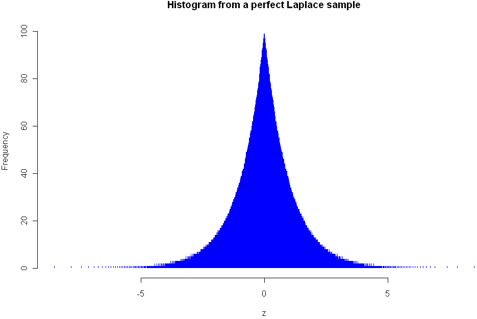
This function should work with any distribution that follows the naming convention of using "dname" for the density of the distribution and has as its first parameter the number of values to sample. The histogram at the top of this post shows the density of the Lapalce, aka Double Exponential distribution. Here is the code I used to create it:

# Needed library for laplace
library(VGAM)
z <- perfect.sample(5000,"laplace",c(0,1))
hist(z,breaks=800,col="blue",border=0,main="Histogram from a perfect Laplace sample")

As you can see, my function plays nice with distributions specified in other packages. Here are a couple more examples using standard R distributions:

# Examples:
perfect.sample(100,"norm")

# Sampling from the uniform distribution with min=10 and max=20
z <- perfect.sample(50,"unif",c(10,20))

Besides plotting the results with a histogram, there are specific tests you can run to see if values are consistent with sampling from a known distribution. Here are tests for uniformity and normality. You should get a p-value of 1 for both of these:

# Test to verify that this is a perfect sample, requires library ddst
# Note only tests to see if it is Uniform(0,1) distributed
library(ddst)
ddst.uniform.test(z, compute.p=TRUE)

# Needed for the Shapiro-Wilk Normality Test
library(stats)
z = perfect.sample(1000,"norm")
shapiro.test(z)

If you notice any bugs with the "perfect.sample" function please let me know. Also let me know if you find yourself using the function on a regular basis.


12
Jun 10

A different way to view probability densities

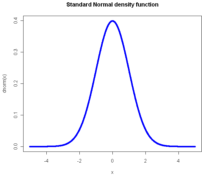
The standard, textbook way to represent a density function looks like this:

Perhaps you have seen this before? (Plot created in R, all source code from this post is included at the end). Not only will you find this plot in statistics books, you’ll also see it in medical texts, sociology, and even economics books. It gives you a clear view of how likely an observation is to fall in a particular range of [latex]x[/latex]. So what’s the problem?

The problem is that what usually concerns us isn’t probability in isolation. What matters is the impact that observations have on some other metric of importance, like the total or average. The key thing we want to know about a distribution is: What range of observations will contribute the most to our expected value, and in what way? We want a measure of influence.

Here’s the plot of the Cauchy density:

From this view, it doesn’t look all that different from the Normal. Sure it’s a little more narrow, with “fatter tails”, but no radical difference, right? Of course, the Cauchy is radically different from the normal distribution. Those slightly fatter tails give very little visual indication that the Cauchy is so extreme-valued that it has no expected value. Integrating to find the exception gives you infinity in both directions. If your distribution is like this, you’ve got problems and your plot should tell you that right away.

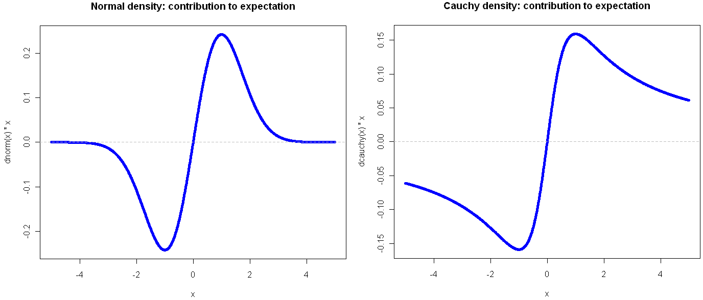
Here’s another way to visualize these two probability distributions:

Go ahead and click on the image above to see the full view. I’ll wait for you…

See? By plotting the density multiplied by the observation value on the y-axis, you get a very clear view of how the different ranges of the function effect the expectation. Looking at these, it should be obvious that the Cauchy is an entirely different beast. In the normal distribution, extreme values are so rare as to be irrelevant. This is why researchers like to find ways to treat their sample as normally distributed: a small sample gives enough information to tell the whole story. But if your life (or livelihood) depends on a sum or total amount, you’re probably best off plotting your (empirical) density in the way shown above.

Another bit of insight from this view is that the greatest contribution to the expectation comes at 1 and -1, which in the case of the Normal isn’t the mean, but rather the second central moment (plus or minus). That’s not a coincidence, but it’s also not always the case, as we shall see. But first, what do things look like when a distribution gets completely out of hand?

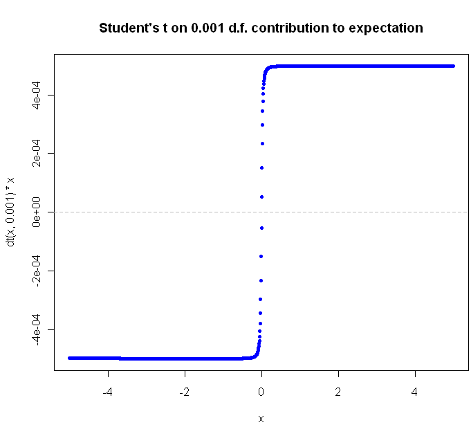
The Student’s t distribution, on 1 Degree of Freedom , is identical to the Cauchy. But why stop at a single DF? You can go all the way down to the smallest (positive) fraction.

The closer you get to zero, the flatter the curve gets. Can we ever flatten it out completely? Not for a continuous distribution with support over an infinite range. Why not? Because in order for the slope of [latex]value * density[/latex] to continue to flatline it indefinitely, the density function would have to be some multiple of [latex]\frac{1}{x}[/latex], and of course the area under this function diverges as we go to infinity, and densities are supposed to integrate to 1, not infinity, right?

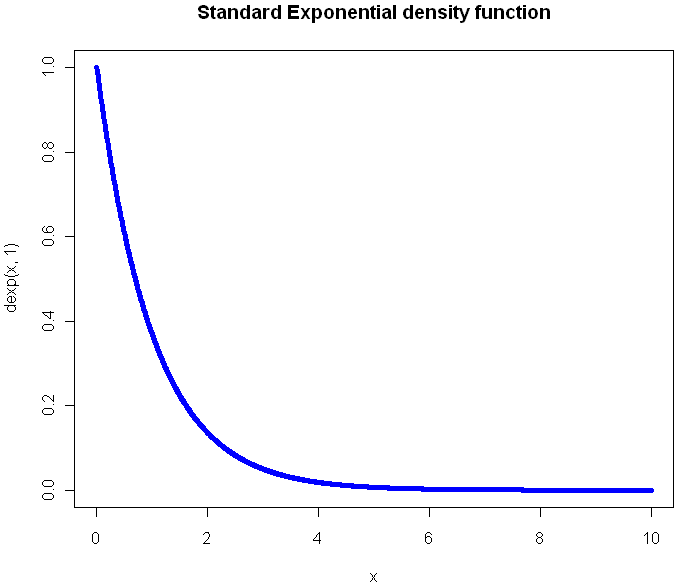
What would the plot look like for a continuous function that extends to infinity in just one direction? Here’s the regular Exponential(1) density function plot:

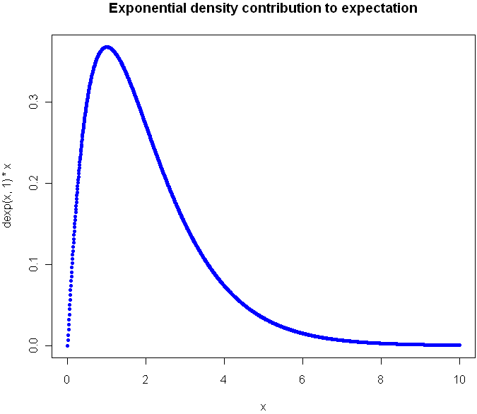
Now look at the plot showing contribution to expectation:

Were you guessing it would peak at 1?  Again, the expectation plot provides insight into which ranges of the distribution will have the greatest impact on our aggregate values.

Before I go look at an a discrete distribution, try to picture what the expectation curve would look like for the standard [latex]Uniform(0,1)[/latex] distribution. Did you picture a diagonal line?

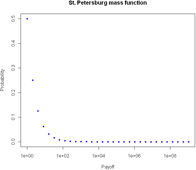
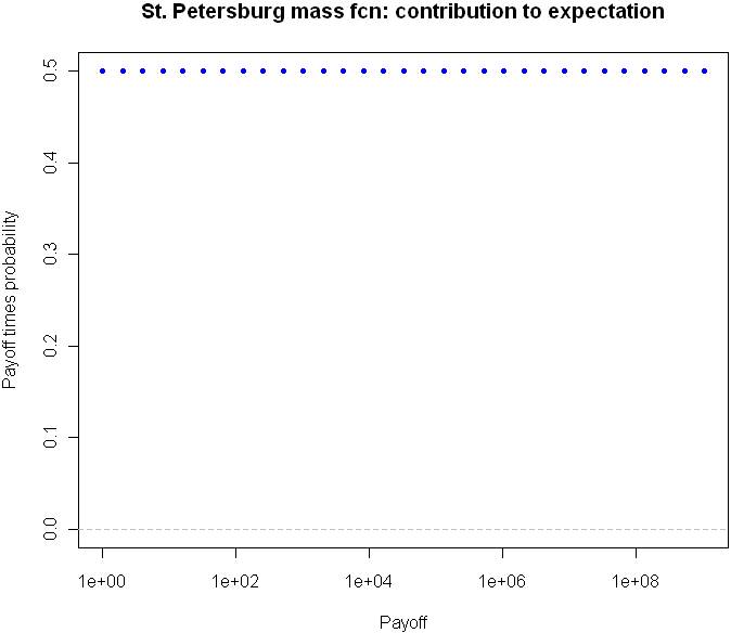
Can we flatten things out completely with an infinitely-supported discrete distribution? Perhaps you’ve heard of the St. Petersburg Paradox. It’s a gambling game that works like this: you flip a coin until tails comes up. If you see one head before a tails, you get $1. For 2 heads you get $2, for 3 heads $4, and so on. The payoff doubles each time, and the chances of reaching the next payoff are halved. The paradox is that even though the vast majority of your winnings will be quite modest, your expectation is infinite.  The regular view of the probability mass function for provides almost no insight:

But take a look at the expectation plot:

Flat as a Nebraska wheat field. You can tell right away that something unusual is happening here.

I could go on with more examples, but hopefully you are beginning to see the value in this type of plot. Here is the code, feel free to experiment with other distributions as well.

# Useful way to make dots look like a line
x = seq(-5,5,length=1500)

# You've seen this before. Our good friend the Normal
plot(x,dnorm(x),pch=20,col="blue", main="Standard Normal density function")

# Cauchy looks a little different, but it's not obvious how different it is 
plot(x,dcauchy(x),pch=20,col="blue", main="Cauchy density function")

# New way of plotting the same
plot(x,dnorm(x)*x,pch=20,col="blue", main="Normal density: contribution to expectation")
abline(h=0,lty="dashed",col="gray")

plot(x,dcauchy(x)*x,pch=20,col="blue", main="Cauchy density: contribution to expectation")
abline(h=0,lty="dashed",col="gray")

# Extreme student-t action:
plot(x,dt(x,0.001)*x,pch=20,col="blue", main="Student's t on 0.001 d.f. contribution to expectation")
abline(h=0,lty="dashed",col="gray")


# The Exponential
x = seq(0,10,length=1500)
plot(x,dexp(x,1),pch=20,col="blue", main="Standard Exponential density function")

# The expectation view:
plot(x,dexp(x,1)*x,pch=20,col="blue", main="Exponential mass contribution to expectation")

# What do we see with the St. Petersburg Paradox
x = 2^(0:30)
dStPete <- function(x) {
	return (1/(2*x))
}

# Note the log
plot(x,dStPete(x),pch=20,col="blue", main="St. Petersburg mass function", log="x", xlab="Payoff", ylab="Probability",ylim=c(0,.5))

# Now we see the light
plot(x,dStPete(x)*x,pch=20,col="blue", main="St. Petersburg mass fcn: contribution to expectation", xlab="Payoff", log="x", ylab="Payoff times probability",ylim=c(0,.5))
abline(h=0,lty="dashed",col="gray")

2
Jun 10

It’s your move

I’m thinking of two numbers between 0 and 1. Your goal is to guess a number which falls in between my two numbers. Each guess costs you $1, and if you guess correctly you win the reciprocal of the length of my range (ie if I am thinking of 0.2 and 0.4, a correct guess wins you $5). At any time you may request that I choose of a new pair of numbers, and of course I will pick a new pair of numbers whenever you win.

What’s your strategy? Under certain conditions, this game is fair. How might you be able to have a positive expectation?


31
May 10

Betting on Pi

I was reading over at math-blog.com about a concept called numeri ritardatari. This sounds a lot like “retarded numbers” in Italian, but apparently “retarded” here is used in the sense of “late” or “behind” and not in the short bus sense. I barely scanned the page, but I think I got the gist of it: You can make money by betting on numbers which are late, ie numbers that haven’t shown up in a while. After all, if the numbers in a lottery or casino are really random, that means it’s highly unlikely that any one number would go a long time without appearing. The “later” the number, the more likely it is to appear. Makes sense, right?

Before plunking down my hard(ly) earned cash at a casino, I decided to test out the theory first with the prototypical random number: Pi. Legend has it that casinos once used digits from Pi to generate their winning numbers. Legend also has it that the digits of Pi are so random that they each appear with almost exactly 1 in 10 frequency. So, given this prior knowledge that people believe Pi to be random, with uniform distribution of digits and no discernible pattern, I can conclude that no one digit should go too long without appearing.

I pulled down the first 10 million digits from here (warning, if you really want this data, right click the link and “save as”). Then I coded up a program in the computer language R to scan through the digits of Pi, one by one, making a series of “fair” bets (1:9 odds) that the next number to appear in the sequence would be the one that had gone longest without appearing. My code is shown below. I had to truncate the data to 1 million digits, and even then this code will take your Cray a good while to process, most likely because I have yet to master the use of R’s faster “apply” functions with complicated loops.

myPi = readLines("pi-10million.txt")[1]

# I think this is how I managed to get Pi into a vector, it wasn't easy.
piVector = unlist(strsplit(myPi,""))
piVector = unlist(lapply(piVector,as.numeric))

# In honor of Goofy Programming Day, I will
# track how long since the last time each digit appeared
# by how many repetitions of that digit are in a vector
ages = c()

# Start us off with nothing in the bank
potHistory = c()

# R just loves long loops like this. Hope you have a fast computer
for(i in 1:1000000) {
	# How did our bet do last round?
	# Skip the first 100 just to build up some data
	if(i > 100) {
		if(betOn == piVector[i]) {
			potHistory = c(potHistory, 9)
		} else {
			potHistory = c(potHistory, -1)
		}
	}

	# Increase all ages by 1 by adding to vector, then set the one we found to 0
	ages = c(ages, 0:9)
	ages = ages[!ages == piVector[i]]

	# Count occurences of each digit, find the top digits by occurence to bet on
	# And you thought Perl was beautiful?
	betOn = as.numeric(names(sort(-table(ages)))[1])
}

# Plot the cumulative sum at 1000 point intervals.
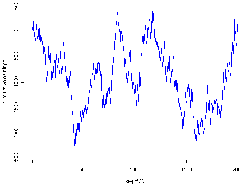
plot.ts(cumsum(potHistory)[seq(0,1000000,500)],pch=20,col="blue",xlab="step/500",ylab="cumulative earnings")

So what was the result? How good was my strategy? After an initial 100 digits to build up data about which digits were latest, I placed a total of 999,900 bets at $1 each. Final earnings: $180. That’s so close to breaking even that it’s almost inconceivable. I had 100,008 wins and 899,892 losses. My winning percentage was 10.0018% percent.

On the face of it, this result seemed almost a little too good, dare I say even suspiciously good, if you know what I mean. How rare is it to get this close (or closer) to the exact perfect proportions after so many trials? Assuming that the number of wins followed a binomial distribution with [latex]p=0.1[/latex], my total wins should follow a Normal distribution with mean 99,990 and variance [latex]n*p*(1-p) = 89,991[/latex] (for an “n” of almost a million and non-minuscule “p”, the Normal approximation to the Binomial should be essentially perfect). Taking the square root of the result, and we get almost exactly 300 as our standard deviation. That’s much larger than the 18 extra wins I had. In fact, the chances that you will land within [latex]18/300 = 0.06[/latex] standard deviations on either side of the Normal’s mean are less than 5%. Before getting too worked up over this result, I decided to take a look at the graph. Using the code:

plot.ts(cumsum(potHistory)[seq(0,1000000,500)],pch=20,col="blue",xlab="step/500",ylab="cumulative earnings")

I got this:

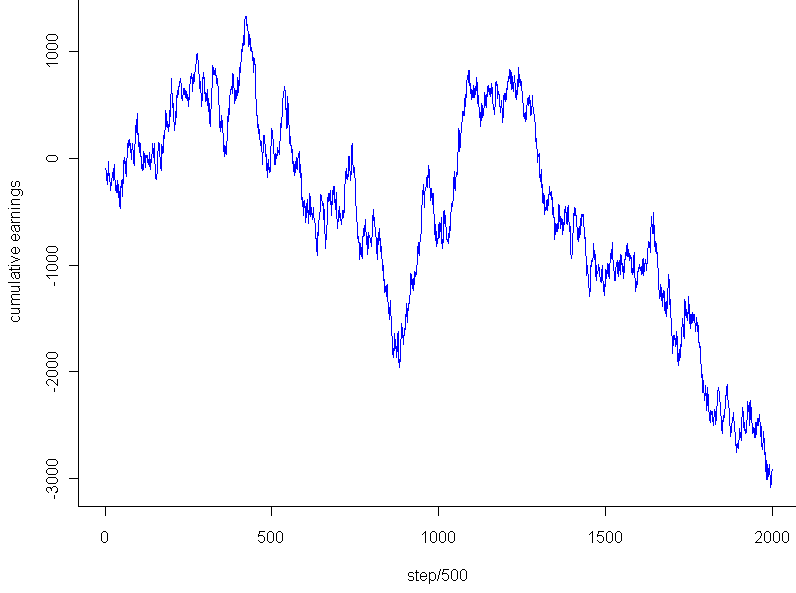
The graph looks pretty much like any random walk, doesn’t it? So the fact that I ended up breaking almost exactly even had to do with the stopping point, not any “unusual” regularity. Just to see if I might salvage any mystery, I tested the very lowest point, -$2,453, which occurred after 202,133 trails. Even that falls within 2 standard deviations of the expected mean for that number of trials, and of course cherry picking the most extreme point to stop at isn’t a fair way to go about this. Any last hope that the graph might be unusual? I plotted a couple random walks using numbers generated in R. Most of them looked like this:

This looks to have the same level of “jaggedness” as  the results of my bet on Pi. Unfortunately, I am forced to conclude that the promising strategy of “late number” gambling turned out to be fairly retarded after all, at least so far as it applies to the digits of Pi.