- Tableau has become a star in the Business Intelligence/Analytics world for its data visualizations. Yet, you can get even more out of Tableau if you integrate it with R. If you also use SQL, here is a tutorial for you on SQL, R and text analysis.
- Bad breaks, then flatlines. Good holds steady.
- Andrew Gelman offers his thoughts on the term marginally significant, which is commonly used but often misleading.
- A list of finance data sources which can be accessed directly using R. This is a must for quants, financial analysts and traders.
- Professor Vivek H. Patil of Gonzaga University describes some R visualization techniques using base R, ggplot2, and rCharts.
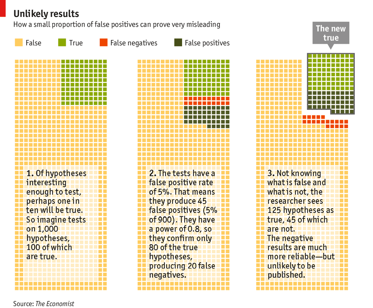
- Christian Robert, of Universite Paris-Dauphine, aka Xi’an, discusses his views on an article from The Economist about statistical significance and why many published research papers are unreproducible.
Posts Tagged: visualization
11
Nov 13
The week in stats (Nov. 11th edition)
9
Sep 13
The week in stats (Sept. 9th edition)
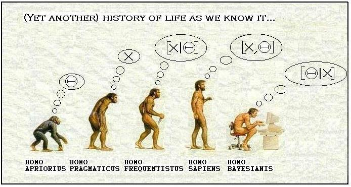
- Larry Wasserman, Professor at Carnegie Mellon University, is a graduate of University of Toronto, a COPSS Award winner, and a leading statistician in Bayesian analysis and inference. In this post, he discusses his views on the question Is Bayesian Inference a Religion?
- Two people will each spend 15 consecutive minutes in a bar between 12:00pm – 1:00pm. Assuming uniform and independent arrival times, what is the probability that they will have a chance to clink glasses?
- Have you ever wondered which statistical package gives the fastest computational speeds? This quick comparison of Julia, Python, R and pqR provides some guidence.
- An interesting analysis of the most popular porn searches in the US.
- A quiz for everyone in the data visualization industry: Identify at least three problems with this chart and explain what you can do to make it better.
- R user groups continue to thrive worldwide. Joseph Rickert from Revolution Analytics prepares the following compilation of the locations of 127 R user groups around the world.


