In my never ending quest to find the perfect measure of tail fatness, I ran across this recent paper by Cooke, Nieboer, and Misiewicz. They created a measure called the “Obesity index.” Here’s how it works:
- Step 1: Sample four times from a distribution. The sample points should be independent and identically distributed (did your mind just say “IID”?)
- Step 2: Sort the points from lowest to highest (that’s right, order statistics)
- Step 3: Test whether the sum of the smallest and greatest number is larger than the sum of the two middle.
The Obesity index is the probability that the sum of these end points is larger than the sum of the middle numbers. In mathy symbols:
[latex]Ob(X) = P (X_1 + X_4 > X_2 + X_3 | X_1 \leq X_2 \leq X_3 \leq X_4), X_i~IID[/latex]
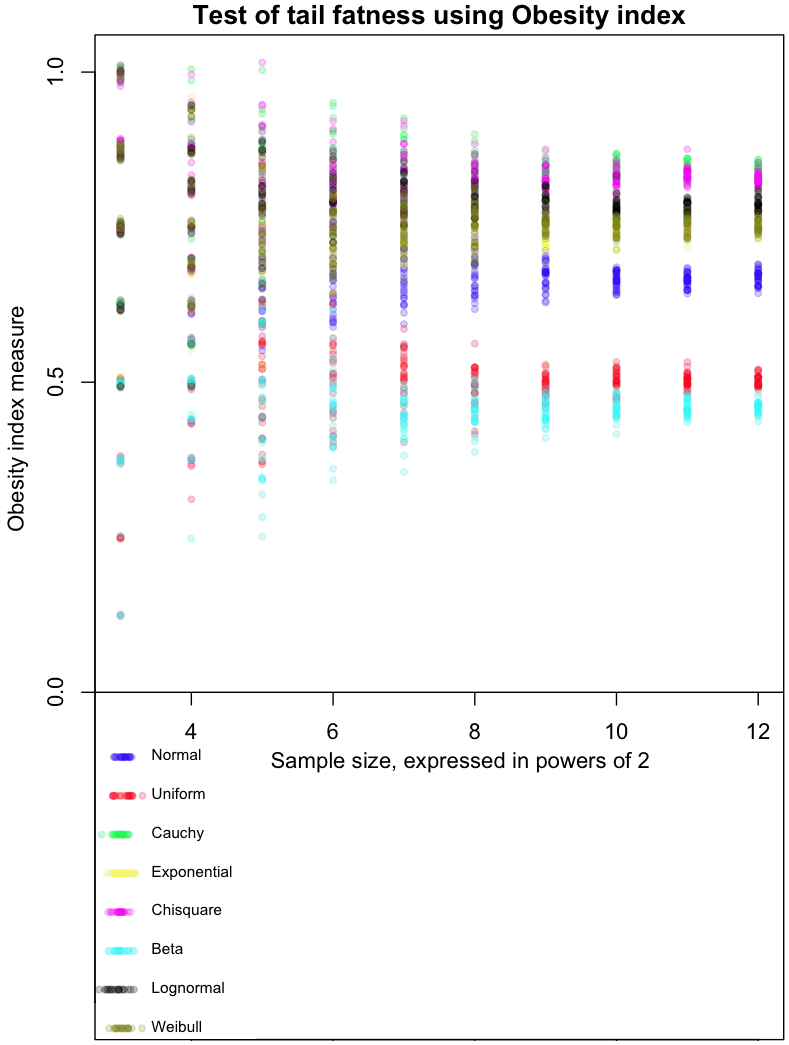
The graph at the top of this post shows how the Obesity index converges for different distributions. As always, I’ve included my R code at the end of this article, so you can run this simulation for yourself (though, as usual, I forgot to set a random seed so that you can run it exactly like I did).
The dots in the graph represent the mean results from 8, 16, 32, and so on, up to 4096 trials from each of the distributions I tested. Note that each trial involves taking 4 sample points. Confused? Think of it this way: each sample of 4 points gives us one Bernoulli trial from a single distribution, which returns a 0 or 1. Find the average result after doing 4096 of these trials, and you get one of the colored dots at the far right of the graph. For example, the red dots are averages from a Uniform distribution. The more trials you do, the closer results from the Uniform will cluster around 0.5, which is the “true” Obesity value for this distribution. The Uniform distribution is, not coincidentally, symmetric. For symmetric distributions like the Normal, we only consider positive values.
The graph gives a feel for how many trials would be needed to distinguish between different distributions based on their Obesity index. I’ve done it this way as part of my Grand Master Plan to map every possible distribution based on how it performs in a variety of tail indices. Apparently the Obesity index can be used to estimate quantiles; I haven’t done this yet.
My initial impressions of this measure (and these are very initial!) are mixed. With a large enough number of trials, it does a good job of ordering distributions in a way that seems intuitively correct. On the other hand, I’d like to see a greater distance between the Uniform and Beta(0.01, 0.01) distribution, as the latter is an extreme case of small tails.
Note that Obesity is invariant to scaling:
[latex]Ob(x) = Ob(k*X)[/latex]
but not to translations:
[latex]Ob(X) \neq Ob(X+c)[/latex]
This could be a bug or a feature, depending on what you want to use the index for.
Extra special karma points to the first person who comes up with a distribution whose Obesity index is between the Uniform and Normal, and that isn’t a variant of one I already tested.
Here’s the code:
# Code by Matt Asher for StatisticsBlog.com
# Feel free to redistribute, but please keep this notice

# Create random varaibles from the function named in the string
generateFromList = function(n, dist, ...) {
	match.fun(paste('r', dist, sep=''))(n, ...)
}

# Powers of 2 for testAt
testAt = 3:12
testAtSeq = 2^testAt
testsPerLevel = 30


distros = c()

distros[1] = 'generateFromList(4,"norm")'
distros[2] = 'generateFromList(4,"unif")'
distros[3] = 'generateFromList(4,"cauchy")'
distros[4] = 'generateFromList(4,"exp")'
distros[5] = 'generateFromList(4,"chisq",1)'
distros[6] = 'generateFromList(4,"beta",.01,.01)'
distros[7] = 'generateFromList(4,"lnorm")'
distros[8] = 'generateFromList(4,"weibull",1,1)'

# Gotta be a better way to do this.
dWords = c("Normal", "Uniform", "Cauchy", "Exponential", "Chisquare", "Beta", "Lognormal", "Weibull")

par(mar=c(4,5,1.5,.5))
plot(0,0,col="white",xlim=c(min(testAt),max(testAt)), ylim=c(-.5,1), xlab="Sample size, expressed in powers of 2", ylab="Obesity index measure", main="Test of tail fatness using Obesity index")

abline(h=0)

colorList = list()
colorList[[1]]=rgb(0,0,1,.2)
colorList[[2]]=rgb(1,0,0,.2)
colorList[[3]]=rgb(0,1,0,.2)
colorList[[4]]=rgb(1,1,0,.2)
colorList[[5]]=rgb(1,0,1,.2)
colorList[[6]]=rgb(0,1,1,.2)
colorList[[7]]=rgb(0,0,0,.2)
colorList[[8]]=rgb(.5,.5,0,.2)

# Create the legend
for(d in 1:length(distros)) {
	x = abs(rnorm(20,min(testAt),.1))
	y = rep(-d/16,20)
	points(x, y, col=colorList[[d]], pch=20)
	text(min(testAt)+.25, y[1], dWords[d], cex=.7, pos=4)

}


dCounter = 1
for(d in 1:length(distros)) {
	for(l in testAtSeq) {
		for(i in 1:testsPerLevel) {
			count = 0
			for(m in 1:l) {

				# Get the estimate at that level, plot it testsPerLevel times
				x = sort(abs(eval(parse( text=distros[dCounter] ))))
				if ( (x[4]+x[1])>(x[2]+x[3]) ) {
					count = count + 1
				}
			}

			# Tiny bit of scatter added
			ratio = count/l
			points(log(l, base=2), ( ratio+rnorm(1,0,ratio/100)), col=colorList[[dCounter]], pch=20)
		}
	}

	dCounter = dCounter + 1
}


