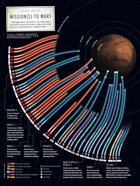
My copy of Information Graphics arrived yesterday. It’s a massive book, in all senses (shipping weight listed as 8lbs, height is 15 inches). It contains hundreds of fascinating charts, diagrams, maps and illustrations. My favorite so far is the one above. It shows the various missions to send human proxies (so far just proxies!) to the red planet. Make sure to click the image for the full version.
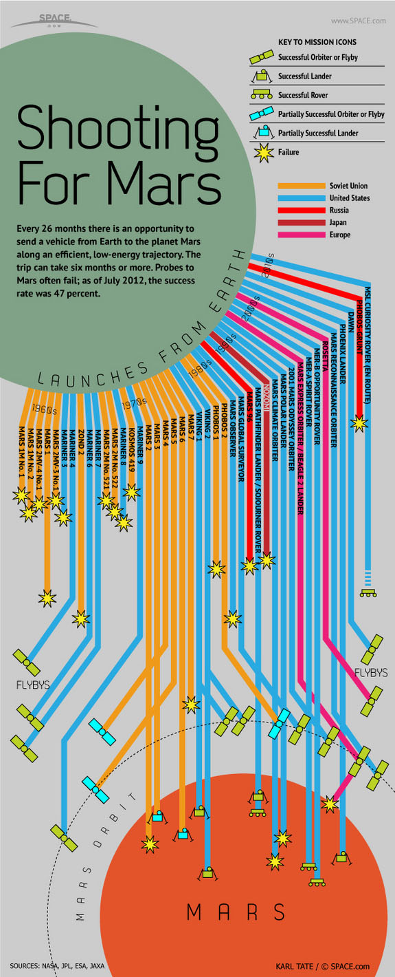
While searching the internet for a version of the chart, I noticed that space.com created a knockoff of the graphic. Their version uses the same innovative metaphor for presenting the data, but has less charm and is much harder to parse. The space.com version is shown below.


