feature


26
Apr 13

Manifesto addition: “N is always finite”

Added one more point to my manifesto:

“N” is always finite. Probability theory gives us many powerful limit theorems. These tell us what to expect, mathematically, as the number of trials goes to infinity. That fine, but we don’t live our lives at the limit. In the real world, asymptotics are much more important, as are non-parametric inference and tools like bootstrap to maximize the information extracted from small sample sizes. Even in those real life situations when N could increase without limit, the growth of the sample size itself can change the problem. Toss a die enough times and the edges will start to wear off, changing the frequency that each side comes up.

Had to add it after reading the phrase “if we let N go to infinity” one to many times.


18
Apr 13

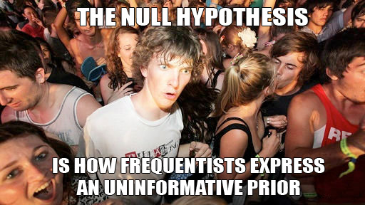
Sudden clarity about the null hypothesis

Can’t take credit for this realization (I studied at an “Orthodox” shop), and the “Clarance” wishes to be anonymous, so send all karma points to your favorite (virtual) charity.


11
Apr 13

High Obesity levels found among fat-tailed distributions

In my never ending quest to find the perfect measure of tail fatness, I ran across this recent paper by Cooke, Nieboer, and Misiewicz. They created a measure called the “Obesity index.” Here’s how it works:

  • Step 1: Sample four times from a distribution. The sample points should be independent and identically distributed (did your mind just say “IID”?)
  • Step 2: Sort the points from lowest to highest (that’s right, order statistics)
  • Step 3: Test whether the sum of the smallest and greatest number is larger than the sum of the two middle.

The Obesity index is the probability that the sum of these end points is larger than the sum of the middle numbers. In mathy symbols:

[latex]Ob(X) = P (X_1 + X_4 > X_2 + X_3 | X_1 \leq X_2 \leq X_3 \leq X_4), X_i~IID[/latex]


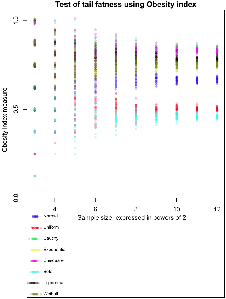
The graph at the top of this post shows how the Obesity index converges for different distributions. As always, I’ve included my R code at the end of this article, so you can run this simulation for yourself (though, as usual, I forgot to set a random seed so that you can run it exactly like I did).

The dots in the graph represent the mean results from 8, 16, 32, and so on, up to 4096 trials from each of the distributions I tested. Note that each trial involves taking 4 sample points. Confused? Think of it this way: each sample of 4 points gives us one Bernoulli trial from a single distribution, which returns a 0 or 1. Find the average result after doing 4096 of these trials, and you get one of the colored dots at the far right of the graph. For example, the red dots are averages from a Uniform distribution. The more trials you do, the closer results from the Uniform will cluster around 0.5, which is the “true” Obesity value for this distribution. The Uniform distribution is, not coincidentally, symmetric. For symmetric distributions like the Normal, we only consider positive values.

The graph gives a feel for how many trials would be needed to distinguish between different distributions based on their Obesity index. I’ve done it this way as part of my Grand Master Plan to map every possible distribution based on how it performs in a variety of tail indices. Apparently the Obesity index can be used to estimate quantiles; I haven’t done this yet.

My initial impressions of this measure (and these are very initial!) are mixed. With a large enough number of trials, it does a good job of ordering distributions in a way that seems intuitively correct. On the other hand, I’d like to see a greater distance between the Uniform and Beta(0.01, 0.01) distribution, as the latter is an extreme case of small tails.

Note that Obesity is invariant to scaling:

[latex]Ob(x) = Ob(k*X)[/latex]


but not to translations:

[latex]Ob(X) \neq Ob(X+c)[/latex]


This could be a bug or a feature, depending on what you want to use the index for.

Extra special karma points to the first person who comes up with a distribution whose Obesity index is between the Uniform and Normal, and that isn’t a variant of one I already tested.

Here’s the code:

# Code by Matt Asher for StatisticsBlog.com
# Feel free to redistribute, but please keep this notice

# Create random varaibles from the function named in the string
generateFromList = function(n, dist, ...) {
	match.fun(paste('r', dist, sep=''))(n, ...)
}

# Powers of 2 for testAt
testAt = 3:12
testAtSeq = 2^testAt
testsPerLevel = 30


distros = c()

distros[1] = 'generateFromList(4,"norm")'
distros[2] = 'generateFromList(4,"unif")'
distros[3] = 'generateFromList(4,"cauchy")'
distros[4] = 'generateFromList(4,"exp")'
distros[5] = 'generateFromList(4,"chisq",1)'
distros[6] = 'generateFromList(4,"beta",.01,.01)'
distros[7] = 'generateFromList(4,"lnorm")'
distros[8] = 'generateFromList(4,"weibull",1,1)'

# Gotta be a better way to do this.
dWords = c("Normal", "Uniform", "Cauchy", "Exponential", "Chisquare", "Beta", "Lognormal", "Weibull")

par(mar=c(4,5,1.5,.5))
plot(0,0,col="white",xlim=c(min(testAt),max(testAt)), ylim=c(-.5,1), xlab="Sample size, expressed in powers of 2", ylab="Obesity index measure", main="Test of tail fatness using Obesity index")

abline(h=0)

colorList = list()
colorList[[1]]=rgb(0,0,1,.2)
colorList[[2]]=rgb(1,0,0,.2)
colorList[[3]]=rgb(0,1,0,.2)
colorList[[4]]=rgb(1,1,0,.2)
colorList[[5]]=rgb(1,0,1,.2)
colorList[[6]]=rgb(0,1,1,.2)
colorList[[7]]=rgb(0,0,0,.2)
colorList[[8]]=rgb(.5,.5,0,.2)

# Create the legend
for(d in 1:length(distros)) {
	x = abs(rnorm(20,min(testAt),.1))
	y = rep(-d/16,20)
	points(x, y, col=colorList[[d]], pch=20)
	text(min(testAt)+.25, y[1], dWords[d], cex=.7, pos=4)

}


dCounter = 1
for(d in 1:length(distros)) {
	for(l in testAtSeq) {
		for(i in 1:testsPerLevel) {
			count = 0
			for(m in 1:l) {
		
				# Get the estimate at that level, plot it testsPerLevel times	
				x = sort(abs(eval(parse( text=distros[dCounter] ))))
				if ( (x[4]+x[1])>(x[2]+x[3]) ) {
					count = count + 1
				}
			}
			
			# Tiny bit of scatter added
			ratio = count/l
			points(log(l, base=2), ( ratio+rnorm(1,0,ratio/100)), col=colorList[[dCounter]], pch=20)
		}
	}
	
	dCounter = dCounter + 1
}


27
Mar 13

Minding the reality gap

Officially, unemployment in the US is declining. It’s fallen from a high of 9.1% a couple years ago, to 7.8% in recent months. This would be good news, if the official unemployment rate measured unemployment, in the everyday sense of the word. It doesn’t. The technical definition of “U3” unemployment, the most commonly reported figure, excludes people who’ve given up looking for work, those who’ve retired early due to market conditions, and workers so part time they clock in just one hour per week.

Most critically, unemployment excludes the 14 million American on disability benefits, a number which has quadrupled over the last 30 years. If you include just this one segment of the population in the official numbers, the unemployment rate would double. On Saturday, This American Life devoted their entire hour to an exploration of this statistic. Russ Robert’s, who’s podcast I’ve recommend in the past, discussed the same topic last year. Despite the magnitude of the program and the scale of the change, these are the only outlets I know of to report on the disability number, and on the implications it has for how we interpret the decline in U3 unemployment.

Targeting the number, not the reality
Statistics, in the sense of numerical estimates, are measures which attempt to condense the complex world of millions of people into a single data point. Honest statistics come with margins of error (the most honest indicate, at least qualitatively, a margin of error for their margin of error). But even the best statistical measures are merely symptoms of some underlying reality; they reflect some aspect of the reality as accurately as possible. The danger with repeated presentations of any statistic (as in the quarterly, monthly, and even hourly reporting of GDP, unemployment, and Dow Jones averages), is that we start to focus on this number by itself, regardless of the reality it was created to represent. It’s as if the patient has a high fever and all anyone talks about is what the thermometer says. Eventually the focus becomes, “How do we get the thermometer reading down?” All manner of effort goes into reducing the reading, irrespective of the short, and certainly long-term, health of the patient. When politicians speak about targeting unemployment figures, this is what they mean, quite literally. Their goal is to bring down the rate that gets reported by the Bureau of Labor Statistics, the number discussed on television and in every mainstream source of media.

Politicians focus on high profile metrics, and not the underlying realities, because the bigger and more complicated the system, the easier it is to tweak the method of measurement or its numeric output, relative to the difficulty of fixing the system itself. Instead of creating conditions which allow for growth in employment (which would likely require a reduction in politicians’ legislative and financial powers), the US has quietly moved a huge segment of its population off welfare, which counts against unemployment, and into disability and prisons — the incarcerated also don’t count in U3, whether they are slaving away behind bars or not.

How metrics go bad
Over time, all social metrics diverge from the reality they were created to reflect. Sometimes this is the result of a natural drift in the underlying conditions; the metric no longer captures the same information it had in the past, or no longer represents the broad segment of society it once did. For example, the number of physical letters delivered by the postal service no longer tracks the level of communication between citizens.

Statistics and the reality they were designed to represent are also forced apart through deliberate manipulation. Official unemployment figures are just one example of an aggressively targeted/manipulated metric. Another widely abused figure is the official inflation rate, or core Consumer Price Index. This measure excludes food and energy prices, for the stated reason that they are highly volatile. Of course, these commodities represent a significant fraction of nearly everyone’s budget, and their prices can be a leading indicator of inflation. The CPI also uses a complex formula to calculate “hedonics,” which mark down reported prices based on how much better the new version of a product is compared to the old one (do a search for “let them eat iPads”).

I don’t see it as a coincidence that unemployment and inflation figures are among the most widely reported and the most actively manipulated. In fact, I take the following to be an empirical trend so strong I’m willing to call it a law: the greater the visibility of a metric, the more money and careers riding on it, the higher the likelihood it will be “targeted.” In this light, the great scandal related to manipulation of LIBOR, a number which serves as pivot point for trillions of dollars in contracts, is that the figure was assumed to be accurate to begin with.

Often the very credibility of the metric, built up over time by its integrity and ability to reflect an essential feature of the underlying reality, is cashed in by those who manipulate it. Such was the case with the credit ratings agencies: after a long run of prudent assessments, they relaxed their standards for evaluating mortgage bundles, cashing in on the windfall profits generated by the housing bubble.

Why we don’t see the gaps
It might seem like the disconnect between a statistic and reality would cause a dissonance that, once large enough to be clearly visible, would lead to reformulation of the statistic, bringing it back in line with the underlying fundamentals. Clearly there are natural pressures in that direction. For example, people laid off at the beginning of a recession are unlikely to believe that the recovery has begun until they themselves go back to work. Their skepticism of the unemployment figure erodes its credibility. Unfortunately, two powerful forces work against the re-alignment of metric and reality: the first related to momentum and our blindness to small changes, the second having to do with the effects of reflexivity and willful ignorance.

In terms of inertia, humans have a built-in tendency to believe that what has been will continue to be. More sharply, the longer a trend has continued, the longer we presume it will continue — if it hasn’t happened yet, how could it happen now? Laplace’s rule of succession is our best tool for estimating probabilities under the assumption of a constant generating process, one that spits out a stream of conditionally independent (exchangeable) data points. But the rule of succession fails utterly, at times spectacularly, when the underlying conditions change. And underlying conditions always change!

These changes, when they come slowly, pass under our radar. Humans are great at noticing large differences from one day to the next, but poor at detecting slow changes over long periods of time. Ever walked by an old store with an awning or sign that’s filthy and falling apart? You wonder how the store owner could fail to notice the problem, but there was never any one moment when it passed from shiny and new to old and decrepit. If you think you’d never be as blind as that shop keeper, look down at your keyboard right now. As with our environment, if the gap between statistic and reality changes slowly, over time, we may not see the changes. Meanwhile, historical use of the statistic lends weight to it’s credibility, reducing the chance that we’d notice or question the change — it has to be right, it’s what we’ve always used!

The perceived stability of slowly changing systems encourages participants to depend on or exploit it. This, in turn, can create long term instabilities as minor fluctuations trigger extreme reactions on the part of participants. Throughout the late 20th century and the first years of the 21st, a large number of investors participated in the “Carry Trade,” a scheme which depended on the long term stability of the Yen, and of the differential between borrowing rates in Japan and interest rates abroad. When conditions changed in 2008, investors “unwound” these trades at full speed, spiking volatility and encouraging even more traders to exit their positions as fast as they could.

These feedback loops are an example of reflexivity, the tendency in some complex systems for perception (everyone will panic and sell) to affect reality (everyone panics and sells). Reflexivity can turn statistical pronouncements into self-fulfilling prophecies, at least for a time. The belief that inflation is low, if widespread, can suppress inflation in and of itself! If I believe that the cash in my wallet and the deposits in my bank account will still be worth essentially the same amount tomorrow or in a year, then I’m less likely to rush out to exchange my currency for hard goods. Conversely, once it’s clear that my Bank of Zimbabwe Bearer Cheques have a steeply declining half-life of purchasing power, then I’m going to trade these paper notes for tangible goods as quickly as possible, nominal price be damned!

Don’t look down

If perception can shape reality, then does the gap between reality and statistic matter? Clearly, the people who benefit most from the status quo do their best to avoid looking down, lest they encourage others to do the same. More generally, though, can we keep going forward so long as we don’t look down, like Wile E. Coyote chasing the road runner off a cliff?

The clear empirical answer to that questions is: “Yes, at least for a while.” The key is that no one knows how long this while can last, nor is it clear what happens when the reckoning comes. Despite what ignorant commentators might have said ex post facto, by 2006 there was wide understanding that housing prices were becoming un-sustainably inflated. In 2008, US prices crashed back down to earth. North of the border, in Canada, the seemingly equally inflated housing market stumbled, shrugged, then continued along at more level, but still gravity-defying trajectory.

The high cost of maintaining the facade
Even as the pressures to close the gap grow along with its size, the larger the divergence between official numbers and reality, the greater the pressures to keep up the facade. If the fictional single entity we call “the economy” appears to be doing better, politicians get re-elected and consumers spend more money. When the music finally stops, so too will the gravy-train for a number of vested interests. So the day of reckoning just keeps getting worse and worse as more and more resources go into maintaining the illusion, into reassuring the public that nothing’s wrong, into extending, pretending, and even, if need be, shooting the messenger.

It’s not just politicians and corporations who become invested in hiding and ignoring the gap. We believe official statistics because we want to believe them, and we act as if we believe them because we believe that others believe them. We buy houses or stocks at inflated prices on the hope that someone else will buy them from us at an even more inflated price.

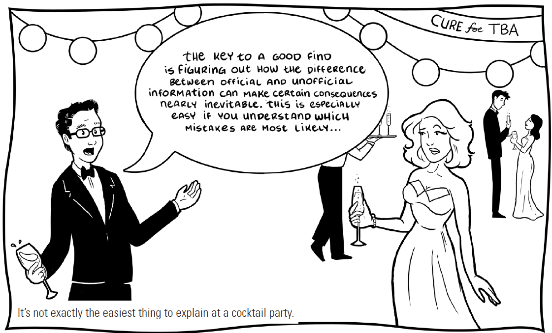
My (strong) belief is that most economic and political Black Swans are the result of mass delusion, based on our faith in the quality and meaning of prominently reported, endlessly repeated, officially sanctioned statistics. The illustration at the beginning of this post comes from a comic I authored about a character who makes his living off just this gap between official data and the reality on the ground, a gap that always closes, sooner or later, making some rich and toppling others.


18
Mar 13

Review of Mathematica 9 and R-link

VIDEO TRANSCRIPT: Hello, this is Matt Asher from StatisticsBlog.com. I’m going to be reviewing Mathematica 9, from Wolfram Research. In particular, I’ll be focusing on using it with R and to do Monte Carlo simulations and other statistical work. You can find a full transcript of this video at my blog, including the source code and links to all of the webpages I mention.

Before I begin I’d like to thank Jeff Hara and Andy Ross from Wolfram for their time. Also thanks to the folks at the Mathematica Stack Exchange, who helped with a couple of my questions.

I’m going to get started with a blank notebook. I’m going to clear out all of the variables that exist. I’ve found sometimes that if you have existing variables that can cause problems.

ClearAll["Global`*"]

After each line I’m hitting Shift+Enter to run the command, if you just hit enter Mathematica won’t run things yet.

So I’ve cleared my variables and I’m going to run

Needs["RLink`"]

which will bring in the link between Mathematica and R.

InstallR[]

I’m going to make sure it’s installed.

REvaluate["R.Version()"]

And then I’m going to run a test command here to make sure everything is up and running. As you can see this is the version of R I’m running and the connection succeeded.

Note that the free version of Mathematica, the evaluation version, doesn’t come with support for R, so if you want to test out Mathematica’s and its interactions with R you either have to have to buy the full version or maybe if you call up or contact Wolfram they’d be willing to let you have a free evaluation version that is full and allows you to test out R.

So how does the interface between R and Mathematica work?

Basically, you can run operations in R, then store the results to variables in R. You can also pass data types back and forth between R and Mathematica.

Here I’m setting a variable and this variable is set in R, not in Mathematica

RSet["hal", 9000]

So if I were to type just

hal

There is no response back. This is Mathematica’s way of saying that the variable is undefined or that it doesn’t know what to do with your input. So to get back information from R we have to use:

REvaluate["hal"]

We are putting “hal” in quotes so we are parsing this in R and not in Mathematica.

For example we can do things like grab a dataset from R

iris = REvaluate["iris"]

I’m grabbing the famous “iris” dataset in R and I am pulling it into Mathematica.

or I could do things like evaluate a command in R:

REvaluate["det(matrix(sample(-50:49),nrow=10))"]

and bring back the results. This grabs the determinant of a random matrix.

We can even do things like create our own functions in R, and this gets put into a variable in Mathematica.

perfectSample = RFunction["function(n, dist, ...) match.fun(paste('q', dist, sep=''))((1:n) / (n+1), ...)"]

This function creates a perfect sample of the length that you specify of a particular distribution. Then we can call that function directly in Mathematica.

perfectSample[100, "pois", 10]

and the results are returned.

Of course, if we just wanted to do things in R, we would be continuing to just use R, instead of having to learn this new interface between R and Mathematica. So then what can we do in Mathematica that goes beyond what we can easily do in R?

One of the biggest advantages to using Mathematica is that you get access to tools for creating interactive plots and simulations that can be changed on the fly.

I’m going to do an example using the Benini Distribution, which, according to Wolfram’s web page, can be used to model the weight of cats.

So to do that, what I’m going to do is use the Mathematica command “Manipulate”

Manipulate[Block[{data, dist, kmd},
  data = RandomVariate[dist = BeniniDistribution[\[Alpha],\[Beta], \[Sigma]], n];
  kmd = KernelMixtureDistribution[data, h, MaxMixtureKernels -> All];
  Plot[{PDF[dist, x], PDF[kmd, x]}, {x, 0, xRng}, 
   PlotRange -> Automatic]], {{\[Alpha], 1}, .01, 5}, {{\[Beta], 1}, 0.01, 
  5}, {{\[Sigma], 1}, .01, 2}, {{n, 100}, {10, 100, 1000, 10000}}, {{xRng, 5}, 1, 
  10}, {{h, .5}, 0.01, 1}]

And then I get back the results and what I’ve got here is a live Monte Carlo simulation where I am specifying the different parameters of the distribution and I’m also specifying how many variates that I’m creating. This is the smoothing, the kernel bandwidth that I am adjusting.

And I can adjust the size of it here. Make it bigger. And do all of these adjustments on the fly.

As you can see, you’ve got some good power here for generating interactive plots and simulations. You can do these natively in Mathematica, or you do live manipulation of results coming from R. This example comes from the Mathematica guys:

mathematicaRPlotWrapper = RFunction["function(filename, plotfun){
     pdf(filename)
     plotfun()
     dev.off()
     }"];

Clear[getRPlot];
getRPlot[plotFun_RFunction] := 
  With[{tempfile = FileNameJoin[{$TemporaryDirectory, "temp.pdf"}]}, 
   If[FileExistsQ[tempfile], DeleteFile[tempfile]];
   mathematicaRPlotWrapper[tempfile, plotFun];
   If[! FileExistsQ[tempfile], Return[$Failed]];
   Import[tempfile]];

myFun[t_] := 
 Show[#, ImageSize -> Medium, PlotRange -> All] &@
  getRPlot[RFunction["function(){
        x<- seq(1," <> ToString@t <> ",0.1)
        y<- sin(x)
        plot(y~x)
        }"]]

What's going to happen here is I am calling an R function, doing all of my calculations, bringing them back into Mathematica.

I forgot the "Manipulate" part:

Manipulate[myFun[t], {t, 2, 10}]

So here we go. And what's happening is everything is being sent to R for processing then coming all the way back to Mathematica. As you can see even though we are making that round trip the results are coming back at a good pace, it's almost instantaneous this particular example.

What about speed though, more generally?

I tried creating some random variates like I did in my examination of JavaScript versus R. So I'm going to create 10 million random variates from a Normal distribution

Timing[data = RandomVariate[NormalDistribution[], 10^7];]

and that takes about a quarter of a second, a little bit more, which is about twice as fast as R for generating those.

But then let's look at more of a worst-case scenario, a bunch of nested loops.

Timing[
 l = 0;
 For [i = 0, i < 10^2, i = i + 1,
  For[j = 0, j < 10^2, j = j + 1,
   For[k = 0, k < 10^2, k = k + 1,
   l = l + 1
   ]
  ]
  ]
 ]
 

Three of them, a total of a million loops it's going through, and this takes about 1.2 seconds, and it will increase by an order of magnitude if I add an order of magnitude in here. That is slow, it's about twice as slow as the same code would take to run in R, a language not known for it's speed with loops. Of course, this is generally speaking not what you want to do if you want to run fast code. Mathematica itself on their website advises against using these kinds of procedural codes.

But at the same time I've found that there are times when there really is no other way to do things, especially if you are doing simulations with a bunch of objects that take place over time, that are iterative, in which case you do need a programming structure that is like this, so you'll have to keep this in mind in terms of the speed.

Beside the live graphical manipulation of the results, another key benefit to using Mathematica is that you can do direct probability calculations, and sometimes even find closed form solutions for combining random variables.

I've got some code here that determines the probability that one standard normal variable will be greater than another.

Probability[
 Subscript[x, 1] > Subscript[x, 
  2], {Subscript[x, 1] \[Distributed] NormalDistribution[0, 1], 
  Subscript[x, 2] \[Distributed] NormalDistribution[0, 1]}]

And it is, of course, one-half. That's a simple example. We can do things that are more complicated. I'm going to look here for a more general solution when you have two Normal variables with means μ1 and μ2 and we're going to try and find the probability that one of them is greater than the other.

Probability[
 Subscript[x, 1] > Subscript[x, 
  2], {Subscript[x, 1] \[Distributed] 
   NormalDistribution[Subscript[\[Mu], 1], 1], 
  Subscript[x, 2] \[Distributed] 
   NormalDistribution[Subscript[\[Mu], 2], 1]}]

As you can see it's taking more time to run this calculation. And eventually we get back the response. And we do have a closed form solution.

"Erfc" stands for the complementary error function.

Unfortunately, not all of the problems that I tried to do work and sometimes they just freeze up completely.

Probability[
 Subscript[x, 3] > Subscript[x, 
  4], {Subscript[x, 3] \[Distributed] PoissonDistribution[5], 
  Subscript[x, 4] \[Distributed] PoissonDistribution[10]}]

Here I'm running a query to Mathematica to try and find the probability that a Poisson(5) will be greater than a Poission(10) random variable. I found that this just freezes up and will not return a response. Though I only waited a certain number of minutes. Actually, one time it locked my compter up entirely, the other time I gave up after a few minutes. I'm going to hit Alt-comma to abort the command and back out of that.

So, by comparison to R, you can do the same calculation of two Poissions. I'm going to make sure that's run in R:

x = rpois(10^6,5); y=rpois(10^6,10); z = x

(NOTE: This code actually finds the probability that a Poission(5) is LESS than a Poission(10))

As you can see I've run that a couple times already, and it takes about .9 seconds to run this. Of course, this is not trying to find a closed form solution, but for me anyway, these are perfectly good solutions, numerical solutions, to the problems.

So, going back in to Mathematica. Besides getting closed form solutions for probabilities, you can combine distributions, do convolutions and see what kind of formula you get back out.

I found this worked fairly well for simple, well-know distributions:

dist = TransformedDistribution[u + v, 
 {u \[Distributed] NormalDistribution[μ1, σ1], 
  v \[Distributed] NormalDistribution[μ2, σ2]}];
PDF[dist, x]

I do it here for the Normal. I'm adding two Normally distributed variables together and we get back out very quickly the formula for that.

But what happens if we try to work with a less well known distribution. In fact, lets go ahead and see what happens if we want to add together cats and find out the final weight distribution.

dist = TransformedDistribution[u + v, 
 {u \[Distributed] BeniniDistribution[\[Alpha]1,\[Beta]1,\[Sigma]1], 
  v \[Distributed] BeniniDistribution[\[Alpha]2, \[Beta]2,\[Sigma]2]}];
PDF[dist, x]

And, apparently, cats don't add so well. I tried this one as well a couple times and wasn't able to get results returned from Mathematica unfortunately.

So, besides these bugs and issues, there are a couple other significant downsides to Mathematica. Sharing results over the Internet can be done: you can export notebooks to HTML, but people if they want to use the interactive graphs they'll need to have a special browser plugin installed. I asked the guys from Wolfram if they know what percent of web users already have it installed. They didn't know, I suspect the number is very low, much lower than, say, the number who have Flash installed. Of course R by itself doesn't provide much support for sharing results over the web, though Rstudio makes something called Shiny that can do some exporting over the web. I haven't checked that out very much yet. I plan to do that soon.

So, beyond sharing, the biggest impediment to using Mathematica on a daily basis is the interface. The GUI. I'll bring in some of the buttons here, the palettes of buttons. Overall the look is extremely crude. Things are disordered. The floating palettes have buttons of various sizes different places, and it looks essentially like something you might have hacked together in Visual Basic 15 years ago and then hadn't been touched since. Clearly, the modern era of interface design has passed Mathematica by. At this point even open source programs that began with horrific interfaces, like the Gimp, have now begun to focus on making their interfaces look good. And looks may seem superficial, but if you are going to be working with an interface like this, if you are going to be paying $1000 for a license of Mathematica, I don't think it's too much to expect that the design be easy to use, that it be easy to find things, and that there are cues as to where to find things. Color would certainly go a long way to help with that, as would other cues to help you.

I'm going to bring back in Mathematica here.

Based on the GUI, I wonder... One more thing about the GUI, if you're moving the palettes along it doesn't do ghosting, so it pops back in.

So, despite these issues, I can see using Mathematica as an occasional tool to find exact results for probabilities and distributions, or quickly testing out how changing parameters affects a distribution's shape. For now though, I'm going to continue experimenting with JavaScript as an alternative to R that runs code quickly and also I'll be looking some more into Shiny.

Make sure to check out the links related to this video at StatisticsBlog.com, and if you like these videos click on the subscribe button.

5
Mar 13

My favorite randomization device

My recent look at JavaScript as a contender for statistical modeling got me thinking about the different methods used to create random variates. All computers algorithms create Type 1 randomness, which is to say, completely deterministic once you either figure out the underlying algorithm or once you see every number in the algorithm’s period. Jumping outside of software to the hard world around us, it seems possible to create Type 2 or even Type 3 randomness, at least from perspective of an observer who can’t base their predictions on real-time analysis of the generating mechanism (ie, they can’t watch it tick).

My favorite example of a real-world solution to randomizing is shown in the video at top. More details about the construction of the device are here.

What’s your favorite (hardware or virtual) randomization device?


28
Feb 13

Statistical computation in JavaScript — am I nuts?

Over the past couple weeks, I’ve been considering alternatives to R. I’d heard Python was much faster, so I translated a piece of R code with several nested loops into Python (it ran an order of magnitude faster). To find out more about Mathematica 9, I had an extended conversation with some representatives from Wolfram Research (Mathematica can run R code, I’ll post a detailed review soon). And I’ve been experimenting with JavaScript and HTML5’s “canvas” feature.

JavaScript may seem like an unlikely competitor for R, and in may ways it is. It has no repository of statistical analysis packages, doesn’t support vectorization, and requires the additional layer of a web browser to run. This last drawback, though, could be it’s killer feature. Once a piece of code is written in JavaScript, it can be instantly shared with anyone in the world directly on a web page. No additional software needed to install, no images to upload separately. And unlike Adobe’s (very slowly dying) Flash, the output renders perfectly on your smartphone. R has dozens of packages and hundreds of options for charts, but the interactivity of these is highly limited. JavaScript has fewer charting libraries, but it does have some which produce nice output.

Nice output? What matters is the content; the rest is just window dressing, right? Not so fast. Visually pleasing, interactive information display is more than window dressing, and it’s more in demand than ever. As statisticians have stepped up their game, consumers of data analysis have come to expect more from their graphics. In my experience, users spend more time looking at graphs that are pleasing, and get more out of charts with (useful) interactive elements. Beyond that, there’s a whole world of simulations which only provide insight if they are visual and interactive.

Pretty legs, but can she type?
Alright, so there are some advantages to using JavaScript when it comes to creating and sharing output, but what about speed? The last time I used JavaScript for a computationally intensive project, I was frustrated by its slow speed and browser (usually IE!) lockups. I’d heard, though, that improvements had been made, that a new “V8” engine made quick work of even the nastiest js code. Could it be true?

If there’s one thing I rely on R for, it’s creating random variables. To see if JavaScript could keep up on R’s home court, I ran the following code in R:

start = proc.time()[3]
x = rnorm(10^7,0,1)
end = proc.time()[3]
cat(start-end) 

Time needed to create 10 million standard Normal variates in R? About half-a-second on my desktop computer. JavaScript has no native function to generate Normals, and while I know very little about how these are created in R, it seemed like cheating to use a simple inverse CDF method (I’ve heard bad things about these, especially when it comes to tails, can anyone confirm or deny?). After some googling, I found this function by Yu-Jie Lin for generating JS Normals via a “polar” method:

function normal_random(mean, variance) {
  if (mean == undefined)
    mean = 0.0;
  if (variance == undefined)
    variance = 1.0;
  var V1, V2, S;
  do {
    var U1 = Math.random();
    var U2 = Math.random();
    V1 = 2 * U1 - 1;
    V2 = 2 * U2 - 1;
    S = V1 * V1 + V2 * V2;
  } while (S > 1);

  X = Math.sqrt(-2 * Math.log(S) / S) * V1;
//  Y = Math.sqrt(-2 * Math.log(S) / S) * V2;
  X = mean + Math.sqrt(variance) * X;
//  Y = mean + Math.sqrt(variance) * Y ;
  return X;
  }

So how long did it take Yu-Jie’s function to run 10 million times and store the results into an array? In Chrome, it took about half-a-second, same as in R (in Firefox it took about 3 times as long). Got that? No speed difference between R and JS running in Chrome. For loops, JS seems blazing fast (compared to R). Take another look at the demo simulation I created. Each iteration of the code requires on the order of N-squared operations, and the entire display area is re-rendered from scratch. Try adding new balls using the “+” button and see if your browser keeps up.

It’s only a flesh wound!
So have I found the Holy Grail of computer languages for statistical computation? That’s much too strong a statement, especially given the crude state of JS libraries for even basic scientific needs like matrix operations. For now, R is safe. In the long term, though, I suspect the pressures to create easily shared, interactive interfaces, combined with improvements in speed, will push more people to JS/HTML5. Bridges like The Omega Project (has anyone used this?) might speed up the outflow, until people pour out of R and into JavaScript like blood from a butchered knight.


22
Feb 13

What’s my daughter listening to? HTML chart gen in R

[advanced_iframe securitykey=”5870105317bee1454e210fffd43d74b89a88430f” src=”http://statisticsblog.com/popchart.html” width=”600″ height=”550″ scrolling=”yes”]


My daughter, who turns 10 in April, has discovered pop music. She’s been listing to Virgin Radio 99.9, one of our local stations. Virgin provides an online playlist that goes back four days, so I scraped the data and brought it into R. The chart shown at top shows all of the songs played from February 17th through the 20th, listed by frequency.

Broadly speaking, the data follows a power law. But only broadly speaking. Instead of a smoothly shaped curve from the single most frequently played song to a tail of single plays, Virgin Toronto has four songs that all share the heaviest level of rotation, then a drop-off of almost 50% to the next level. There was one big surprise in the data, at least for me. Listening to the station, it seems like they are playing the same 10 songs over and over. This impression is true to some extent, as the top 10 songs represented about one-third of all plays. But in just four days there were 57 single plays, and 44 songs played just twice. In all, 173 unique songs were played, with a much longer tail than I had expected.

That said, it would be interesting to compare Virgin’s playlist distribution with the widely eclectic (at least to my ears) Radio Paradise. Anyone want to give it a try? Here’s my code after I scraped the four pages of data by hand and put them into a text file.

To get the link to the Youtube videos, I used Google’s “I feel lucky” option paired with a search for the song name. If you get an unexpected result, take it up with Google. In the past I’ve used R’s “brew” library to generate HTML code from a template, this time I just hand coded the snippets. To make the red bars I found out the maximum number of plays for any song, then stretched each bar relative to this maximum.


19
Feb 13

Google places itself at the center of cyberspace

Above is a screen capture of the “Google Doodle” for today. It honors the 540th birthday of Nicolaus Copernicus, proponent of the heliocentric model of the universe. Note that Google is placing itself in the center of the universe, a decision I suspect was made very deliberately for its symbolism.

Astronomy was the first scientific discipline to make extensive use of data. Many of the early advances in data analysis and statistics (like the Gaussian Distribution) came about through detailed observations of heavenly bodies and the vast quantities of (imprecise) data this generated. Astronomy may have even given us the first murder over scientific data. With its Doodle, Google is saying that it’s become the center of the data universe, the dominant lens through which we view the world.

A bold claim! Is it true? Looking closely at all the ways in which Google has integrated itself into our online and offline lives, and it starts to look less like presumption on their part, and more like a simple acknowledgement of present reality.

How does Google guide and track and thee? Let me count the ways:

  1. With search, of course. This includes every character you type into the search box or toolbar, since these are sent to Google for auto-complete and search suggestions. If you’ve ever accidentally pasted a password or a whole draft of your book in progress into the search box, Google has a copy of this stored in their vast data center.
  2. Through your email, if you use Gmail, but also if you email other people who use Gmail.
  3. Every Youtube video you watch.
  4. Your location information, if you use Google Maps. Also, if you are like most people, Google knows the house (or at least the neighborhood) you grew up in, since this is the first place you zoomed-in on that wasn’t your current location. Even if you don’t visit the Maps website or app directly, there’s a good chance a Google Map is embedded in the website of your real estate agent or the restaurant you just checked out.
  5. Through tracking for Analytics. This is a little javascript nugget webmasters put on their pages to get information about their visitors. Millions of websites use Google Analytics, including this one.
  6. Through Adsense, those Google-style ads you see on the side of pages which aren’t Google itself. Adsense is by far the most popular “monetizing” solution for webmasters.
  7. If you use voice dictation on an Android phone, your sounds get sent to Google for conversion into words. Your Android phone is also likely to integrate your calender with Google’s online calender app, sending data about your daily schedule back and forth.
  8. If you use Chrome, then all of the URLs you visit are sent to Google as you type, for auto-complete. Many people use the search box itself to type in URLs, giving this info to Google.
  9. Google has a dozen other products that most of us use at least occasionally, from News to Blogsearch to Translate to Google Docs to Google+ social networking.

Is there any way to escape the pull of Google’s gravity? There are some things you can do to limit the amount of tracking Google does, like clear your cookies on a regular basis, or block Google Ads and Analytics by using your computer’s “hosts” file, but the harder you work to keep your personal data off Google’s servers, the more you end up pushed to the fringes of cyberspace and in some ways from modern life itself: ignoring emails from friends on Gmail, unexposed to the viral video everyone else in your office is talking about, adrift without a good virtual map of the human universe.

Do we welcome our new Sun King?


14
Feb 13

Population simulation leads to Valentine’s Day a[R]t

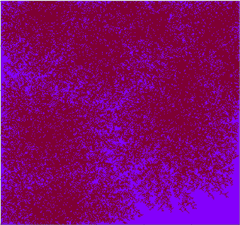
Working on a quick-and-dirty simulation of people wandering around until they find neighbors, then settling down. After playing with the coloring a bit I arrived at the above image, which I quite like. Code below:

# Code by Matt Asher for statisticsblog.com
# Feel free to modify and redistribute, but please keep this notice 

maxSettlers = 150000

# Size of the area
areaW = 300
areaH = 300

# How many small movements will they make to find a neighbor
maxSteps = 200

# Homesteaders, they don't care about finding a neighbor
numbHomesteaders = 10

areaMatrix = matrix(0, nrow=areaW, ncol=areaH)

# For the walk part
adjacents = array(c(1,0,1,1,0,1,-1,1,-1,0,-1,-1,0,-1,1,-1), dim=c(2,8))

# Is an adjacent cell occupied?
hasNeighbor <- function(m,n,theMatrix) {
	toReturn = FALSE
	for(k in 1:8) {
		yCheck = m + adjacents[,k][1]
		xCheck = n + adjacents[,k][2]
		if( !((xCheck > areaW) | (xCheck < 1) | (yCheck > areaH) | (yCheck < 1)) ) {
			if(theMatrix[yCheck,xCheck]>0) {
				toReturn = TRUE
			}
		}
	}
	return(toReturn)
}


# Main loop
for(i in 1:maxSettlers) {
	steps = 1
	xPos = sample(1:areaW, 1)
	yPos = sample(1:areaH, 1)
	
	if(i <= numbHomesteaders) {
		# Seed it with homesteaders
		areaMatrix[xPos,yPos] = 1
	} else {
		if(areaMatrix[xPos,yPos]==0 & hasNeighbor(xPos,yPos,areaMatrix)) {
			areaMatrix[xPos,yPos] = 1
		} else {
			spotFound = FALSE
			outOfBounds = FALSE
			
			while(!spotFound & !outOfBounds & (steps areaW) | (xPos < 1) | (yPos > areaH) | (yPos < 1)) {
					outOfBounds = TRUE
				} else if(hasNeighbor(xPos,yPos,areaMatrix) ) {
					areaMatrix[xPos,yPos] = steps
					spotFound = TRUE
				}
			}
		}
		
	}

}
	
image(areaMatrix, col=rev(rgb(seq(0.01,1,0.01),seq(0.01,1,0.01),seq(0.01,1,0.01))))

# I think this version looks nicer!
# areaMatrix[areaMatrix !=0] = 1
# image(areaMatrix, col=rev(rgb(.5,0,seq(0.2,1,0.2))))