data


22
Feb 13

What’s my daughter listening to? HTML chart gen in R

[advanced_iframe securitykey=”5870105317bee1454e210fffd43d74b89a88430f” src=”http://statisticsblog.com/popchart.html” width=”600″ height=”550″ scrolling=”yes”]


My daughter, who turns 10 in April, has discovered pop music. She’s been listing to Virgin Radio 99.9, one of our local stations. Virgin provides an online playlist that goes back four days, so I scraped the data and brought it into R. The chart shown at top shows all of the songs played from February 17th through the 20th, listed by frequency.

Broadly speaking, the data follows a power law. But only broadly speaking. Instead of a smoothly shaped curve from the single most frequently played song to a tail of single plays, Virgin Toronto has four songs that all share the heaviest level of rotation, then a drop-off of almost 50% to the next level. There was one big surprise in the data, at least for me. Listening to the station, it seems like they are playing the same 10 songs over and over. This impression is true to some extent, as the top 10 songs represented about one-third of all plays. But in just four days there were 57 single plays, and 44 songs played just twice. In all, 173 unique songs were played, with a much longer tail than I had expected.

That said, it would be interesting to compare Virgin’s playlist distribution with the widely eclectic (at least to my ears) Radio Paradise. Anyone want to give it a try? Here’s my code after I scraped the four pages of data by hand and put them into a text file.

To get the link to the Youtube videos, I used Google’s “I feel lucky” option paired with a search for the song name. If you get an unexpected result, take it up with Google. In the past I’ve used R’s “brew” library to generate HTML code from a template, this time I just hand coded the snippets. To make the red bars I found out the maximum number of plays for any song, then stretched each bar relative to this maximum.

19
Feb 13

Google places itself at the center of cyberspace

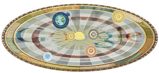
Above is a screen capture of the “Google Doodle” for today. It honors the 540th birthday of Nicolaus Copernicus, proponent of the heliocentric model of the universe. Note that Google is placing itself in the center of the universe, a decision I suspect was made very deliberately for its symbolism.

Astronomy was the first scientific discipline to make extensive use of data. Many of the early advances in data analysis and statistics (like the Gaussian Distribution) came about through detailed observations of heavenly bodies and the vast quantities of (imprecise) data this generated. Astronomy may have even given us the first murder over scientific data. With its Doodle, Google is saying that it’s become the center of the data universe, the dominant lens through which we view the world.

A bold claim! Is it true? Looking closely at all the ways in which Google has integrated itself into our online and offline lives, and it starts to look less like presumption on their part, and more like a simple acknowledgement of present reality.

How does Google guide and track and thee? Let me count the ways:

  1. With search, of course. This includes every character you type into the search box or toolbar, since these are sent to Google for auto-complete and search suggestions. If you’ve ever accidentally pasted a password or a whole draft of your book in progress into the search box, Google has a copy of this stored in their vast data center.
  2. Through your email, if you use Gmail, but also if you email other people who use Gmail.
  3. Every Youtube video you watch.
  4. Your location information, if you use Google Maps. Also, if you are like most people, Google knows the house (or at least the neighborhood) you grew up in, since this is the first place you zoomed-in on that wasn’t your current location. Even if you don’t visit the Maps website or app directly, there’s a good chance a Google Map is embedded in the website of your real estate agent or the restaurant you just checked out.
  5. Through tracking for Analytics. This is a little javascript nugget webmasters put on their pages to get information about their visitors. Millions of websites use Google Analytics, including this one.
  6. Through Adsense, those Google-style ads you see on the side of pages which aren’t Google itself. Adsense is by far the most popular “monetizing” solution for webmasters.
  7. If you use voice dictation on an Android phone, your sounds get sent to Google for conversion into words. Your Android phone is also likely to integrate your calender with Google’s online calender app, sending data about your daily schedule back and forth.
  8. If you use Chrome, then all of the URLs you visit are sent to Google as you type, for auto-complete. Many people use the search box itself to type in URLs, giving this info to Google.
  9. Google has a dozen other products that most of us use at least occasionally, from News to Blogsearch to Translate to Google Docs to Google+ social networking.

Is there any way to escape the pull of Google’s gravity? There are some things you can do to limit the amount of tracking Google does, like clear your cookies on a regular basis, or block Google Ads and Analytics by using your computer’s “hosts” file, but the harder you work to keep your personal data off Google’s servers, the more you end up pushed to the fringes of cyberspace and in some ways from modern life itself: ignoring emails from friends on Gmail, unexposed to the viral video everyone else in your office is talking about, adrift without a good virtual map of the human universe.

Do we welcome our new Sun King?


7
Dec 12

Information Graphics

Click for large version

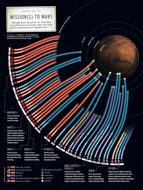
My copy of Information Graphics arrived yesterday. It’s a massive book, in all senses (shipping weight listed as 8lbs, height is 15 inches). It contains hundreds of fascinating charts, diagrams, maps and illustrations. My favorite so far is the one above. It shows the various missions to send human proxies (so far just proxies!) to the red planet. Make sure to click the image for the full version.

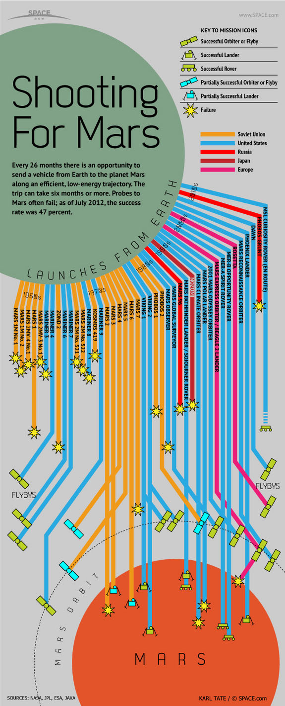
While searching the internet for a version of the chart, I noticed that space.com created a knockoff of the graphic. Their version uses the same innovative metaphor for presenting the data, but has less charm and is much harder to parse. The space.com version is shown below.


6
Jan 12

Explaining large numbers

It can be very hard to convey the meaning and importance of large numbers. As Joseph Stalin infamously said (or perhaps didn’t): “The death of one man is a tragedy. The death of a million is a statistic.” The point being that we can conceive of one person dying, perhaps our mother or a friend. We can understand it and feel it. However horrific the deaths of a million, the size of the number itself turns it into an abstraction.

The video above explores a concept that is abstract to begin with (the national debt) and made even more incomprehensible by having an impossibly large number attached to it (15 trillion). So, how do you make an abstract idea and a massive number meaningful? By personalizing it.

I like the video’s approach, but like other attempts to dividing up a huge number into individual shares, a certain amount of dishonesty is involved. Nation debt, of course, isn’t the same as family debt. For one thing, your family can’t just print more money (though in some ways the availability of a printing press means the national debt is even more scary). Also, there is a big difference between one family living beyond its means and, by extension, every single family in the country living beyond its means.