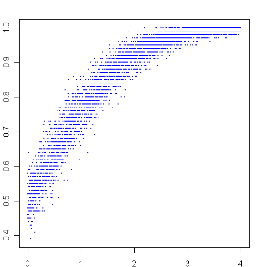
More playing around with R. To create the graph above, I sampled 100 times from two different normal distributions, then plotted the ratio of times that the first distribution beat the second one on the y-axis. The second distribution always had a mean of 0, the mean of first distribution went from 0 to 4, this is plotted on the x-axis.
Here is my code:
AbeatsB <- function(a,b) {
	sum(a>b)/length(a)
}

x = seq(0,4,.001)
y = c()
for (i in x) {
	y = c(y,AbeatsB(rnorm(100,i),rnorm(100,0)))
}

plot(x,y,pch=".",cex=2,col="blue")

