February, 2013


28
Feb 13

Statistical computation in JavaScript — am I nuts?

Over the past couple weeks, I’ve been considering alternatives to R. I’d heard Python was much faster, so I translated a piece of R code with several nested loops into Python (it ran an order of magnitude faster). To find out more about Mathematica 9, I had an extended conversation with some representatives from Wolfram Research (Mathematica can run R code, I’ll post a detailed review soon). And I’ve been experimenting with JavaScript and HTML5’s “canvas” feature.

JavaScript may seem like an unlikely competitor for R, and in may ways it is. It has no repository of statistical analysis packages, doesn’t support vectorization, and requires the additional layer of a web browser to run. This last drawback, though, could be it’s killer feature. Once a piece of code is written in JavaScript, it can be instantly shared with anyone in the world directly on a web page. No additional software needed to install, no images to upload separately. And unlike Adobe’s (very slowly dying) Flash, the output renders perfectly on your smartphone. R has dozens of packages and hundreds of options for charts, but the interactivity of these is highly limited. JavaScript has fewer charting libraries, but it does have some which produce nice output.

Nice output? What matters is the content; the rest is just window dressing, right? Not so fast. Visually pleasing, interactive information display is more than window dressing, and it’s more in demand than ever. As statisticians have stepped up their game, consumers of data analysis have come to expect more from their graphics. In my experience, users spend more time looking at graphs that are pleasing, and get more out of charts with (useful) interactive elements. Beyond that, there’s a whole world of simulations which only provide insight if they are visual and interactive.

Pretty legs, but can she type?
Alright, so there are some advantages to using JavaScript when it comes to creating and sharing output, but what about speed? The last time I used JavaScript for a computationally intensive project, I was frustrated by its slow speed and browser (usually IE!) lockups. I’d heard, though, that improvements had been made, that a new “V8” engine made quick work of even the nastiest js code. Could it be true?

If there’s one thing I rely on R for, it’s creating random variables. To see if JavaScript could keep up on R’s home court, I ran the following code in R:

start = proc.time()[3]
x = rnorm(10^7,0,1)
end = proc.time()[3]
cat(start-end) 

Time needed to create 10 million standard Normal variates in R? About half-a-second on my desktop computer. JavaScript has no native function to generate Normals, and while I know very little about how these are created in R, it seemed like cheating to use a simple inverse CDF method (I’ve heard bad things about these, especially when it comes to tails, can anyone confirm or deny?). After some googling, I found this function by Yu-Jie Lin for generating JS Normals via a “polar” method:

function normal_random(mean, variance) {
  if (mean == undefined)
    mean = 0.0;
  if (variance == undefined)
    variance = 1.0;
  var V1, V2, S;
  do {
    var U1 = Math.random();
    var U2 = Math.random();
    V1 = 2 * U1 - 1;
    V2 = 2 * U2 - 1;
    S = V1 * V1 + V2 * V2;
  } while (S > 1);

  X = Math.sqrt(-2 * Math.log(S) / S) * V1;
//  Y = Math.sqrt(-2 * Math.log(S) / S) * V2;
  X = mean + Math.sqrt(variance) * X;
//  Y = mean + Math.sqrt(variance) * Y ;
  return X;
  }

So how long did it take Yu-Jie’s function to run 10 million times and store the results into an array? In Chrome, it took about half-a-second, same as in R (in Firefox it took about 3 times as long). Got that? No speed difference between R and JS running in Chrome. For loops, JS seems blazing fast (compared to R). Take another look at the demo simulation I created. Each iteration of the code requires on the order of N-squared operations, and the entire display area is re-rendered from scratch. Try adding new balls using the “+” button and see if your browser keeps up.

It’s only a flesh wound!
So have I found the Holy Grail of computer languages for statistical computation? That’s much too strong a statement, especially given the crude state of JS libraries for even basic scientific needs like matrix operations. For now, R is safe. In the long term, though, I suspect the pressures to create easily shared, interactive interfaces, combined with improvements in speed, will push more people to JS/HTML5. Bridges like The Omega Project (has anyone used this?) might speed up the outflow, until people pour out of R and into JavaScript like blood from a butchered knight.

22
Feb 13

What’s my daughter listening to? HTML chart gen in R

[advanced_iframe securitykey=”5870105317bee1454e210fffd43d74b89a88430f” src=”http://statisticsblog.com/popchart.html” width=”600″ height=”550″ scrolling=”yes”]


My daughter, who turns 10 in April, has discovered pop music. She’s been listing to Virgin Radio 99.9, one of our local stations. Virgin provides an online playlist that goes back four days, so I scraped the data and brought it into R. The chart shown at top shows all of the songs played from February 17th through the 20th, listed by frequency.

Broadly speaking, the data follows a power law. But only broadly speaking. Instead of a smoothly shaped curve from the single most frequently played song to a tail of single plays, Virgin Toronto has four songs that all share the heaviest level of rotation, then a drop-off of almost 50% to the next level. There was one big surprise in the data, at least for me. Listening to the station, it seems like they are playing the same 10 songs over and over. This impression is true to some extent, as the top 10 songs represented about one-third of all plays. But in just four days there were 57 single plays, and 44 songs played just twice. In all, 173 unique songs were played, with a much longer tail than I had expected.

That said, it would be interesting to compare Virgin’s playlist distribution with the widely eclectic (at least to my ears) Radio Paradise. Anyone want to give it a try? Here’s my code after I scraped the four pages of data by hand and put them into a text file.

To get the link to the Youtube videos, I used Google’s “I feel lucky” option paired with a search for the song name. If you get an unexpected result, take it up with Google. In the past I’ve used R’s “brew” library to generate HTML code from a template, this time I just hand coded the snippets. To make the red bars I found out the maximum number of plays for any song, then stretched each bar relative to this maximum.


19
Feb 13

Google places itself at the center of cyberspace

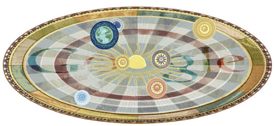
Above is a screen capture of the “Google Doodle” for today. It honors the 540th birthday of Nicolaus Copernicus, proponent of the heliocentric model of the universe. Note that Google is placing itself in the center of the universe, a decision I suspect was made very deliberately for its symbolism.

Astronomy was the first scientific discipline to make extensive use of data. Many of the early advances in data analysis and statistics (like the Gaussian Distribution) came about through detailed observations of heavenly bodies and the vast quantities of (imprecise) data this generated. Astronomy may have even given us the first murder over scientific data. With its Doodle, Google is saying that it’s become the center of the data universe, the dominant lens through which we view the world.

A bold claim! Is it true? Looking closely at all the ways in which Google has integrated itself into our online and offline lives, and it starts to look less like presumption on their part, and more like a simple acknowledgement of present reality.

How does Google guide and track and thee? Let me count the ways:

  1. With search, of course. This includes every character you type into the search box or toolbar, since these are sent to Google for auto-complete and search suggestions. If you’ve ever accidentally pasted a password or a whole draft of your book in progress into the search box, Google has a copy of this stored in their vast data center.
  2. Through your email, if you use Gmail, but also if you email other people who use Gmail.
  3. Every Youtube video you watch.
  4. Your location information, if you use Google Maps. Also, if you are like most people, Google knows the house (or at least the neighborhood) you grew up in, since this is the first place you zoomed-in on that wasn’t your current location. Even if you don’t visit the Maps website or app directly, there’s a good chance a Google Map is embedded in the website of your real estate agent or the restaurant you just checked out.
  5. Through tracking for Analytics. This is a little javascript nugget webmasters put on their pages to get information about their visitors. Millions of websites use Google Analytics, including this one.
  6. Through Adsense, those Google-style ads you see on the side of pages which aren’t Google itself. Adsense is by far the most popular “monetizing” solution for webmasters.
  7. If you use voice dictation on an Android phone, your sounds get sent to Google for conversion into words. Your Android phone is also likely to integrate your calender with Google’s online calender app, sending data about your daily schedule back and forth.
  8. If you use Chrome, then all of the URLs you visit are sent to Google as you type, for auto-complete. Many people use the search box itself to type in URLs, giving this info to Google.
  9. Google has a dozen other products that most of us use at least occasionally, from News to Blogsearch to Translate to Google Docs to Google+ social networking.

Is there any way to escape the pull of Google’s gravity? There are some things you can do to limit the amount of tracking Google does, like clear your cookies on a regular basis, or block Google Ads and Analytics by using your computer’s “hosts” file, but the harder you work to keep your personal data off Google’s servers, the more you end up pushed to the fringes of cyberspace and in some ways from modern life itself: ignoring emails from friends on Gmail, unexposed to the viral video everyone else in your office is talking about, adrift without a good virtual map of the human universe.

Do we welcome our new Sun King?


14
Feb 13

Population simulation leads to Valentine’s Day a[R]t

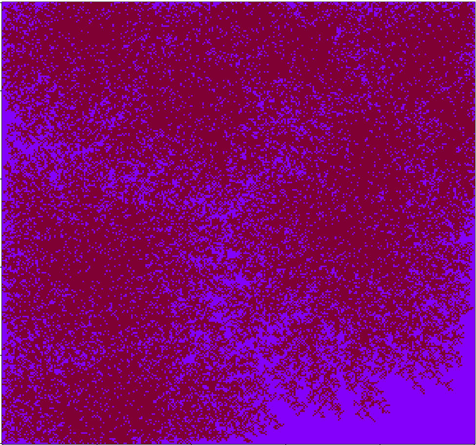
Working on a quick-and-dirty simulation of people wandering around until they find neighbors, then settling down. After playing with the coloring a bit I arrived at the above image, which I quite like. Code below:

# Code by Matt Asher for statisticsblog.com
# Feel free to modify and redistribute, but please keep this notice 

maxSettlers = 150000

# Size of the area
areaW = 300
areaH = 300

# How many small movements will they make to find a neighbor
maxSteps = 200

# Homesteaders, they don't care about finding a neighbor
numbHomesteaders = 10

areaMatrix = matrix(0, nrow=areaW, ncol=areaH)

# For the walk part
adjacents = array(c(1,0,1,1,0,1,-1,1,-1,0,-1,-1,0,-1,1,-1), dim=c(2,8))

# Is an adjacent cell occupied?
hasNeighbor <- function(m,n,theMatrix) {
	toReturn = FALSE
	for(k in 1:8) {
		yCheck = m + adjacents[,k][1]
		xCheck = n + adjacents[,k][2]
		if( !((xCheck > areaW) | (xCheck < 1) | (yCheck > areaH) | (yCheck < 1)) ) {
			if(theMatrix[yCheck,xCheck]>0) {
				toReturn = TRUE
			}
		}
	}
	return(toReturn)
}


# Main loop
for(i in 1:maxSettlers) {
	steps = 1
	xPos = sample(1:areaW, 1)
	yPos = sample(1:areaH, 1)
	
	if(i <= numbHomesteaders) {
		# Seed it with homesteaders
		areaMatrix[xPos,yPos] = 1
	} else {
		if(areaMatrix[xPos,yPos]==0 & hasNeighbor(xPos,yPos,areaMatrix)) {
			areaMatrix[xPos,yPos] = 1
		} else {
			spotFound = FALSE
			outOfBounds = FALSE
			
			while(!spotFound & !outOfBounds & (steps areaW) | (xPos < 1) | (yPos > areaH) | (yPos < 1)) {
					outOfBounds = TRUE
				} else if(hasNeighbor(xPos,yPos,areaMatrix) ) {
					areaMatrix[xPos,yPos] = steps
					spotFound = TRUE
				}
			}
		}
		
	}

}
	
image(areaMatrix, col=rev(rgb(seq(0.01,1,0.01),seq(0.01,1,0.01),seq(0.01,1,0.01))))

# I think this version looks nicer!
# areaMatrix[areaMatrix !=0] = 1
# image(areaMatrix, col=rev(rgb(.5,0,seq(0.2,1,0.2))))

4
Feb 13

Landmine detection revisited; the inverse unicorn problem

A couple weeks ago I wrote about an interesting idea to clear landmines using the power of the wind. A reader asked me to comment more on the value of using these wind-powered “Kafons” to do an initial assay of a suspected minefield, an idea I mentioned at the end of my video on the subject. In particular, how good would the devices be at detecting the existence of mines if they were very sparse in an area? In a sense, this is the inverse of the unicorn problem; instead of trying to find every last mine, we’re concerned with finding the very first one, if indeed land mines are there. Put another way: How hard do we have to look before we can safely conclude that unicorns don’t exist?

Download the code for this simulation.

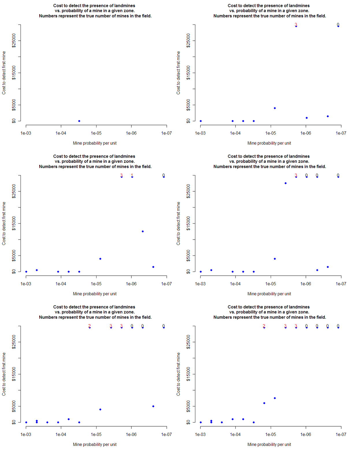
The animated plot shown at the top of this post represents a small sample of data from the simulation I ran. Each blue dot shows the progress of testing of a location to see if that field has mines. I’ve cutoff the testing at $30,000, which is 600 kafons based on their estimated cost (feel free to go into the code and change the cutoff to whatever you want). The dots at the top, with numbers above them, represent testing that used all 600 kanfons without finding any mines. Does this mean no mines exist? Sometimes, but not always. The number above the dot shows the true number of mines in that field during that particular simulation. As you can see, it’s very possible for the field to have several mines, yet still not have any detected, even after trying with hundreds of kafons. In the entire simulation, there were 283 trials with a single mine in the field. On 36 of those occasions, the mine was detected (and, in the simulation, detonated). The other 87% of time, we spent a (virtual) $30,000 and failed to detect its presence.

I’ve shown the results as an animation so that you can put yourself into the position of someone trying to decide whether to continue testing a field for mines, or move on to another location. Each new test costs additional funds, but when do you stop? My $30,000 cutoff is arbitrary. It represents a best guess on my part as to when it would be better to use other methods to test for landmines. These kinds of optimal stopping points can be extremely difficult to determine, especially when, as in this case, those testing for landmines will have to deal with the problem of sunk costs: imagine you’ve just spent $30,000 testing for mines in a field you suspect is dangerous, but you haven’t found anything. The very next kafon, at a cost of just $50, could be the one to find a mine. Do you continue? In my simulation, with this particular distribution of probabilities, once no mine was found in the first 300 kafons, it was very unlikely one would ever be found (although, as mentioned, even when no mine was detected after 600 kafons the field was still way more likely than not to have mines).

Based on the results of the simulation, using kafons to detect mines is cheap when the probability of finding a mine is very high, but in that case I would imagine there’s already strong evidence that landmines exist. In the case where landmines are more sparse, testing with kafons is expensive and the question of when to stop testing is difficult. Note that in a real world use, we don’t know the underlying probability of a mine in the field; we you could be anywhere along the x-axis of the plot shown at top. All we see, in real time, is a rising cost and no kafon found.

If we know how much (new) area is covered by each addition kafon, and if we assume that coverage and placement of landmines is randomly distributed (at least from our position of ignorance), then we can come up with some probability estimates for the chances that a field has an undetected landmine after each additional kafon is given a chance to detect mines. The biggest challenge is that, unless I’m missing something, the question of this exact probability is unanswerable unless we assume a prior distribution on the number of landmines in our field.

We wanted to let the data speak for itself in terms of whether we have hidden mines or not, but in the end, our final beliefs will depend as much on our previous hunch as on the data itself. Which is, in effect, exactly what we were hoping to avoid by sending out kafons to detect for mines.

Shown below is a full plot of all 2800 trials, each dot at the top might represent dozens of failed attempts to find a mine.