October, 2012


31
Oct 12

Recommendation of the week

“[I]f you have performed any statistical analysis that is more complex than calculating the mean and the standard deviation, you should perform the same analysis on noise to make sure that whatever effect you observe is indeed a unique feature of your data and not an artefact of the analysis.”

Found this one over at Stefan’s sieste blog. I couldn’t agree more, especially now that computers and big data sets entice us to make ever more complex models. Oh, and that’s not a bad thing! As I’ve argued, we’ll need to give up on simple, easy to interpret models in order to get more predictive power.

I’d go even more meta than Stefan and argue that you should re-test your entire model-creating process on noise (perhaps he meant this with his quote). If you started with a data set, then ran a stepwise variable selection algorithm, then added in a new non-linear term to get a better fit, do the same on noise, trying to get the best fit. Are you able to get a statistically significant result? Better still, run the same procedure on different types of noise, not just Gaussian White (I know, sounds like something you’d load into a syringe. Normality, the gateway drug?).


25
Oct 12

How fat are your tails?

Lately I’ve been thinking about how to measure the fatness of the tails of a distribution. After some searching, I came across the Pareto Tail Index method. This seems to be used mostly in economics. It works by finding the decay rate of the tail. It’s complicated, both in formula and in it’s R implementation (I couldn’t get “awstindex” to run, which supposedly can be used to calculate it). The Index also has the disadvantage of being a “curve fitting” approach, where you start by assuming a particular distribution, then see which parameter gives the best fit. If this doesn’t seem morally abhorrent to you, perhaps you have a future as a high-paid econometrician.

In the past I’ve looked at how to visualize the impact of the tails on expectation, but what I really wanted was a single number to measure fatness. Poking around the interwebs, I found a more promising approach. The Mean Absolute Deviation (or MAD, not to be confused with the Median Absolute Distribution, or MAD) measures the average absolute distance between a random variable and it’s mean. Unlike the Standard Deviation (SD), the MAD contains no squared terms, which makes it less volatile to outliers.

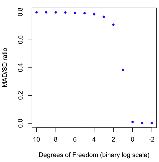
As a result, we can use the MAD/SD ratio as a gauge of fat-tailedness. The closer the number is to zero, the fatter the tails. The closer the number is to 1 (it can never exceed 1!), the thinner the tails. For example, the normal distribution has a MAD/SD ratio of 0.7970, which happens to be the square root of 2 over pi (not a coincidence, try proving this if you rock at solving integrals).

The graph at the beginning of this post shows a Monte Carlo estimation of the MAD/SD ratio for the Student T distribution as it goes from very high Degrees of Freedom (1024) to very low (1/4). You may know that the T distro converges to the Normal at high degrees of freedom (hence the result of nearly .8 for high DF), but did you know that the T distro on 1 Degree of Freedom is the same as the infamously fat-tailed Cauchy? And why stop at 1? We can keep going into fractional DFs. I’ve plotted the ratio all the way down to 1/4. As always, code in R is at the end of the post.

One more thing: there is at least one continuous distribution for which the MAD/SD ratio reaches it’s maximum possible value of one. First person to guess this maximally thin-tailed distribution gets a free copy of the comic I worked on.

# Start with a Normal, move to a Cauchy
dfs = 2^(10:-2)
results = c()
for(i in dfs) {
	x = rt(1000000,i)
	results = c(results, mean(mean(abs(x))/sd(x)))
}

# Note the wonky x-axis limit and order
plot(rev(-2:10), results, col="blue", pch=20, xlim=rev(range(-2:10)), xlab="Degrees of Freedom (binary log scale)", ylab="MAD/SD ratio")

23
Oct 12

Comic with stats discussion

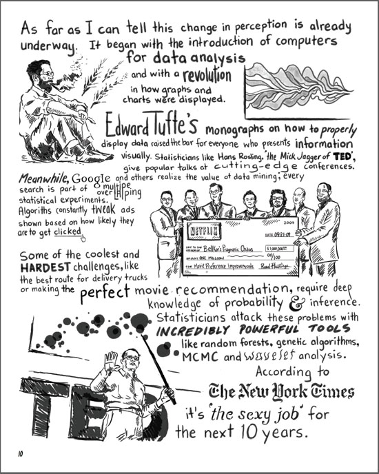
I recently finished work on the first issue of a graphic novel. It’s in the form of a fictional first person narrative. The story isn’t directly about statistics, but there are a few digressions on the subject. Here are some samples, make sure to click on the images for a larger view:

If you’re interested, head over to sunfalls.com and pick up a copy. Here’s the order page. The comic comes with a full money-back guarantee, including shipping. You don’t even have to send back your copy to claim the refund.


13
Oct 12

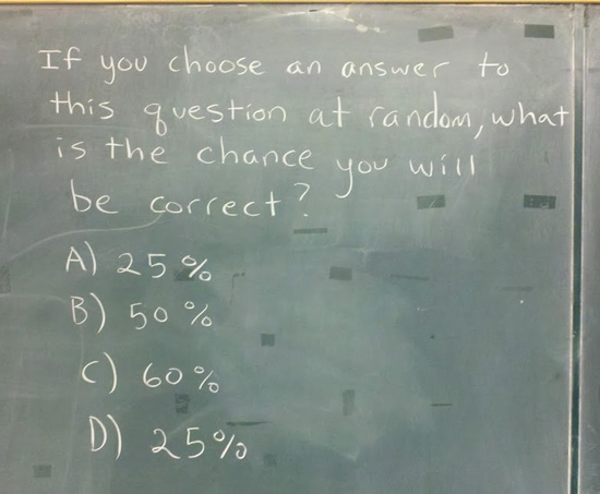
If you choose an answer to this question at random, what is the chance you will be correct?

Image found out there on The Internets. If it doesn’t hurt your brain, you’re not thinking about it hard enough.


13
Oct 12

The unicorn problem

Let’s say your goal is to observe all known species in a particular biological category. Once a week you go out and collect specimens to identify, or maybe you just bring your binoculars to do some spotting. How long will it take you to cross off every species on your list?

I’ve been wondering this lately since I’ve begun to hang out on the Mushrooms of Québec flickr group. So far they have over 2200 species included in the photos. At least one of the contributors has written a book on the subject, which got me wondering how long it might take him to gather his own photos and field observations on every single known species.

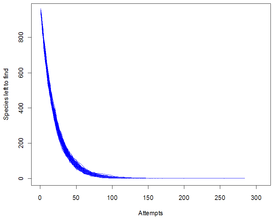
My crude model (see R code at the end of this post) assumes that every time Yves goes out, he has a fixed chance of encountering every given species. In other words, if there were 1000 species to find, and he averages 50 species per hunt, then every species is assigned a 1/20 chance of being found per trip. Thus the total found on any trip would have a Poisson distribution with parameter 50.

This model is unrealistic for lots of reasons (can you spot all the bad assumptions?), but it does show one of the daunting problems with this task: the closer you get to the end, the harder it becomes to find the last few species. In particular, you can be stuck at 1 for a depressingly long time. Run the simulation with different options and look at the graphs you get. I’m calling this “The unicorn problem,” after Nic Cage’s impossible-to-rob car in the movie Gone in 60 Seconds.

Do you have a real-life unicorn of one sort or another?


species = 1000
findP = 1/20
trials = 100
triesToFindAll = rep(0, trials)


for(i in 1:trials) {
	triesNeeded = 0
	
	leftToFind = rep(1, species)
	leftNow = species
	numberLeft = c()
	
	while (leftNow > 0) {
	
		found = sample( c(0,1), 1000, replace=TRUE, prob = c((1-findP),findP))
		
		leftToFind = leftToFind - found
		
		leftNow = length(leftToFind[leftToFind > 0])
		
		numberLeft = c(numberLeft, leftNow)
		
		triesNeeded = triesNeeded + 1
	
	}
	
	if(i == 1) {
		plot.ts(numberLeft, xlim=c(0, 2*triesNeeded), col="blue", ylab="Species left to find", xlab="Attempts")
	} else {
		lines(numberLeft, col="blue")
	}
	
	triesToFindAll[i] = triesNeeded
}