Ronald Aylmer Fisher, statistics badass. Illustration by Rachelle Scarfó for a project I was working on.
January, 2012
15
Jan 12
R A Fisher illustration
6
Jan 12
Explaining large numbers
It can be very hard to convey the meaning and importance of large numbers. As Joseph Stalin infamously said (or perhaps didn’t): “The death of one man is a tragedy. The death of a million is a statistic.” The point being that we can conceive of one person dying, perhaps our mother or a friend. We can understand it and feel it. However horrific the deaths of a million, the size of the number itself turns it into an abstraction.
The video above explores a concept that is abstract to begin with (the national debt) and made even more incomprehensible by having an impossibly large number attached to it (15 trillion). So, how do you make an abstract idea and a massive number meaningful? By personalizing it.
I like the video’s approach, but like other attempts to dividing up a huge number into individual shares, a certain amount of dishonesty is involved. Nation debt, of course, isn’t the same as family debt. For one thing, your family can’t just print more money (though in some ways the availability of a printing press means the national debt is even more scary). Also, there is a big difference between one family living beyond its means and, by extension, every single family in the country living beyond its means.
4
Jan 12
Iowa: Was the fix in? (a statistical analysis of the results)
Summary/TL;DR
Either the first precincts to report were widely unrepresentative of Iowa as a whole, or something screwy happened.
Background
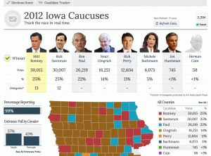
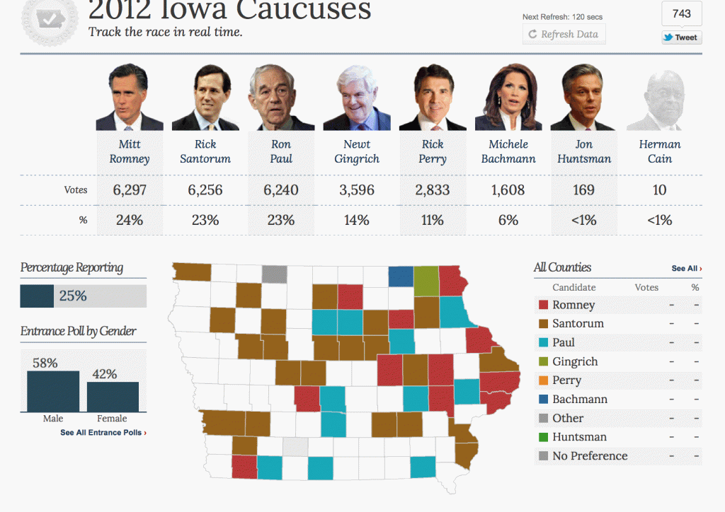
Yesterday was the first primary for the 2012 U.S. presidential elections. When I logged off the internet last night, the results in Iowa showed a dead heat between Ron Paul, Mitt Romney, and Rick Santorum. When I woke up this morning and checked the results from my phone, they were very different. So before connecting to the internet, I took a screen shot of what I saw before going to bed. Here it is:
Then I connected to the internet and refreshed that page:

It seemed strange to me that the results should change so dramatically after 25% of the votes had already been recorded. As a statistician, my next question was: how unusual is this? That’s a question that can be tested. In particular, I can test how often you might have a split of voters like the one shown in the first screen shot, if the final split is like the one shown in the other screen shot, given that the first precincts to report were similar to later ones in voter composition.
That’s a lot to digest all at once, so I’m going to repeat and clarify exactly what I’m assuming, and what I’m going to test.
The assumptions
First, I assume the following:
1. That CNN was showing the correct partial results as they became available. Similarly, I am assuming that the amount shown with 99% of votes reported (second screen shot) is the true final tally, give or take some insignificant amount.
2. That the precincts to report their vote totals first were a random sampling of the precincts overall. Given how spread out these appear to be in the first screen shot, this seems like a good assumption. But that might not be the case. See the end of this post for more about that possibility.
3. No fraud, manipulation, or other shenanigans occurred in terms of counting up the votes and reporting them.
The test
Given these three assumptions, I’m going to come up with a numeric value for the following:
1. What is the probability that the split, at 25% of the vote tallied, would show Ron Paul, Mitt Romney, and Rick Santorum all above 6,200 votes.
It’s possible to come up with a theoretical value for this probability using a formal statistical test. If you decide to work this out, make sure to take into account the fact that your initial sample size (25%) is large compared to the total population. You’ll also need to factor in all of the candidates. Could get messy.
For my analysis, I used the tool I trust: Monte Carlo simulation. I created a simulated population of 121,972 votes, with 26,219 who favor Ron Paul, 30,015 who favor Mitt Romney, and so on. Then I sampled 27,009 from them (the total votes tallied as of the first screen shot). Then I looked at the simulated split as of that moment, and saw if the three top candidates at the end are all above 6,200 votes. What about just Ron Paul?
I’ve coded my simulation using the programming language R, you can see my code at the end of this post.
The results
Out of 100,000 simulations, this result came up not even once! In all those trials, Ron Paul never broke 6,067 votes at the time of the split.
I ran this test a couple times, and each time the result was the same.
Conclusion
If my three assumptions are correct, the probability of observing partial results like we saw is extremely small. It’s much more likely that one of the assumptions is wrong. It could be that the early reports were wrong, though that seems unlikely. The other websites showed the same information or very similar, so it seems doubtful that an error occurred in passing along the information.
Was there something odd about the precincts that reported early? This is not something you could tell just by looking at split vs final data. The data clearly show that the later precincts disfavored Ron Paul, but that’s just what we want to know: did they really disfavor him, or was the data manipulated in some way. The question is, were any of the results faked, tweaked, massaged, Diebold-ed?
To answer that question, we’d need to know if these later precincts to report were expected, beforehand, to disfavor Ron Paul relative to the others. It would also help to look at entrance polling from all of the precincts, and compare the ones that were part of the early reporting versus those that were part of the later reports. At this point, I have to ask for help from you, citizen of the internet. Is this something we can figure out?
UPDATE
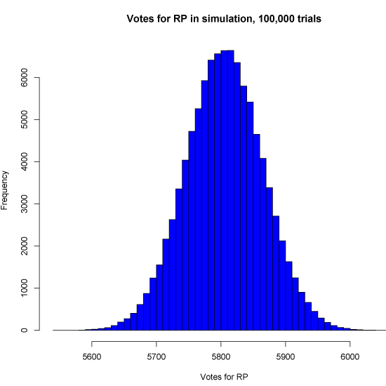
In case folks are interested, here’s a histogram of the 100,000 simulations. This shows the distribution of votes for Ron Paul as of the split, given the assumptions. As you can see it’s a nice bell curve, which it should be. Also note how far out on the curve 6,240 would be.

The code
Oh, one final possibility is that I messed up my code. You can check it below and see:
# Code for StatisticsBlog.com by Matt Asher

# Vote amounts
splits = list()
splits["MR"] = 6297
splits["RS"] = 6256
splits["RP"] = 6240
splits["NG"] = 3596
splits["JRP"] = 2833
splits["MB"] = 1608
splits["JH"] = 169
splits["HC"] = 10

finals = list()
finals["MR"] = 30015
finals["RS"] = 30007
finals["RP"] = 26219
finals["NG"] = 16251
finals["JRP"] = 12604
finals["MB"] = 6073
finals["JH"] = 745
finals["HC"] = 58

# Get an array with all voters:
population = c()
for (name in names(finals)) {
    population = c(population, rep(name, finals[[name]]))
}

# This was the initial split
initialSplit = c()
for (name in names(splits)) {
    initialSplit = c(initialSplit, rep(name, splits[[name]]))
}


# How many times to pull a sample
iters = 100000

# Sample size equal to the size at split
sampleSize = length(initialSplit)

successes = 0
justRPsuccesses = 0

# Track how many votes RP gets at the split
rpResults = rep(0, iters)

for(i in 1:iters) {
	ourSample = sample(population, sampleSize, replace=F)
	results = table(ourSample)

	rpResults[i] = results[["RP"]];

	if(results[["RP"]]>6200) {
		justRPsuccesses = justRPsuccesses + 1

		if(results[["MR"]]>6200 & results[["RS"]]>6200) {
			successes = successes + 1
		}
	}
}

cat(paste("Had a total of", successes, "out of", iters, "trials, for a proportion of", successes/iters, "\n"))
cat(paste("RP had a total of", justRPsuccesses, "out of", iters, "trials, for a proportion of", justRPsuccesses/iters, "\n"))

