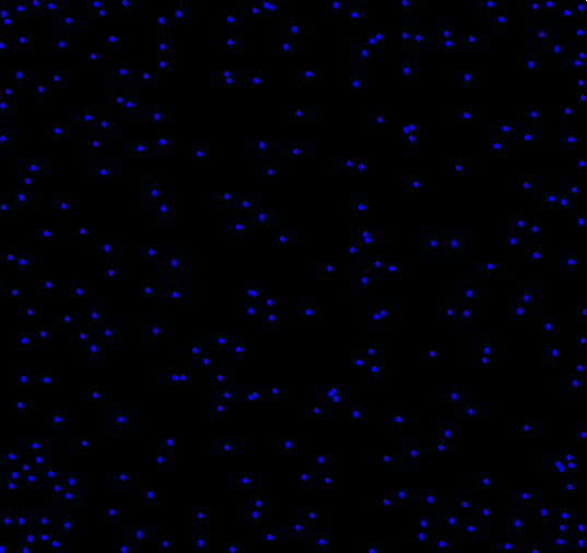
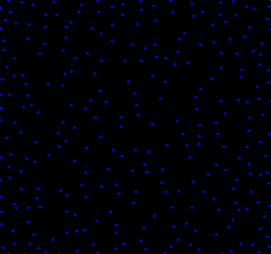
What if you wanted to randomly place objects into a field, and the more objects you had, the more they rejected newcomers placed nearby? To find out, I setup a simulation. The code, shown at the end, isn’t all that interesting, and the plots shown below aren’t all that special. I think there is one interesting part of this, and that’s how the clustering changes depending on how distance is measured. One of the plots uses the traditional “L2″ distance, the other uses L1” (Manhattan taxi cab) measure . Each plot shown below has almost exactly the same number of dots (277 vs 279). Can you tell which uses L1 and which uses L2 just by looking?
Plot B:
Here’s the code. Run it and see for yourself. Make sure to change adjust the values which have comments next to them. Uncommenting “print(force)” can help you pack a maxRepulse value.
calcRepulse <- function(x,y,dots,use="L2") {
	force = 0
	i = 1
	while(i <= dim(dots)[1] && dots[i,1] != 0) {
		if(use == "L2") {
			force = force + 1/( (x-dots[i,1])^2 + (y-dots[i,2])^2 )
		} else if(use == "L1") {
			force = force + 1/( abs(x-dots[i,1]) + abs(y-dots[i,2]) )
		}
		i = i+1
	}
	# print(force)
	return(force)
}

par(bg="black")
par(mar=c(0,0,0,0))
plot(c(0,1),c(0,1),col="white",pch=".",xlim=c(0,1),ylim=c(0,1))

place = 1 #Maximum number of dots to place, change this to something bigger
dots = matrix(rep(0,place*2),ncol=2)
maxTries = place * 10
maxRepulse = 1 # Anything above this will be rejected as too repulsive a location
dist2use = "" # Pick L1 or L2

placed = 0
tries = 0


while(placed < place && tries < maxTries) {
	x = runif(1)
	y = runif(1)

	if(calcRepulse(x,y,dots,dist2use) < maxRepulse) {
		dots[(placed + 1),1] = x
		dots[(placed + 1),2] = y
		placed = placed + 1
		points(x,y,col="blue",pch=20)
	}

	tries = tries + 1
}
Tags: distance


I’m guessing the first one is L1, am I right?
@T. Dan:
Maybe.
Isn’t the L2 missing a square root?
@w. davis:
Yes. But it doesn’t matter because I am just setting an arbitrary cutoff number for “repulsiveness” (a different one for each Norm); and taking the square root doesn’t change the order.
I think setting a different cutoff for each norm makes comparisons between them more difficult because the relationship between the metrics is nonlinear.
Here is a plot for the unit square.
mydata<-matrix(runif(0,1,n=1e5),nc=2) # generate data on unit square
par(mfrow=c(1,2),pty="s")
# keep things simple for relationship between metrics just measure distance from the origin.
plot(x=rowSums((mydata)^2),y=rowSums(abs(mydata)),xlab="Squared L2", ylab="L1")
abline(a=0,b=1)
plot(x=sqrt(rowSums((mydata)^2)),y=rowSums(abs(mydata)),xlab="L2", ylab="L1")
abline(a=0,b=1)
@w. davis:
That’s a good point. I had to set different cutoffs in order to have the roughly the same number of dots placed in each image. I’ll try to re-visit this at some point down the line.