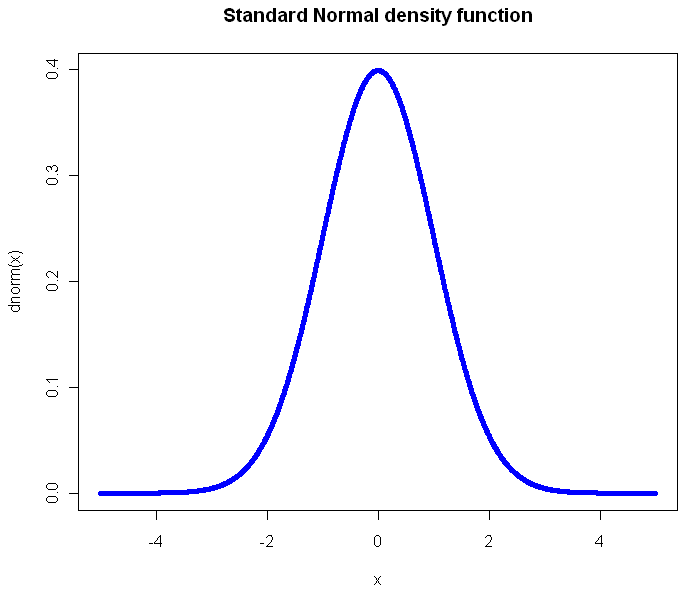
The standard, textbook way to represent a density function looks like this:
Perhaps you have seen this before? (Plot created in R, all source code from this post is included at the end). Not only will you find this plot in statistics books, you’ll also see it in medical texts, sociology, and even economics books. It gives you a clear view of how likely an observation is to fall in a particular range of [latex]x[/latex]. So what’s the problem?
The problem is that what usually concerns us isn’t probability in isolation. What matters is the impact that observations have on some other metric of importance, like the total or average. The key thing we want to know about a distribution is: What range of observations will contribute the most to our expected value, and in what way? We want a measure of influence.
Here’s the plot of the Cauchy density:
From this view, it doesn’t look all that different from the Normal. Sure it’s a little more narrow, with “fatter tails”, but no radical difference, right? Of course, the Cauchy is radically different from the normal distribution. Those slightly fatter tails give very little visual indication that the Cauchy is so extreme-valued that it has no expected value. Integrating to find the exception gives you infinity in both directions. If your distribution is like this, you’ve got problems and your plot should tell you that right away.
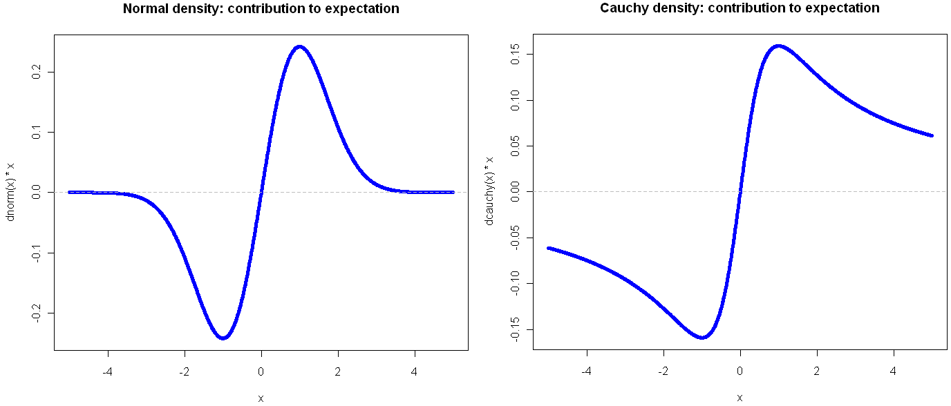
Here’s another way to visualize these two probability distributions:
Go ahead and click on the image above to see the full view. I’ll wait for you…
See? By plotting the density multiplied by the observation value on the y-axis, you get a very clear view of how the different ranges of the function effect the expectation. Looking at these, it should be obvious that the Cauchy is an entirely different beast. In the normal distribution, extreme values are so rare as to be irrelevant. This is why researchers like to find ways to treat their sample as normally distributed: a small sample gives enough information to tell the whole story. But if your life (or livelihood) depends on a sum or total amount, you’re probably best off plotting your (empirical) density in the way shown above.
Another bit of insight from this view is that the greatest contribution to the expectation comes at 1 and -1, which in the case of the Normal isn’t the mean, but rather the second central moment (plus or minus). That’s not a coincidence, but it’s also not always the case, as we shall see. But first, what do things look like when a distribution gets completely out of hand?
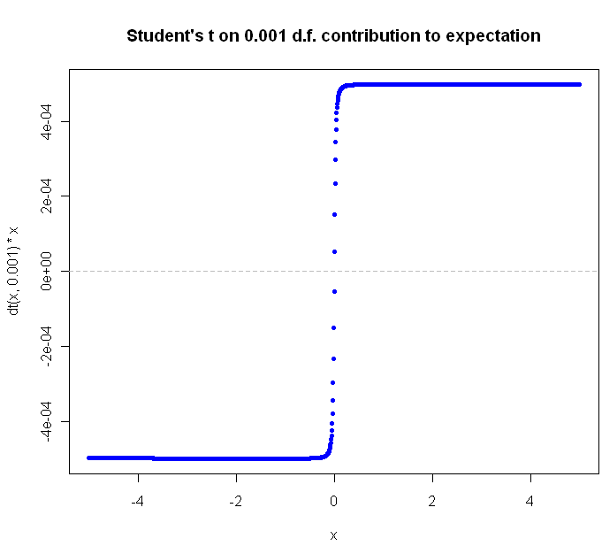
The Student’s t distribution, on 1 Degree of Freedom , is identical to the Cauchy. But why stop at a single DF? You can go all the way down to the smallest (positive) fraction.
The closer you get to zero, the flatter the curve gets. Can we ever flatten it out completely? Not for a continuous distribution with support over an infinite range. Why not? Because in order for the slope of [latex]value * density[/latex] to continue to flatline it indefinitely, the density function would have to be some multiple of [latex]\frac{1}{x}[/latex], and of course the area under this function diverges as we go to infinity, and densities are supposed to integrate to 1, not infinity, right?
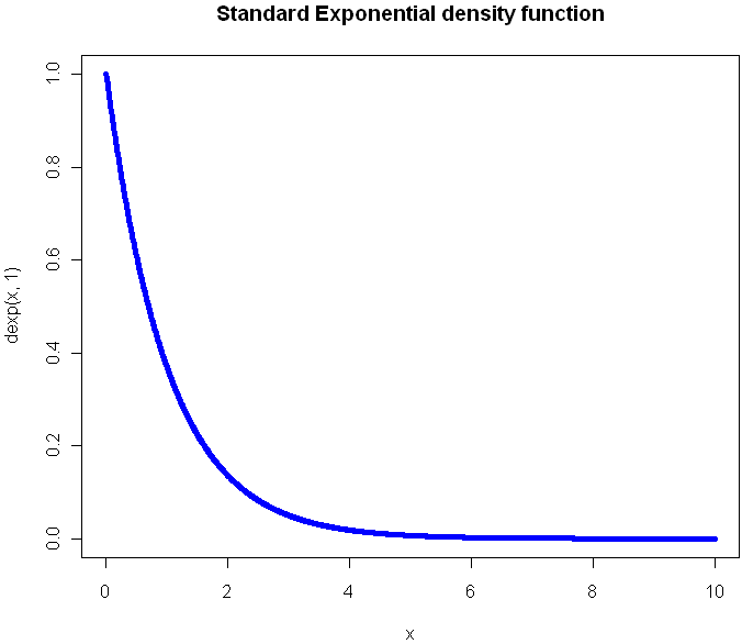
What would the plot look like for a continuous function that extends to infinity in just one direction? Here’s the regular Exponential(1) density function plot:
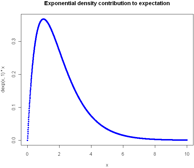
Now look at the plot showing contribution to expectation:
Were you guessing it would peak at 1? Again, the expectation plot provides insight into which ranges of the distribution will have the greatest impact on our aggregate values.
Before I go look at an a discrete distribution, try to picture what the expectation curve would look like for the standard [latex]Uniform(0,1)[/latex] distribution. Did you picture a diagonal line?
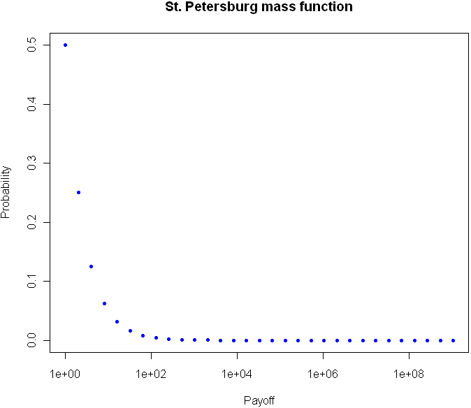
Can we flatten things out completely with an infinitely-supported discrete distribution? Perhaps you’ve heard of the St. Petersburg Paradox. It’s a gambling game that works like this: you flip a coin until tails comes up. If you see one head before a tails, you get $1. For 2 heads you get $2, for 3 heads $4, and so on. The payoff doubles each time, and the chances of reaching the next payoff are halved. The paradox is that even though the vast majority of your winnings will be quite modest, your expectation is infinite. The regular view of the probability mass function for provides almost no insight:
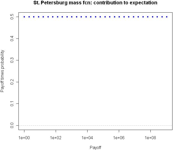
But take a look at the expectation plot:
Flat as a Nebraska wheat field. You can tell right away that something unusual is happening here.
I could go on with more examples, but hopefully you are beginning to see the value in this type of plot. Here is the code, feel free to experiment with other distributions as well.
# Useful way to make dots look like a line
x = seq(-5,5,length=1500)

# You've seen this before. Our good friend the Normal
plot(x,dnorm(x),pch=20,col="blue", main="Standard Normal density function")

# Cauchy looks a little different, but it's not obvious how different it is
plot(x,dcauchy(x),pch=20,col="blue", main="Cauchy density function")

# New way of plotting the same
plot(x,dnorm(x)*x,pch=20,col="blue", main="Normal density: contribution to expectation")
abline(h=0,lty="dashed",col="gray")

plot(x,dcauchy(x)*x,pch=20,col="blue", main="Cauchy density: contribution to expectation")
abline(h=0,lty="dashed",col="gray")

# Extreme student-t action:
plot(x,dt(x,0.001)*x,pch=20,col="blue", main="Student's t on 0.001 d.f. contribution to expectation")
abline(h=0,lty="dashed",col="gray")


# The Exponential
x = seq(0,10,length=1500)
plot(x,dexp(x,1),pch=20,col="blue", main="Standard Exponential density function")

# The expectation view:
plot(x,dexp(x,1)*x,pch=20,col="blue", main="Exponential mass contribution to expectation")

# What do we see with the St. Petersburg Paradox
x = 2^(0:30)
dStPete <- function(x) {
	return (1/(2*x))
}

# Note the log
plot(x,dStPete(x),pch=20,col="blue", main="St. Petersburg mass function", log="x", xlab="Payoff", ylab="Probability",ylim=c(0,.5))

# Now we see the light
plot(x,dStPete(x)*x,pch=20,col="blue", main="St. Petersburg mass fcn: contribution to expectation", xlab="Payoff", log="x", ylab="Payoff times probability",ylim=c(0,.5))
abline(h=0,lty="dashed",col="gray")
Tags: density functions, expectation, plots, probability


Fun and interesting read, thank you very much for writing this post.
Where did the idea came to you from ?
p.s: consider installing the plugin “subscribe to comments”
Cheers,
Tal
I liked this article, too.
There is a problem with the Cauchy distribution, which is that it has no expectation…
The second (central) moment is the variance. The points you’re referring to are one standard deviation either side of the mean.
Hmm. Sorry, I expected “blockquote” html to work in comments – that first line is quoting you, the final sentence is me.
@xi’an:
The Cauchy (as a whole) has undefined expectation. But if you look at any finite range of the distribution, this subset makes a finite, real-valued contribution towards the overall expectation.
This may seem obvious, but it’s related to
@Tal’s: question of how the idea came to me. Most of the time, if you are looking at real-world data, it’s not going to follow any exact, known distribution. At best it will approximate something recognizable. Also, you’re going to be looking at some finite set of data, and presumably the values will be finite. If you look at your data with a histogram or kernel density plot, you’ll see some rough variation on a the standard density plots. This will works even if you have a sample that comes from one of those wickedly stable distributions with no calculable moments. Looking at the chart will give little evidence that you may be in for a nasty surprise if you try to predict future values or a population mean on the basis of your sample. But if you plot your (empirical) density as I am suggesting, in terms of values of x versus that value’s contribution to total value, then you see right away 1. If something strange is going on and 2. What parts of the distribution contribute the most to your average (which are the most influential).
It seems to me that this is really important information to have, and you should get it right away in visual form.
@efrique:
I was referring to the Standard Normal distribution, which has variance equal to standard deviation equal to 1. Sorry if I wasn’t clear about drawing that out. I added “central” to the sentence.